HOME | DD
 MetGod — pUnk...
by-nc-nd
MetGod — pUnk...
by-nc-nd

Published: 2009-08-18 05:35:33 +0000 UTC; Views: 1642; Favourites: 34; Downloads: 40
Redirect to original
Description
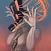
Hey peeps. Finally I decided that I would do something more colourful but it still looks a little "dark" but this is fast becoming one of my favourites. This background bas a total bitch. Not because it was hard to do, as you can see it's quite simple, it was more because I couldn't decide what to do in the background. This was one of five fully illustrated options that I made. I have to say I am really happy all that is over.Used some reference and some CS3.
Till next time.
Related content


Comments: 26


aww it looks so great! Its so detailed and the background is really good
 - :D")
👍: 0 ⏩: 0

This piece has been featured in my current journal
👍: 0 ⏩: 1

i like the way the green repeats itself throughout the painting, from her bad ass haircut to smaller details, such as her eyes and her pendant. the lens flare looks a bit weird, but the way you colored it turned out very well.
👍: 0 ⏩: 0


Her face is beautiful and very neatly done. Also, her hair looks great (both the colour and the strusture of it). The background is cool and I like that it doesn't cover the whole field, but most of the background is left simply white. It makes the girl stand out nicely.
The only thing I dislike about this is how flat her top looks. I mean, yea there is some shadow in the middle where it touches the skin, but it's completely flat on both shoulders. Even black can have lighter shades  (Wink)")
👍: 0 ⏩: 0

The coloring on this is pretty awesome. I like the painterly look on her skin. I also like how you colored the hair and her lips... and the eyes, and the flat blacks, and the background, haha. The only problem I have is the jewelry. It looks like it's just hovering there... mostly for two reasons: there are no projected shadows on her; also I think you should turn up the levels and contrast on the jewelry to give it more 3-dimensionality.
👍: 0 ⏩: 1

I feel the same about the jewelry, I just couldnt put my finger on what it was. Thanks, I'll definately look into it.
👍: 0 ⏩: 0

this is a great one! i noticed u like to focus on the look (on the eyes) and that's very effective
👍: 0 ⏩: 1
Thank you. Yeah, I love doing the face.
👍: 0 ⏩: 0

Very cool---something really bugs me about the head and face, though. It is like it is disconnected or like the face and scalp are too long. Maybe it is just the style? It tickles my eyes, but it isn't to distracting.
I agree with everyone else, otherwise. The colors are bold and she has a serious kick-butt feel to her (me likes  (Smile)")
Oh, you already gave me critiques. I plan to thumb through your gallery to enjoy your talents when I have a little more free time. Great work!
👍: 0 ⏩: 1
Yeah... the style is a bit streched. I like to do it in a comic book style but I'll look at it again and see if I can see what you see. Thank you for being attentive, I really apreciate it.
👍: 0 ⏩: 1
No problem. Like I said, it just bugged me. I don't see many people in mohawks so it may just be that I am not used to it. I tried googling mohawks but didn't see anyone with their head in the same position so it could just be my lack of experience
👍: 0 ⏩: 0
The grungy background works a treat with the theme; I love how vibrant the colours are. And your shading is so amazingly smooth. Well done!
👍: 0 ⏩: 0
Hehe. My lady is also a bit of a punk. Not in music per say but in her style. I thought a lot about her when I was painting this.
👍: 0 ⏩: 1

ow thats sweet!!! cool! more to come man!
im watching you!
👍: 0 ⏩: 1

She looks really cool and her make-up and piercings are great. The colouring is awesome too and the anatomy seems flawless.
Great job.
👍: 0 ⏩: 1

I like your idea and the composition of colours
it's put way too much into the right corner of the picture I think, that's a little irritating.
👍: 0 ⏩: 1
Thank you. Yeah the of-centre thing was done intentionally and it wont always appeal to everyone and I left it like this for a lack of a better option. Thank you for looking so diligently at it.
PS. I saw your post but you forgot to write "crit". If it's not too much trouble, please post again.
👍: 0 ⏩: 0


ja bearofDOOOM, dit het toe great uit gekom !!!
ek seker jys trots?? so bietjie?? ne ne ?? jaaa? XD
MWA!
👍: 0 ⏩: 1
Dankie luv! Ek is nogal trots op dit. Die agtergrond is beter as die voriges, maar dit het my nogal 'n klompie probeerslagte gevat om dit reg te kry. Hehe.
👍: 0 ⏩: 1
mar welldone ^^
i are to be lovings it!
👍: 0 ⏩: 0