HOME | DD
 michal09 — Software company
Published: 2010-02-10 19:56:02 +0000 UTC; Views: 6731; Favourites: 28; Downloads: 277
Redirect to original
Description
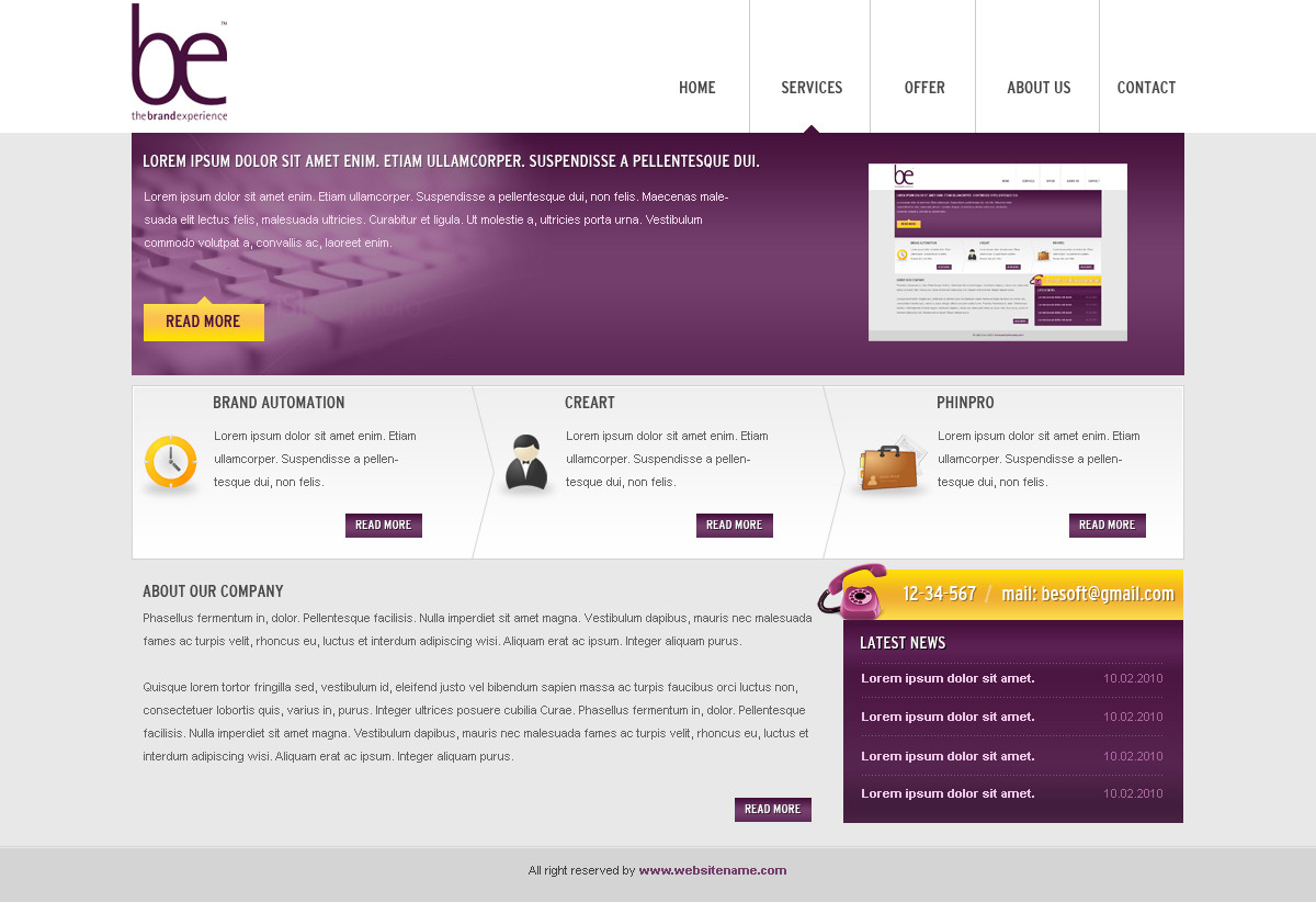
Logo is not my.Layout for software company
 (Smile) - :)")
Icons:
[link]
[link]
Thanks for comments and favs!
---------------------------
Small update, added keyboard in area under logo.
Related content


Comments: 14

nice design .............. to
visit may you like some Designs
.................................................. [link]

👍: 0 ⏩: 0

I love your layout designs, very clean (minimal).
👍: 0 ⏩: 1
 (Wink) - ;)")

 - :D")


I really like it. Your good use of colors, gradients and attention to details really show in this.
If I were to point out one thing to watch out for, it would be the spacing of your elements. To my eyes, everything is a little too crowded together. Most notably I think you should give the main heading in the feature region a larger font size, and this region itself might do well with a little margin between it and the header. Some spacing between the bottom news box and paragraph next to it is also an idea. My point is basically to just make sure everything has breathing room. It doesn't have to be a lot, but just enough so that things don't feel too close together.
Like I said, this is just what I think, but I'm hoping it'll help. I think your design is fantastic, and everything really is top-notch.
👍: 0 ⏩: 1

Big thanks for your comment! Of course it help me to make better design
👍: 0 ⏩: 0

 - :P")


I like it! Very clean, and the combination of colours works nice! ^^
👍: 0 ⏩: 1