HOME | DD
 mikeomni — Cyberpunk Cantine Color

Published: 2010-08-27 11:42:39 +0000 UTC; Views: 6200; Favourites: 68; Downloads: 0
Redirect to original
Description
Line Art:Color:
Related content
Comments: 65

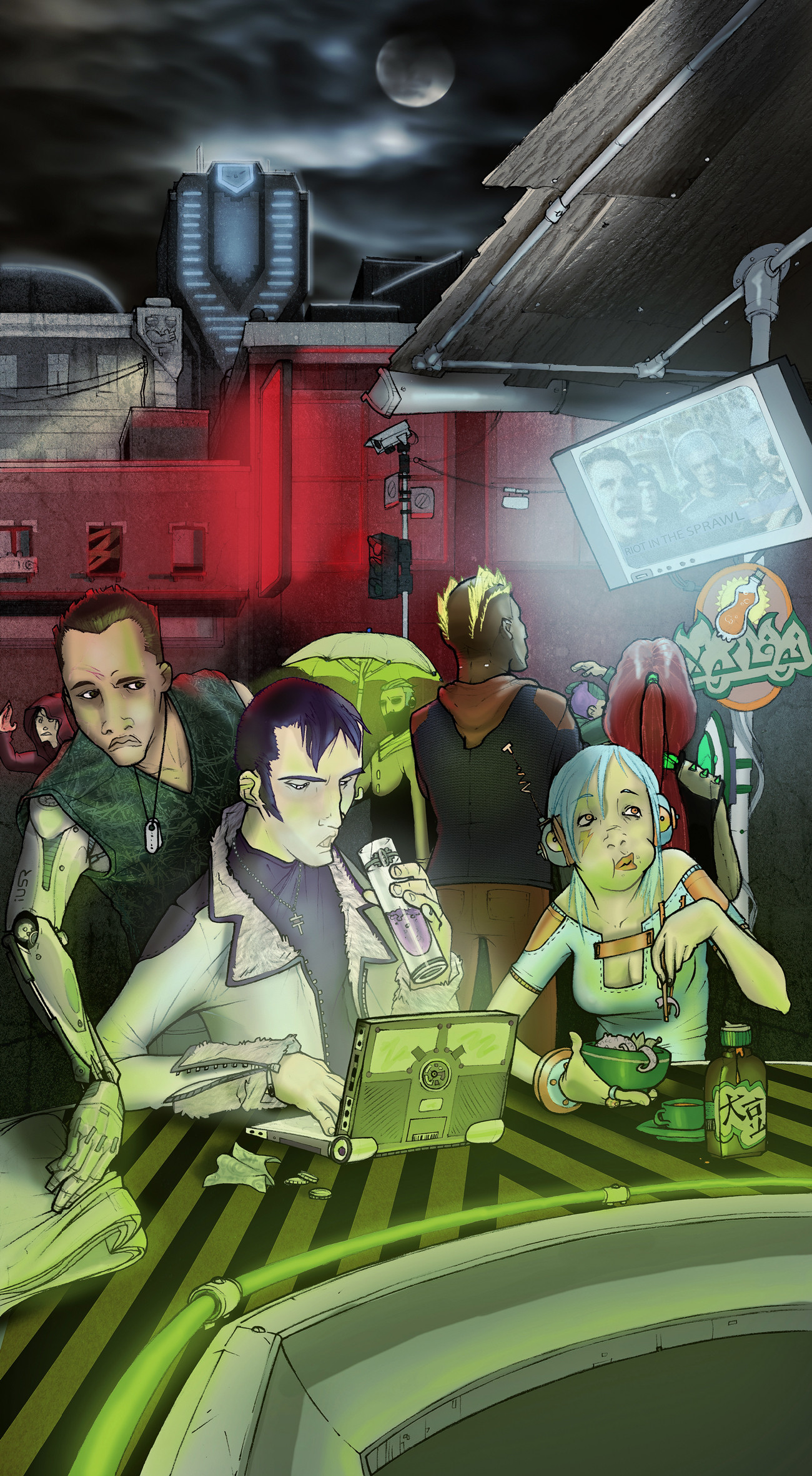
Really atmospheric! thinking bladerunner mixed with a star wars cantina
👍: 0 ⏩: 1

I love bar scenes they always have so much personality
👍: 0 ⏩: 1

yeah, with the smoke and cooking and every-day people
👍: 0 ⏩: 0

The backround is awesome O-0
👍: 0 ⏩: 1

Thank you! The background always takes the longest to do right in big scenes
👍: 0 ⏩: 0

You did a fantastic job coloring this. You really captured the dark cyberpunk mood here.
👍: 0 ⏩: 1

And *you* did a fantastic job of making me feel better after an awful day of work.
👍: 0 ⏩: 1

Looks great. Man, I love the line art on this one, good choice.
I think as bright as you have the image coming off the TV screen, the people standing directly in front of it would be a little more silhouetted.
And I love the ambient light glow effects throughout. The only place it doesn't relly come off is the gentleman with the dog tags. I'm not reading the green on his forehead as ambient light; looks more like face paint, and I think that's because it's a darker green than on the guy sitting closer to the light source. Also, I think his flesh tones are a little monochromatic; the left side of his face should be darker.
And I think the flourescent lights up front look a little dull. You might want to hit it with some white highlighting to really convey that brightness.
Again, the background is tremendous. Love the sky effects. Great work!
👍: 0 ⏩: 1

That is a fair critique. I saw some of the same problems, but to be honest I saw dada's color of it and was like - yup I'm done now. Maybe I'll spruce it up, though. It was such a complicated piece in terms of a bunch of different light sources from a couple angles that made each other difficult. In the course of the work it became more of a study in light than anything else.
👍: 0 ⏩: 0
<= Prev |


