HOME | DD

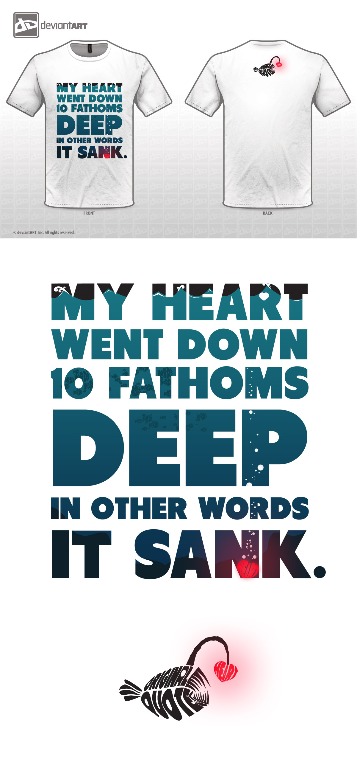
mindCollision — 10 Fathoms Deep.

Published: 2012-05-11 12:21:41 +0000 UTC; Views: 1320; Favourites: 24; Downloads: 0
Redirect to original
Description My entry for the Original Quotes contest. I'm not sure what I think about it, but I may like this.

Font used: Tondu , free font.

No resources used.

If you like this, I would really appreciate your vote!
Related content
Comments: 43

uplabel [2012-08-21 09:28:36 +0000 UTC]

My heart sank, too..
I like your work, far more than most of the OQ semi-sinalists.

👍: 0 ⏩: 1

mindCollision In reply to uplabel [2012-08-21 13:15:14 +0000 UTC]

Thank you very much, I appreciate that This didn't do very well at all so it's good to hear something nice about it!

👍: 0 ⏩: 0

gbindis [2012-06-28 11:34:19 +0000 UTC]

Smart quote, beautiful graphics!

👍: 0 ⏩: 1

mindCollision In reply to gbindis [2012-06-28 13:35:26 +0000 UTC]

Thank you very much Apparently this contest is over but I never heard who won?

👍: 0 ⏩: 1

gbindis In reply to mindCollision [2012-07-01 21:32:32 +0000 UTC]

Really? That's interesting!

👍: 0 ⏩: 1

mindCollision In reply to gbindis [2012-07-02 08:55:45 +0000 UTC]

Found out the other day, I didn't make it needless to say lol

👍: 0 ⏩: 0

Brieana [2012-06-08 13:29:51 +0000 UTC]

Ah I love thick sans serif fonts! You can put a lot of detail in them, like you've done here. The small swirls of the waves are nice. I also didn't notice how you replaced the hole in the R in 'heart' with a heart until the third time I looked, Nice touch! I think if you made the fish just a fish shape it would look better, also as the blue gets darker the contrast is lost so it's hard to see zoomed out, so if they got progressively darker as well it would be improved. Speaking of color, You did a great job going with the complementary colors of this blue and red! The glow around the heart is really nice, makes it stand out. The A in the heart could be a bit wider because it's hard to make out, but I think it's fine either way. Lastly, I love the "original quote" Angler fish, Very clever and neat. Overall really nice job! Good luck with future contests, you definitely have talent here in your gallery

👍: 0 ⏩: 1

mindCollision In reply to Brieana [2012-06-08 15:39:23 +0000 UTC]

Thanks! Good to get some constructive criticism I deliberately made the fish dark to give the impression of being far away, I wasn't worried about making them easy to see really. Glad you like the colours, when I looked at it afterwards I wished I'd made the gradient more pronounced but sure. I think the glow round the heart is cool but I'm not sure if something like that good even be printed. Thanks again for your lovely comment

👍: 0 ⏩: 1

Brieana In reply to mindCollision [2012-06-08 16:03:38 +0000 UTC]

Honestly gradients are hard to screen-print unless you have special screens (not an expert but I did ask a teacher once haha!)). But as a poster, this is very nice and definitely worth keeping in your gallery. I see about the fish now, now that you say that it looks cool how they fade away. Keep them ^_^ Also the gradients are perfect, subtle change and has a nice flow. Sometimes subtle contrast is just what a piece needs! Keep up the fantastic work love!

👍: 0 ⏩: 1

mindCollision In reply to Brieana [2012-06-08 18:35:46 +0000 UTC]

Tehe I'm glad you agree about the fish! I was trying to get a sort of "far away" underwater effect. Naw thanks, nice to meet someone genuinely nice randomly like this

👍: 0 ⏩: 1

Brieana In reply to mindCollision [2012-06-08 18:59:06 +0000 UTC]

Got it ^_^ Looks great! And aw thanks, it's nice to meet an awesome person like yourself!

👍: 0 ⏩: 0

SaitouuRyuuji [2012-05-18 04:53:54 +0000 UTC]

love this.

👍: 0 ⏩: 1

mindCollision In reply to SaitouuRyuuji [2012-05-18 08:09:53 +0000 UTC]

Awesome Thanks for the fave

👍: 0 ⏩: 1

SaitouuRyuuji In reply to mindCollision [2012-06-06 16:40:38 +0000 UTC]

my pleasure.

👍: 0 ⏩: 0

Cyntilla [2012-05-15 08:21:25 +0000 UTC]

Beautiful! Voted!
Please, check out my entry and vote if you like it, thank you!
[link]

👍: 0 ⏩: 1

mindCollision In reply to Cyntilla [2012-05-15 08:25:13 +0000 UTC]

Thanks a lot! Yours looks great, well done

👍: 0 ⏩: 1

Cyntilla In reply to mindCollision [2012-05-15 08:32:39 +0000 UTC]

👍: 0 ⏩: 0

ohbeautifuldelilah [2012-05-15 08:13:08 +0000 UTC]

That's a really really good quote. I mean, it's just.... really really good.

👍: 0 ⏩: 1

mindCollision In reply to ohbeautifuldelilah [2012-05-15 08:18:20 +0000 UTC]

Thank you! I wasn't sure if people would like the quote, it's like a little mini poem that I came up with randomly Thanks a lot for your comment

👍: 0 ⏩: 1

ohbeautifuldelilah In reply to mindCollision [2012-05-16 04:09:03 +0000 UTC]

You're welcome! I really love it! I'd wear that shirt in a heartbeat!

👍: 0 ⏩: 0

grohsARTig [2012-05-14 15:34:17 +0000 UTC]

very nice work!!!!

👍: 0 ⏩: 1

mindCollision In reply to grohsARTig [2012-05-14 20:42:55 +0000 UTC]

Thanks man! Much appreciated

👍: 0 ⏩: 1

grohsARTig In reply to mindCollision [2012-05-19 17:04:55 +0000 UTC]

you are most welcome

👍: 0 ⏩: 0

FRSHSnip3r [2012-05-12 21:02:53 +0000 UTC]

Love the font!

👍: 0 ⏩: 2

mindCollision In reply to FRSHSnip3r [2012-05-12 22:37:19 +0000 UTC]

Oh and thank you for faving too

👍: 0 ⏩: 0

mindCollision In reply to FRSHSnip3r [2012-05-12 22:36:56 +0000 UTC]

Yeah I love it too, just found it while I was searching for a nice chunky font to use in this, best thing about it is it's free

👍: 0 ⏩: 0

gingergenius [2012-05-12 17:11:47 +0000 UTC]

Oh god, WHY? WHY IS THIS SO AWESOME?

👍: 0 ⏩: 1

mindCollision In reply to gingergenius [2012-05-12 17:26:23 +0000 UTC]

Lol amazing comment! I dunno why but I'm glad you think so

👍: 0 ⏩: 0

LOSTSOULkreation [2012-05-12 13:33:38 +0000 UTC]

yo u should definitely win haha ... check out my designs (link in signature)

👍: 0 ⏩: 1

mindCollision In reply to LOSTSOULkreation [2012-05-12 15:01:51 +0000 UTC]

Lol wow thanks! That's really kind of you. Yours look really good

👍: 0 ⏩: 0

juelleann [2012-05-12 10:48:06 +0000 UTC]

Neatly done!

👍: 0 ⏩: 1

mindCollision In reply to juelleann [2012-05-12 13:29:10 +0000 UTC]

Thanks! Glad you like it

👍: 0 ⏩: 0

Ariis [2012-05-11 15:40:32 +0000 UTC]

very nice! I voted

[link] check mine too

👍: 0 ⏩: 1

mindCollision In reply to Ariis [2012-05-11 15:55:50 +0000 UTC]

Thank you very much Will do

👍: 0 ⏩: 1

Ariis In reply to mindCollision [2012-05-13 17:19:39 +0000 UTC]

you're welcome

👍: 0 ⏩: 0

Imaydaybest [2012-05-11 13:24:13 +0000 UTC]

Good job!

👍: 0 ⏩: 1

mindCollision In reply to Imaydaybest [2012-05-11 13:29:48 +0000 UTC]

Thank you!

👍: 0 ⏩: 0

ExosFear94 [2012-05-11 12:57:30 +0000 UTC]

Like it ... !! ^^

Pliss vote my design .. ^^

👍: 0 ⏩: 1

mindCollision In reply to ExosFear94 [2012-05-11 13:08:57 +0000 UTC]

Thank you

👍: 0 ⏩: 1

ExosFear94 In reply to mindCollision [2012-05-11 13:21:41 +0000 UTC]

^^

👍: 0 ⏩: 0

aryan26 [2012-05-11 12:40:11 +0000 UTC]

Nice work!

I'd be glad if you could check mine! [link]

👍: 0 ⏩: 1

mindCollision In reply to aryan26 [2012-05-11 12:50:10 +0000 UTC]

Thank you yours is great, one of the better ones I've seen so far in the entries.

👍: 0 ⏩: 1

aryan26 In reply to mindCollision [2012-05-11 13:14:17 +0000 UTC]

Thanks!

👍: 0 ⏩: 0