HOME | DD
 Minuiko — TCP cover idea 2 revised
Published: 2011-12-23 07:40:36 +0000 UTC; Views: 3645; Favourites: 62; Downloads: 27
Redirect to original
Description
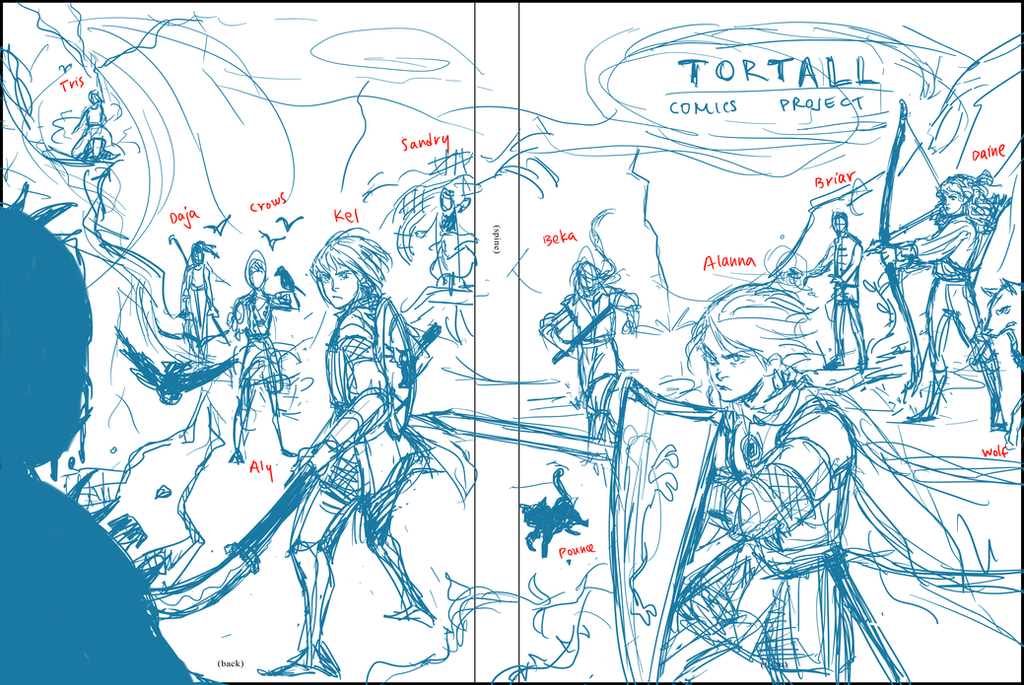
revised cover draft! Still not sure about the positioning of the Emelan kids but I definitely know I want Tris summoning lightning to provide a cool backdrop for the cover. I'm happier with this version though, what do you guys think?Tortall and Emelan (c) Tamora Pierce
Art (c) Minuiko
Related content


Comments: 26

I really like this one better. and i think everyones position is fine
however daine really stands out because there isnt as much dynamic action to her pose. Just my opinion though XD
👍: 0 ⏩: 0


I like the direction they're all facing. It makes it so the reader kind of has to go to the back cover to see what they're all looking at and not just stay at the front cover.
I think it's all great! ")
👍: 0 ⏩: 0


Definitely much better. An epic cover for an epic project.
👍: 0 ⏩: 0

Looks great! I'm really liking this layout for the cover.
👍: 0 ⏩: 0


*random villian xD*
u should draw FAITHFUL TOO!  (Smile)")
")
👍: 0 ⏩: 0

This is my favorite so far! Excellent composition.
I would recommend dragging Pounce just a tiny bit to the right... sometimes the printing press won't be 100% accurate, and you don't want a bit of his ear ending up on the spine!
👍: 0 ⏩: 0

This one is really nice. You have a lot more depth in this layout than in the first
👍: 0 ⏩: 0

I like the positioning of the characters better on this one, it seems a little odd that the focus is on the back cover but I don't think that's a big problem, I like it

👍: 0 ⏩: 0


Ah, I like that one! It's much more dynamic than the last
About the Emelan kids...well I'm not quite sure about them. I don't know what Sandry's doing in the back and daja also seems kind of...useless x3 Maybe Sandry could be nearer to the villain, playing with his cloth
 (Wink)")
👍: 0 ⏩: 0

Love love LOVE this one! And I'll add my general agreement to all the previous comments, particularly Yellow's comment on Daine's stance - I can attest to that one, being an archer myself.
👍: 0 ⏩: 0


Watever you make I bet it will look awesome!!!Alanna looks pretty bad ass right here!!!
👍: 0 ⏩: 0


Aly, Briar, and Daja look a bit stiff, and if you want to be technical, Daine's body should be positioned facing Briar, with just her torso twisting to shoot at the villain (just 'cause that's how archery works). I love it, though! The idea of them all getting together to fight a common villain is like the epitome of a TP fangasm. I really hope you stick with this!
👍: 0 ⏩: 1

Daja is deliberately sort of stiff but Aly and Briar aren't. Thanks for the tip on Daine, she looks a lot better now
👍: 0 ⏩: 1

I like this one a lot better that the first. Not that the first was bad, but this one looks a lot more balanced and I like the idea of having the villain on the back cover.
👍: 0 ⏩: 1
