HOME | DD
 MIROART — Joystick Transformation Icon
Published: 2004-06-15 12:40:29 +0000 UTC; Views: 6526; Favourites: 127; Downloads: 1641
Redirect to original
Description
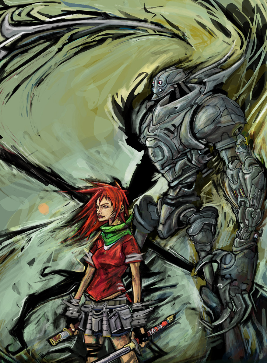
Concept Art for NTS.PS-CS
Related content


Comments: 39


awesome colors and cool drawing! *want a meka like this one to protect my room*
 (Wink)")
👍: 0 ⏩: 0


Very good, the only critique I have is that the left side of the blade could be daker/have a dark outline. Espesially since it seems that the lightsource is at the right?
👍: 0 ⏩: 0


pretty awesome
only thing i could criticise is the non-reflectzing robot-shell..
i LOVE robot shells.
 (Smile)")
👍: 0 ⏩: 0


Wooa~ Nice drawings you have there. It resemble those professional manga arts in magazines.
Well, a little comment on your drawing is that the space in belo the robot looks a bit out of position. I can't visualise it floating in the sky unless there are some booster of some sort to keep it in the air.
But overall, it's certainly a good and nicely brushed piece of work.

👍: 0 ⏩: 1
You are absolutely welcome. That's the most i can do.
👍: 0 ⏩: 0

Awesome, I love your clean lineart/painting with the textures!
👍: 0 ⏩: 1


👍: 0 ⏩: 1

I gotta colour that damn thing soon or it's gonna rot in my computer
")
")
👍: 0 ⏩: 1
yeah yeah!, and post it!...thats the best!
👍: 0 ⏩: 0


Busty chick riding a robot, you can't go wrong there. Excellent work
👍: 0 ⏩: 0


Another fine job bruddah. Nice to finally be able to work on your own peices again eh.
")
👍: 0 ⏩: 1
yeah, just getting started bra
👍: 0 ⏩: 0


Wow, nice textures. (I've really got to get around to unpacking CS^^) I like the camoflage print on the head of the mech. Looks like some crazymad cross between robocop and geiger's alien, in armour. But what do I know, I'm a girl. I like your fairly precise stlye of painting, and the use of highlights.
👍: 0 ⏩: 1
thanks, i love and have much fun making textures.
you should really get into cs..what a wonderful toy it is.
thanks for the great comments girl!
👍: 0 ⏩: 0

couple o' thoughts for ya, miro:
- The positioning of the girl's legs makes it look like the robot has no shoulders, like its a really thin robot. If the robot had shoulders then her legs would have to be really spread apart to be riding on the back like that - either that or they would have to be resting ON the shoulders. Anyways, this point is moot if the robot IS supposed to be narrow.
- Not really feeling the design of that mech - the head, arm and sword look menacing but the legs throw the whole design off balance. Guess this is more of a subjective issue than a technical issue.
Other than these things, I'm really feelin the colors you used. I dont agree with you that this is a flat 2d painting, cuz I see a lot of depth in the colors. I have one question, though - Why is it bright and sunny when the moon is out? It looks like maybe the sun is behind the moon, but if that was true, then the moon would be really dark in shadow (like in an eclipse). I'm sure there's a reason why you did that and I'm curiouse what it means.
Anyways, this is great work man. My favorite part is the texture of the blade. Excellent.
-Max
👍: 0 ⏩: 2
ahh...
that straightens me out.
I gotta hand it to you, Miro, when it comes to art styles, yours is definitely unique. And I guess because of that it requires a little more of an unconventional type of interpretation technique. Gotta say, though, it's great to see someone trying out new things. Makes us (the viewers) think a little more when we absorb your work.
keep us posted on ninja talkshow, aite?
Talk to u later,
Max
👍: 0 ⏩: 1
your the best!, keep up the crits brotha...keeps me on my toes.
👍: 0 ⏩: 0
thanks for the crits and comments.
im glad you enjoyed the blade and the color scheme.
however i dont agree with your view of my work. of course the robot looks thin cause its a totally stylized flat 2d design.
i added depth in the color to add even more style to the linework...im a fan of things that look different and have sick style.
this is not ment to be a technical or dynamic scene in a pinup or sequential.
think of it as a emblem or icon...a symbol..then it starts to make sense.
and the moon, thats called a IAM (inner atmosphere moon)-should explain that
only in the world of ninjtalkshow ?
👍: 0 ⏩: 0


*picks up my chin from my knee* yikes.. extremely good detail and excellent coloring! The bg is really awesome too! Very good job!
👍: 0 ⏩: 0

dont like the white outline
but its dope anyway
👍: 0 ⏩: 0


SICK GOOD PAINTED!
Insanely cool detail and shit... you know! Wicked good!
👍: 0 ⏩: 0