HOME | DD
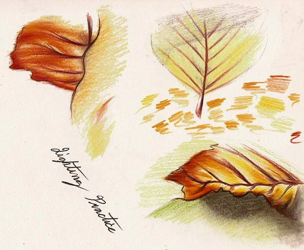
 Mitch-el — Coloring Practice - Leaves
Published: 2012-01-09 20:14:41 +0000 UTC; Views: 445; Favourites: 17; Downloads: 11
Redirect to original
Description
The original photograph which I referred to can be found here: [link]Coloring practice. I'm not very good, obviously, especially since I hardly ever work with color. Since light and how it plays upon various hues is what I'm interested in the most in the art world, however, I'd better get practicing sooner rather than later!
-- Mitch
The photograph referred to is © its respective owner.
Related content


Comments: 6

Overall


Vision
Originality
Technique
Impact
What I like overall about the way you colored this piece is the blending of different colors to create surfaces, and add a little depth, and I also saw that you were trying to use complimentary colors to add a little "pop" as I call it. I always try to use 2 complimentary colors with every piece I create whether it be on paper or on the computer. Its the same all around. One thing I would stress to you, that I have struggled with, and am still struggling with whenever I try to color drawings, is light sources, and core shadows. I know this is a basic drawing, but I would have still tried to color with lighter values closer to the light source and darker values vise versa, and if your leaves were close to the ground as the one on the bottom right seems to be, the shadows being casted by the leaf are 1: going to make a definite shadow on the ground, and 2; isn't necessarily going to be just a black shadow. I Don't know how you made the shadow under the leave on the lower right, but it seems like you put down a base green, then simply added black over the top. By all means I am not saying this is wrong, but if you would like to add a little more depth, to your drawings, you may try adding a little blue to your composition. The blue will both contrast with the orange, and it will add a little depth to whatever you are drawing. These are the only two things I would seriously stress at the moment, other than that, great work! Love the warm color choice, and keep practicing. I'm definitely not a pro, but I've been practicing for a long long time, and I'm still discovering things that help me out every day. I just hope some of my knowledge can help you out. e.deviantart.net/emoticons/r/r… " width="15" height="15" alt="
")
👍: 0 ⏩: 1

Hello there,
First of all, I'd like to thank you so very much for the critique! I truly appreciate it.
Hmm. Yes, I do tend to go for the darker colors over the lights, and this can mess up the composition if I go so far as to not stay true to the original photograph/whatever I'm referencing. As for the shadow, that green is actually another leaf, and the shadow is a shadow on that leaf that's being cast by a leaf from above (that's not shown). This makes things really confusing, seeing as I didn't render the other leaf. I probably should have cleared up this confusion in the "Artist's Comment" box. Sorry about that!
Blue. I didn't think of that. It contrasts with the orange, which is what I'd want. Thanks for suggesting that!
Once again, thank you so much for the comments and critique! I'll definitely keep practicing, and I wish you all the best in your artistic endeavors, as well.
-- Mitch

👍: 0 ⏩: 1

Thank you!
-- Mitch
👍: 0 ⏩: 0