HOME | DD
 Molkoo — Fresh Creative

Published: 2007-09-25 16:47:58 +0000 UTC; Views: 28345; Favourites: 227; Downloads: 1088
Redirect to original
Description
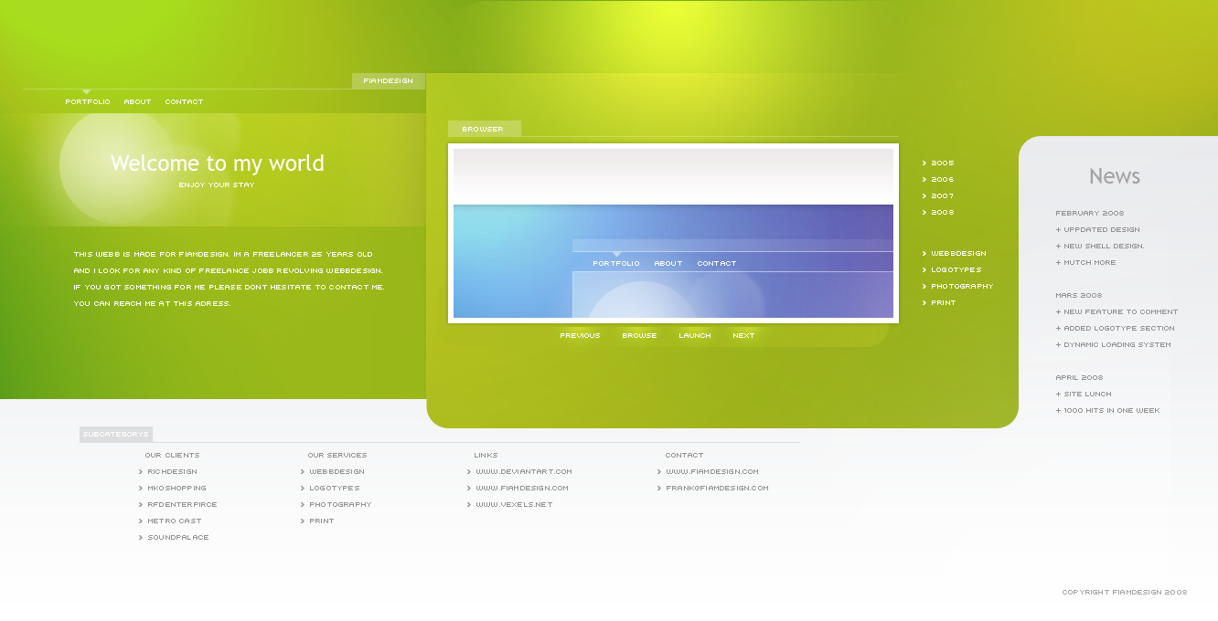
For sale.Send me a note if interested.
Related content


Comments: 33


For metropolis logo tools used ..... it's Tahoma.
👍: 0 ⏩: 0

Great layout but imo the help button is far to hard to read and help should be easier to find. Over all nice job.
👍: 0 ⏩: 0


 (Smile)")

")

nice and clean design... loved the header part the most although the readability of 'contact' and 'help and faq' is less...
👍: 0 ⏩: 0


These icons are made by [link]
They are called S.N.O.W.E.
👍: 0 ⏩: 0


 (Wink)")


The green boxes get progressively harder to read as they get brighter....
Other than that, sharp!
👍: 0 ⏩: 0

nice design, BUT you've to credit the author of the folder icons
👍: 0 ⏩: 1

there free icons.
I don't know who made them or I would have.
Sorry.
👍: 0 ⏩: 1
free for personal use :/
and the author is Sasha Höhne [link]
👍: 0 ⏩: 0

thje concept and the look are great but i think the writing on the right, you cant read soo god...
👍: 0 ⏩: 1
thanks.
ye it may be, its because certain monitors vary so on mine it looks fine so i had no reason to change.
But thanks for pointing that out.
👍: 0 ⏩: 0


