HOME | DD
 movezig — First half of unity project
Published: 2002-09-30 00:59:52 +0000 UTC; Views: 5494; Favourites: 65; Downloads: 388
Redirect to original
Description
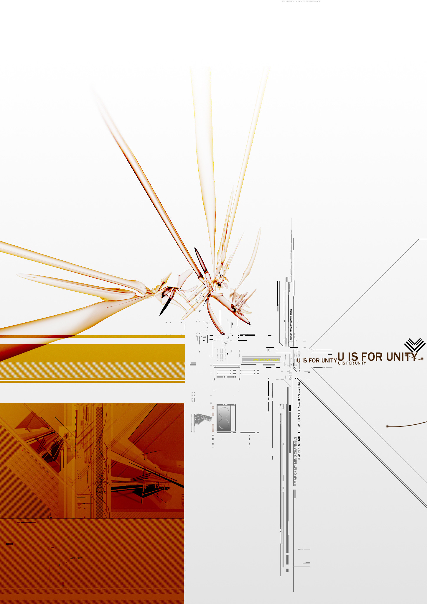
This is the top left half of the Unity project im doing for adentity.Related content


Comments: 83


ah, hey this is a pretty smooth design, I like all the lines and points. relly nice, clean work
👍: 0 ⏩: 0

I used this as a wallpaper for a long long time. Very detailed work. And such a lovely colour composition. It has a very silent feeling to it. One of my favourites from you!
👍: 0 ⏩: 0


you got a very nice design here.
nice arrangement, colors and balancing.
keep it up!
👍: 0 ⏩: 0

i have been looking at your work for a while now.but I have never left a comment.the reason is you seem pretty angry,and I just didn't want to jump on the bandwagon the truth is I love your work.I think I will start giving comments,because your work is [link] probably doesn't matter to you.I've talked enough.BTW this is another excellent piece.
👍: 0 ⏩: 0


WOHOOO ! this is kick as design man ! LOVE IT ! FAV +++++++++
👍: 0 ⏩: 0

Actually, if Y=55 then X = 2.5
Therfore, by the law of transitivity, if X = 2.5, then this whole thing is screwed.
👍: 0 ⏩: 0


wow thats a huge bitch but i like every pixel of it
👍: 0 ⏩: 0

Cool cool... I like the spaciality (if that's a word). The little bits of 2D everywhere look pretty cool.
👍: 0 ⏩: 0

Works great as a wallpaper for those of us who have 2 monitors!!!
👍: 0 ⏩: 0


This is very well excecuted and I really like the layout, however I have to agree with arch to some extent that there's not a great deal of innovation.
That said this piece still made me squeal with delight and I've added it to my favourites; it's very sexy.
👍: 0 ⏩: 0


The typo is extremely phat, as is the bottom left section + the ugly colour scheme works damn well here
top notch piece this...the whole poster is gonna be damn tight
👍: 0 ⏩: 0

excellent choice of colour and delicate details. intriguing !
👍: 0 ⏩: 0

You must be flattered by all of these comments...I am not so taken with this piece. The style has been done over and over. It was over done a year ago and now it's just plain common. But these people just keep eating it up so keep going. Daily Top Favorites is what is important anyways is it not?
👍: 0 ⏩: 0


WOW, that's some excellent design! i'd love to see more of this...great job!
👍: 0 ⏩: 0

great design
i really love the vector art
and the typo is reallt nice!
👍: 0 ⏩: 0

Arrghghg... i can't beleive you didnt post the whole damn thing!!!
anyways awesome stufff.
👍: 0 ⏩: 0


"2X+Y=55 if Y=50 then the whole thing is screwed" ha! i wish i could answer my homework like that! anyway, i'm not overly fond of the 3d in the top left, but i absolutely love everything else
::aria::
👍: 0 ⏩: 0


very sweet +favs no need for others comments apart from excellent
👍: 0 ⏩: 0

its good for what it is i guess, but im not really down with the whole eric jordan deal. if you want to see a REAL artist who actually started this trend, NOT ERIC JORDAN goto [link] ... yea techy is kinda gay and over played, no real art behind it, just designing the same thing ppl do over and over again.
👍: 0 ⏩: 0

Very nice piece...it's too bad Unity isn't implied anywhere in the image...it'd be nice if the type's message was reflected by the piece in some way.
👍: 0 ⏩: 0


very awesome chaotic style
that alone impresses me and grabs my attention
but the color usage in this is great too
the reds and golds mesh very well together over the white
great work!
👍: 0 ⏩: 0


the formula thing is pretty much the best part of this assembly of whatever
👍: 0 ⏩: 0

ooo, nice job dood. really nice elements and 3d here
👍: 0 ⏩: 0
| Next =>