HOME | DD
 mrgraphicsguy — fiveTimes
by-nd
mrgraphicsguy — fiveTimes
by-nd
Published: 2007-01-13 23:02:20 +0000 UTC; Views: 5490; Favourites: 54; Downloads: 259
Redirect to original
Description
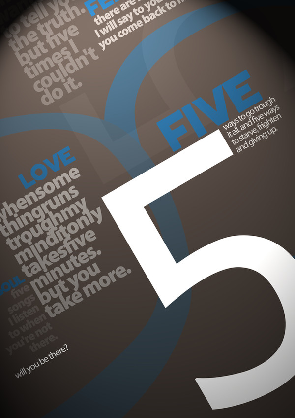
This one is influenced by one of my favourites. There's a contrast between cold design (colors, fonts) and very personal and emotional content. Hope you like it!Related content


Comments: 29


You misspelled "Through" unless you meant a "Pigs Trough."
👍: 0 ⏩: 1

Oh... didn't notice that! Thanks!
👍: 0 ⏩: 1

Love how everything is aligned to something else, designer's seem to forget that sometimes...But you didn't did you lol
👍: 0 ⏩: 1
Thank you... great that you spend some time watching on the alignments
👍: 0 ⏩: 1
can't help it lol The curse of a graphic designer lol
👍: 0 ⏩: 0


Ich habe eine Weile damit herumprobiert und bin doch recht zufrieden damit! Freut mich, dass es dir auch gefällt, dankesehr!
👍: 0 ⏩: 0


Goooood work!
Here's some good typo work!
[link]
ENJOY!
👍: 0 ⏩: 0

okay, was aber trotzdem komisch ist ist der Fakt, dass die Formen nicht zusammen passen. Also entweder "give up" oder alles im Gerundium...
Ich dich erst!
👍: 0 ⏩: 1
Nix is! Jetzt red dich hier mal nicht raus!
👍: 0 ⏩: 1
Was heißt denn hier rausreden? Als ob ich Ahnung von Grammatik hätte  (Wink)")
👍: 0 ⏩: 1
Da du mich ja dazu aufgefordert hast (selbst Schuld), beginne ich hiermit mit dem Rumkritteln:
"Five ways to starve, frighten and giving up."
Was genau willst du damit sagen?
Das passt irgendwie nicht zusammen.
Es müsste entweder heißen: "Five ways to starve, be frightened and give up." oder "Five ways to starving, being frightened and giving up."
Was aber auf jeden Fall zu "frightened" in diesem Fall offenbar dazu gehört, ist ein "be", da es sonst heißen würde "jemanden erschrecken", was aber wiederum nicht in den Kontext passt...
So, das fürs erste, jetzt muss ich mich erstmal durch die anderen drehen
*knutsch*
👍: 0 ⏩: 1
Ach Gertje, da fehlt die die künstlerische Dimension für ")
Alles klar?
Hab dich lieb!
👍: 0 ⏩: 0

Thank you very much! And thanks for the fav!
👍: 0 ⏩: 0

Well I really like this. Sometimes the use of grey looks very odd and boring but here in the combination with blue and white it's great! and I like the content as well.
👍: 0 ⏩: 1
Thanks a lot, darling  (Smile)")
👍: 0 ⏩: 0

 (Cool)")
Thanks a lot... and thanks for the fav as well!
👍: 0 ⏩: 0

I love the message that it has! Also very nice colors, you can really associate content with appearance. Great work!
👍: 0 ⏩: 1
I thought you learn for your exams as you told me before?
👍: 0 ⏩: 1
Well, I don´t have an exam tomorrow 
👍: 0 ⏩: 0