HOME | DD
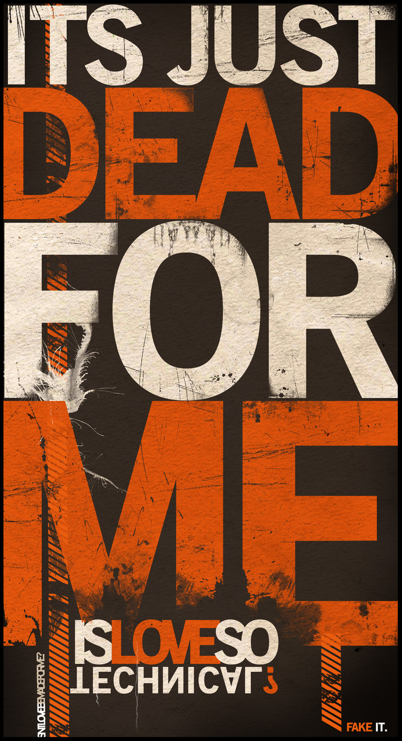
 mrgraphicsguy — technicalLove
by-nd
mrgraphicsguy — technicalLove
by-nd
Published: 2007-03-06 01:09:08 +0000 UTC; Views: 76128; Favourites: 823; Downloads: 2851
Redirect to original
Description
Re-submission. Yay!Another personal deviation. I used the proportions of my last submission and mixed the clean typo style with some grungy parts.
Maybe you'll get what the "gd" is about...
NOTE FOR ALL PRINT REQUESTS: dA won'T let me upload the current version as print, it's always the old one. I'm sorry for this and I'm working to fix that.
Related content


Comments: 90


Grime textures used WELL.. love the composition of the type too.. could definately see this as a poster! ^_^
👍: 0 ⏩: 0

This gorgeous piece has been included in Typographysical Appearance 3 as a part of *lucastomaszewski 's typography collection. If you have time, please do take a look as it features a lot of resources. I hope it would be useful to you, too, and I'd appreciate it if you leave a comment. Thank you for sharing your brilliant work with us!
👍: 0 ⏩: 0

Dropped on this while researching typographical poster designs via google. Loving the grungy feeling - it has that 'sprayed on the wall' air and is very urban. Basic colour sceme, but it's very nice.
👍: 0 ⏩: 0

amazing poster. if you haven't figured out the print issue yet, all you have to do is select the 'adjust image' option each size you wish to print it in, and it gives you an option to upload a new image for the print.
👍: 0 ⏩: 1

Well, thank you for that good advice! I'll upload the poster then later...
 (Smile) - :)")
👍: 0 ⏩: 0


this is amazing,you should make a tutorial on how to do this:]
👍: 0 ⏩: 0


Your poster has been featured on my blog see it here ")
👍: 0 ⏩: 0

Hey there!
I've featured you in a news article here: [link]
Hope you don't mind 

~Redeemer-of-light
👍: 0 ⏩: 0


awesome dude!
you really have to tell me how do you get the grunge effect and textures ")
👍: 0 ⏩: 0


hello. may i know what typeface is this?
btw i love the style of your work. Absolutely amazing! (:
👍: 0 ⏩: 0


Loving the distortions in the lower part of the M. But really, you ought to use "it's" instead of the possessive "its". No need to get your grammar wrong, even though it looks nice.
👍: 0 ⏩: 0


 (Wink)")


awesome job, but how do you make the texture visible on the letters? do you change the opacity of the letters or what ?
👍: 0 ⏩: 0


as I always said, you're the best typo artist of deviantART.
👍: 0 ⏩: 0


congradulations you have been featured here -> [link]
👍: 0 ⏩: 0


very very very good work
keep it up
i added it to my fav
👍: 0 ⏩: 1
Thank you very much, glad you like it
👍: 0 ⏩: 0


Thank you very much, mister!
👍: 0 ⏩: 0


| Next =>