HOME | DD
 mrtomone — Origami OS 2.4.1 - Concept Update
by-nd
mrtomone — Origami OS 2.4.1 - Concept Update
by-nd

#conceptos #origami #os #ui #windows #windows10 #origamios #beautiful #concept #conceptart #simplicity #uidesign #newbuild
Published: 2015-06-28 11:18:31 +0000 UTC; Views: 3453; Favourites: 26; Downloads: 64
Redirect to original
Description
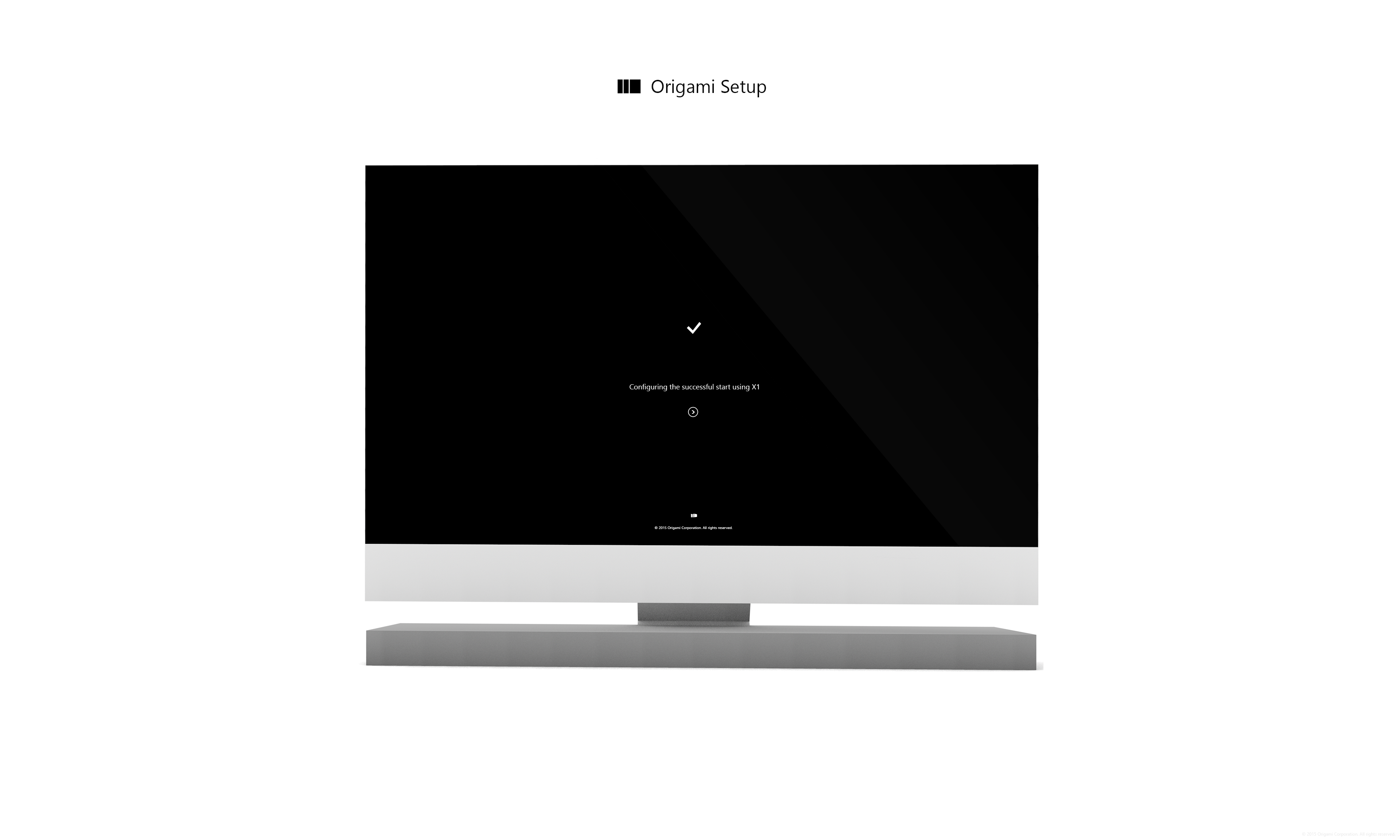
Origami OS 2.4.1 is the next update systems built on Windows.Inspired concept by: fav.me/d7r96y9
Inspired File Explorer: fav.me/d8j5ifk
Inspired Notepad: fav.me/d8l16lu
If you liked this concept a look at my gallery and you'll find many podobmych and interesting concept
©2015 Origami Corporation
Related content


Comments: 16


looks like a possible* windows 10 desk modding setup
*except the login screen
👍: 0 ⏩: 0

Because the windows were inspired your work  (Smile)")
👍: 0 ⏩: 1

Yeah, that's totally ok, but seems like you forgot to give any credit...
The File Explorer and Notepad app are NOT from this concept: fav.me/d7r96y9
Here are the original work:
File Explorer: fav.me/d8j5ifk
Notepad: fav.me/d8l16lu
So, fix this please
 (Wink)")
👍: 0 ⏩: 1


")
I understand that it look delicious
👍: 0 ⏩: 1

Podobają mi się projekty Eksploatora i Notatnika, choć oby dwie te aplikacje mogłyby nabrać trochę koloru. Instagrama nie używam, więc nie mogę się wypowiedzieć, jednak przeniósłbym ten pasek na prawą stronę, zostawiając lewą dla menu Start i innych systemowych aplikacji.
A okienka 'Remote Display' wogóle nie rozumiem.
👍: 0 ⏩: 1
Jeśli chodzi o aplikację Instagram to jest ona żywcem wzięta z mobilnej najnowszej wersji więc jej funkcjonalność jest bez zmian, natomiast jeśli chodzi o przenoszenie tych aplikacji na prawą stronę to faktycznie miało by to tak działać, że po przeciągnięciu ich kursorem miały by się tam umieszczać i nie zajmować miejsca innym operacją, które miały by być wykonywane.
Jeśli chodzi o okno Remote Display to wstawiłem je tam tak po prosty żeby nie zostawiać pustego miejsca.
👍: 0 ⏩: 0

Beautiful as always. Personally I think that this wallpaper is not as good as the last one, but I do like the small ui touches all over. The apps look very consistent (file manager + notepad) with the similar two contrasting gray colors. I love it.
")
👍: 0 ⏩: 1