HOME | DD
 MStout — Dillinger Escape Plan Design
Published: 2005-09-13 21:49:16 +0000 UTC; Views: 637; Favourites: 0; Downloads: 44
Redirect to original
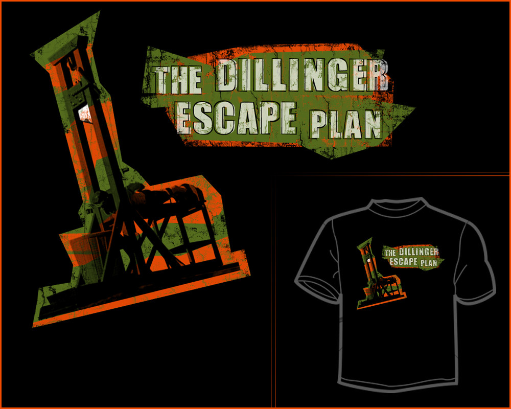
Description
Another random idea I had, and "executed".Enjoy!
EDIT:
This lettering looks 100% better, now that I took my time. Hope you like it more too.
Related content


Comments: 13

don't like the band, but that's a killer design for a shirt!
👍: 0 ⏩: 1

Thanks...I think theyre messy as hell, so I dont like them either. Nothing fits, but theyre hardcore so I made a shirt that would fit for them.
👍: 0 ⏩: 0

Thanks man...Im changing the text though I think.
👍: 0 ⏩: 1

something a little less futuristic would be better i think. but not comic sans. please.
👍: 0 ⏩: 1
Ahaha...thats the most worthless font ever. Im done already though, about to resubmit.
👍: 0 ⏩: 1


of course, i wouLd have made the L's the biggest Letters...
i Love your coLour choices!!
the guiLLotine was a LoveLy touch.
i think the onLy thing i'd change is the coLour of the Letters, that way the bLade wouLd be the onLy white thing & it wouLd stand out more.
but that's just me.
good work, hun.
👍: 0 ⏩: 1
Thanks, theres reasoning for the white letters cause I wanted them both to kinda stand out. Maybe black with a white stroke would be better. I will have to try things. Maybe push them closer to the dead man too.
👍: 0 ⏩: 1
yeah, i knew you wanted them both to stand out. Looks great the way it is, but wouLd Like to see your bLack with a white stroke idea. cLoser to the dead man wouLd be better, i think.
👍: 0 ⏩: 0