HOME | DD
 Multi-Dimension — Multi (Happy Pills Inspiration)
#happypill #happypills
Published: 2018-08-15 15:42:03 +0000 UTC; Views: 475; Favourites: 15; Downloads: 0
Redirect to original
Description
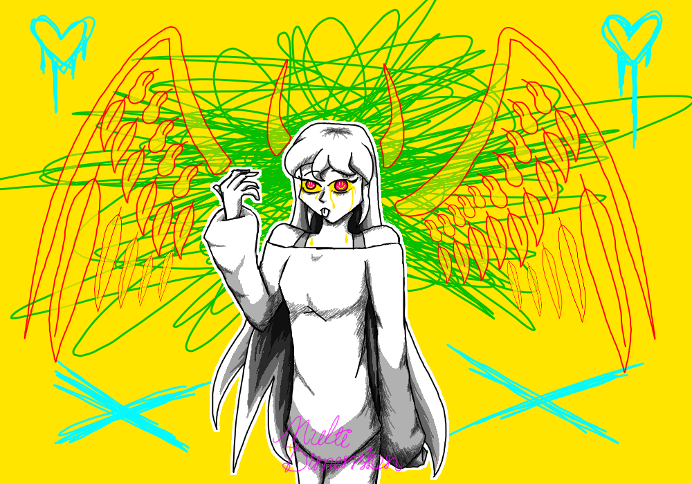
I TAKE MY PILLS AND I'M HAPPY ALL THE TIME~~~Hi everyone! It's MD! I'm going nuts with art... this i'm happy though! I was looking at animation memes, and this version:
www.youtube.com/watch?v=9LF-im…
So it inspired me to draw Multi with a new style of using pixel shading and see how that goes.
I simplified the wings so it reduces the time i need to spend on it, and i didn't color her hair mainly because I want the background colors to pop out more.
The horns and the wings are her powers (more on that in the bright future), her wings are supposed to be bigger than shown here, but this is for simplicity haha.
Time: ~ 3 hrs (shading took me a while)
App: FireAlpaca
Music Inspiration: www.youtube.com/watch?v=y_0CCL…
Character:
Multi (mine) - toyhou.se/2213631.multi
Do not steal, trace or claim this as your own. Please ask for permission before using this art for any purpose or credit me.
Related content


Comments: 10

Hello from ProjectComment
What I liked about your art:
I love how you drew your character. It looks traditional put onto a digital background. I love how the eyes have smiley faces in them as she’s crying yellow.
What i think needs fixing:
The scribble of green must go. It distracts the viewer. Yellow background is good but with the character being white\gray\black it a bit bright and can hurt the eyes. You also need to fix the wings, the lines look wiggly and kind of gives the impression that you gave up.
If you want to keep the green scribbles maybe enlarge the line and make it thicker then use a blur and blur the green a bit. Also the wings, i don’t know if you intended this but with the lines going through them it looks like leaves. I would also recommend looking up references for female bodies. Reason for that is her top part looks great, it’s her lower half that needs work. The hips are a bit small for a female but then again i’ve seen females like that. And that shirt [if it’s a dress it’s way too short] is a bit long. Now the legs. One is larger than the other.
What i realized:
After reading the title i now understand the crazy background but you can still have such with a darker tone.
👍: 0 ⏩: 1

starting from the background, i completely agree that the green could be blurred out. The wings are hard for me to get right, that could be changed if i had more time...
For my OC's anatomy, i messed it up on purpose, for i was trying a new art style and since she took a happy pill, everything's out of shape and for the camera/audience, so is she out of shape. Her shirt/fleece was designed to pass her hip and be a little more long until it nearly passes the crotch. The leg was one large one small because i was intending to make her look like she's walking, and now i think that's unnecessary haha!
Thx for ur time, i appreciate your comment!!!
👍: 0 ⏩: 0

Hi, i’m not the best reviewer and i’m a horrible speller. So sorry if you can’t understand this. I hope this helps, even a little bit

The artwork is… Not bad but in my personal opinion, not that good. It’s the colors that really make it go from ‘this is pretty cool’ to mem. It starts to hurt my eyes after a while and maybe that’s what you were going for. Then you did great. But I feel like having the vary nice black and white line work then NEON BRIGHT BACKGROUND, brought it down a few notches.
With the background, The yellow would be good if it wasn’t so bright, maybe a little to the white side (Not full on white but lighter basically) Then the BRIGHT NEON BLUE just makes it destrating and the piece would be better without them. I get it’s for edgy effects (which i’m a big fan of) but maybe for this pic not to have them, or at least maybe in side of the green we have the heart and x behind her.
For the green, it could be a darker color so it makes our eyes go to her face and not the the hearts and x.
The wings are… Could be better if the line work was consistent. I really like the idea of the feathers not connecting and being on there own. But I would try to make them a little more spread out, just a bit. Make all the feathers the same or consistent. For the top feathers look weird.
I vary much like the horns and that the inside of them (horn and wings) are faded, and just slightly so it’s a great effect in my opinion.
Now the person. I’m not one who should give advice on anatomy. I’m learning as well and is horrible at it. But if there’s something I can say it that the shoulders are a bit to wide. And the body is a bit to long. Simple fix. Also make the hips wider.
The hands are pretty good. It’s hard to draw them but I would try to stay consistent with them because some fingers look like blobs attached to each other.
The shading is well done, although there is some parts that could be lighter (Like at the vary top of her sweater) But other then that the combination of lines and normale shading, it’s really cool and bring it to life.
I really like there design and big sweater + the hair, although the face could have softer line work, it’s vary out of place with all those elegant covers and then, the face.
The eyes are my favorite of this piece. The little smiley in them, honestly is a vary smart choice. (Although one of them have too thick of lines, but it’s a simple fix).
Then the crying yellow is really, REALLY cool and makes me go ‘wow.’.It stand out and direct the eyes to them. (Although it’s kind of hard to pay attention to them, as I said before, because of the background)
Over all, 6/10. It would be 8/10 but the background. Don’t get me wrong of course. Background are hard to do, take if from someone that sucks at them.
A lot of time and efforts has obviously been put on this and I can’t wait to see more from you. I can see your art going great places ^^
👍: 0 ⏩: 1
Thank u so much for ur feedback!! Come to think of it, yea the background could change a lot... I was rushing the background and honestly the wings. I didn’t thought that I would add so much details in the art. The anatomy of my OC was actually purposed to be out of shape, ‘Cause my understanding was that the pills make people hallucinate, so her figure goes out. Shading yea I agree there’s places to improve...
thx so much for the comment it means a lot to me! I will improve after this!
👍: 0 ⏩: 1
Yeah background with some can eather be good, or just rushed it for the sake of having a background XD
With the anatomy part, I can see that now, although maybe you could make it more wasky if that's the case, but I can see what you mean.
I'm glad I can help! ^^ love to see more from you!
👍: 0 ⏩: 0

"'Cause I'm having a good time, I'm having a good time!"
👍: 0 ⏩: 0

I must've drank too much tea, and now I am seeing stuff.
👍: 0 ⏩: 2
