HOME | DD
 MyBrilliantArt — Vento

Published: 2011-11-24 20:06:56 +0000 UTC; Views: 2053; Favourites: 72; Downloads: 1
Redirect to original
Description
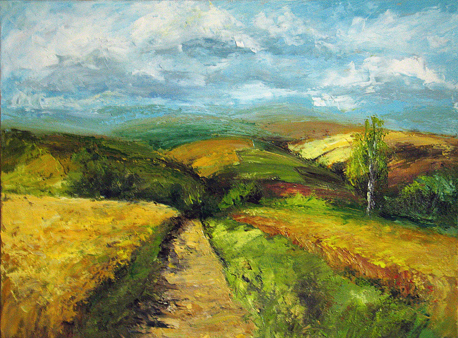
Oil on canvas, brush and knife.80 x 60 cm.
Made from a photo taken in Tuscany.
* You can buy this painting on [link]
Related content


Comments: 43


Beautiful. I love the rich colours. The quirky trees are kinda like Van Gogh, no? Brilliant  (Wink)")
👍: 0 ⏩: 1

Thank you! 

👍: 0 ⏩: 1
Woo, 2 points to me! But yeah, great job.
 (Smile)")
👍: 0 ⏩: 0


I love the colours and the texture. The road seems a little out of place for me because it lacks the textural quality of the rest of the painting.
👍: 0 ⏩: 1
Thank you!
👍: 0 ⏩: 1
I can understand that. The lack of texture just keeps drawing my eye to the road and for me puts an emphasis on an area you might not have meant to emphasize.
👍: 0 ⏩: 1
I'm not sure I can entirely get what you mean...In my head the road is supposed to be as important as a background so I wanted it to stay flat. I would like eye of an observer was attracted by whats in relief and not by what is not. Maybe the grey of the road is too dark..
👍: 0 ⏩: 1
For me the fact that the road has no texture while the rest of the painting is extremely texturized puts an emphasis on it. From the small view I don't have this problem because the texture isn't readily apparent and I don't think it is an issue of colour because the thumbnail looks cohesive.
👍: 0 ⏩: 0

nice work, reminds me ALOT of van goghs trees. Looks great! ")

👍: 0 ⏩: 1
This is true, the trees are totally inspired by Van Gogh! I'm very glad that you saw the similarity! Thank you!
👍: 0 ⏩: 1


Thank you very much Teresa!
👍: 0 ⏩: 1

You're most welcome Silvia!
👍: 0 ⏩: 0


