HOME | DD
 mynti — The Space Between v2
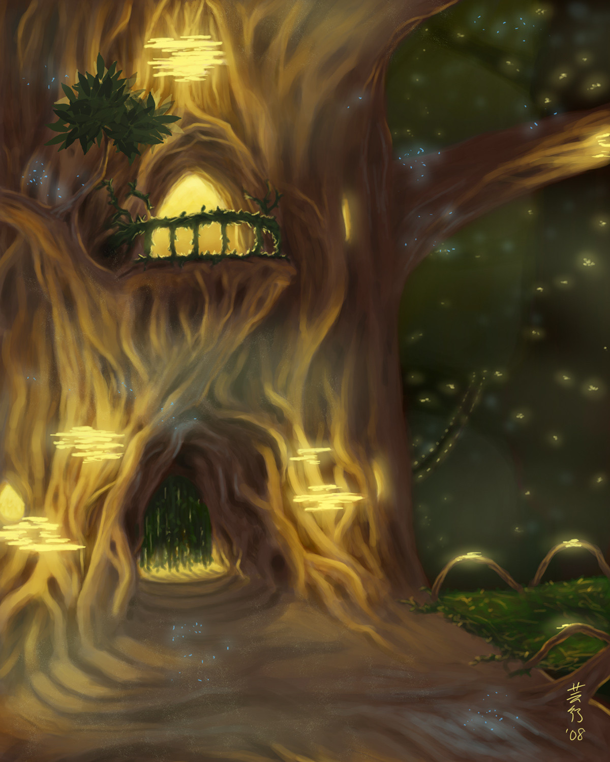
Published: 2008-11-29 11:03:29 +0000 UTC; Views: 3959; Favourites: 131; Downloads: 0
Redirect to original
Description
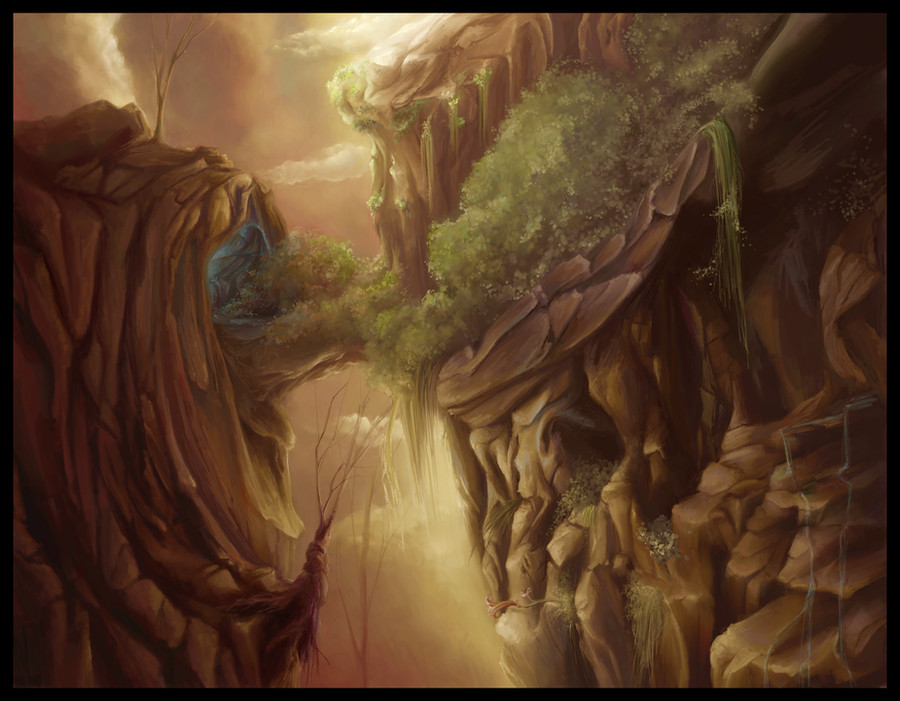
This is a play on the older painting of mine, "Space Between". Looking at the print, I thought it too dark, so I'll do a test of this and see what I think
Changes:
Some color work + curves.
Which do you prefer? mynti.deviantart.com/art/The-S…
Related content


Comments: 32


Wow! I prefer this one... the way that you placed the light adds a lot of depth to things, somehow. I love it!
👍: 0 ⏩: 1

Thanks, sometimes it's worth it to go back when you realize something is not quite right.
👍: 0 ⏩: 1
No one is 100% perfect all the time!
👍: 0 ⏩: 0


In answer to your question, they are both very good, but I do prefer this one. I agree with you about the other being too dark, but having said that, if you hadn't posted this version as well, I wouldn't have said that that one was too dark( 

👍: 0 ⏩: 0

I was wondering around in your gallery and saw this... strange... you have so many favs on other works and for example on traditional art or pieces like this you don't have... Sadly I'm a little disappointed from the dA community, however, everyone has a different taste. I'm afraid that there are too many ppl though who just watch what others like and they "like" it too - that is the disappointing party. Sorry for that comment on such a beautiful piece... And one more thing - I don't know why but I think you will really like the works of one artist that I really love If you have some free time check his gallery and hopefully you can recognize his talent... I've written a really strange comment, sorry bout that. Wish you the best of luck, hun!
👍: 0 ⏩: 2
I accidentally sent that too soon ")
👍: 0 ⏩: 1
Well, I've never taken anything connected with the internet too seriously... it's meaningless knowing that 99% of the communications are artificial, etc.  (Smile)")
👍: 0 ⏩: 0
Oh I know, but that's okay. Digital is best viewed digitally, and traditional is best viewed in person. This is how it will always be, it is the nature of specific mediums.
When you turn a work from its original medium into a reproduction (and this happens slightly with digital, but moreso with traditonal) it loses some of its appeal.
I'm not worried, my originals sell, so this is what matters
👍: 0 ⏩: 0

I really like how you have all the reddish tones, and then you have that small dash of glowing blue from that little cave there

👍: 0 ⏩: 0

i don't know bout u guys but i prefer this one, i don't know why but i just do....
👍: 0 ⏩: 1
Thanks
👍: 0 ⏩: 1

Really enjoy the first one. The other one is completely different in atmosphere, and I like that one as well. Prefer this one though
👍: 0 ⏩: 0

Here, the colours are richer.
Anyway, a sunny day light won't suit this painting, because it could lose its "magic".
👍: 0 ⏩: 1
Hmm... but the key is, which do you like better my friend?
👍: 0 ⏩: 1
I choose old version 
👍: 0 ⏩: 0

this one, the illumination on the rocks makes the piece IMO.
👍: 0 ⏩: 1
Yar, thank you for letting me know 
👍: 0 ⏩: 0


I prefer the old one, the darkness gives it a bit more atmosphere
👍: 0 ⏩: 1
Hm, I prefer the old one onscreen, but if you saw the print... well, the darkness makes people turn it all directions, 'cause they don't know what they're lookin at 

👍: 0 ⏩: 1
Ah, I can imagine..
Well, this one would definitely have more details in the shadow areas than the old one.
👍: 0 ⏩: 0

Yeah I have to say I do like this one better as well
👍: 0 ⏩: 1
Thank you for the imput! I think I do too
👍: 0 ⏩: 0

You've chosen the perfect colors for this.
It looks amazing.
👍: 0 ⏩: 1
Thank you. I do think it looks better now
👍: 0 ⏩: 0

I think so too
👍: 0 ⏩: 0