HOME | DD
 Myroux — Waiting for the Next Joke -WIP
by-nc-nd
Myroux — Waiting for the Next Joke -WIP
by-nc-nd
Published: 2010-08-27 01:29:36 +0000 UTC; Views: 746; Favourites: 5; Downloads: 0
Redirect to original
Description
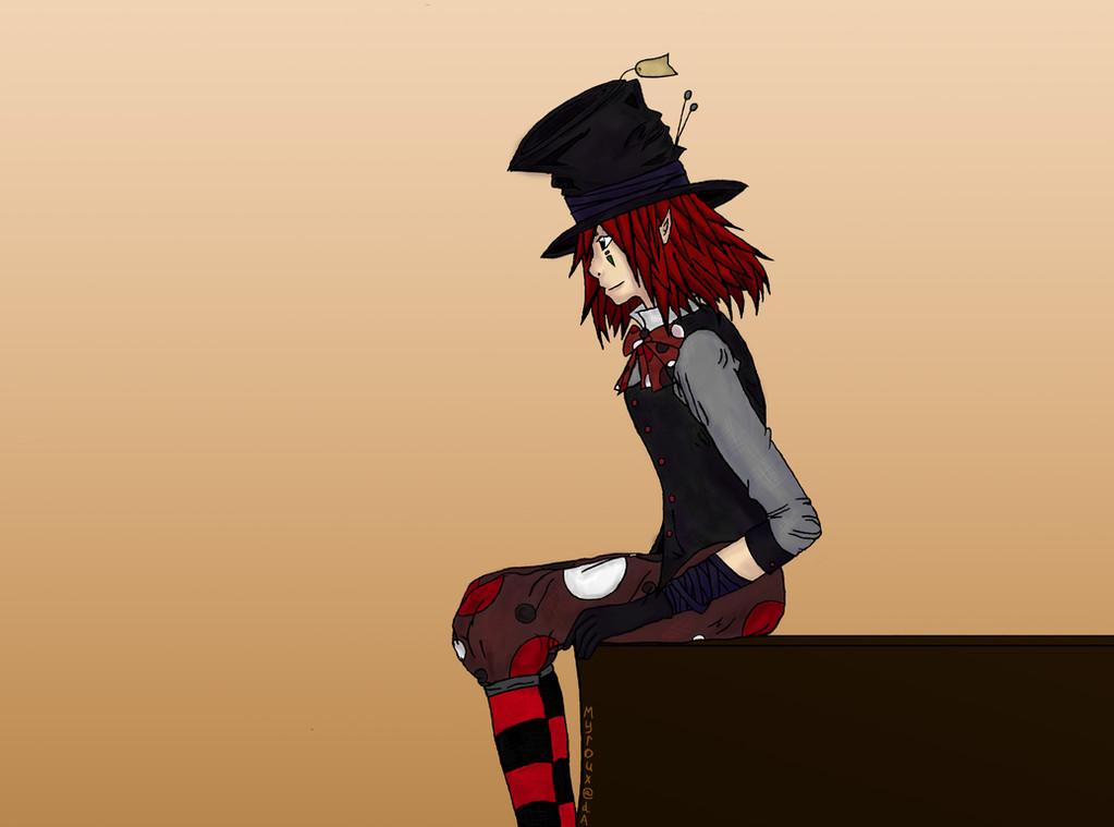
Inspired by both the Joker and Alice in Wonderland's Mad Hatter.When a friend saw this, uncolored, he immediately exclaimed "it's Michael Jackson!"
I don't see it. O_o;
I'd love critiques, I want to improve this if I can.
If anyone has a better idea for how to put a signature on the image that would be hard to remove, this one's just temporary - I don't want art thieves stealing my stuff.
If you see this on ANY other site, tell me. No one has permission to use this as a background or anything without asking, and I'm not on other art sites now, so tell me.
EDIT: I fixed the proportions of the arm (thank you for pointing it out!) and redid some of the coloring subtly, mostly the hair.
---
Time: Approximately 8 hours to color; outline time not included
Tools: Photoshop CS4, Wacom Intuos 4 Small tablet, pencil, sketchbook
Related content


Comments: 8

")

I'd like some context in the image (the plain gradient is fine for say, a character sheet, but if you're aiming for an art drawing, backgrounds can prove helpful). He's staring very intently (at what?) and is sort of sitting somewhat... tensely (that is to say, the position is not relaxed, as would be an average human of that stature sitting. If, as you say, he was about to get up and do something, context then becomes /essential/). I would also argue that the composition would be better (more effective, dramatic, et cetera) if he weren't in profile. And then there are my usual issues with strict cartoon proportions, but I'll not bother.
👍: 0 ⏩: 0

As soon as i gazed at this it was as if he stood up, like you caught the moment before he stood to attention, very well done.
👍: 0 ⏩: 1

Thank you! Yes, he was about to get up and do something (I don't know what) in my mind.
👍: 0 ⏩: 0

Anatomy's a bit wonky (arms too long, for one), more shading, needs a more direct lightsource, a more detailed background would be excellent, same for whatever he's sitting on.
👍: 0 ⏩: 1
I used a proportion guide, and since manga proportions aren't the same as normal ones, I'm pretty sure the arms are okay...but I could be wrong. You're right about the shading and detail, I'm working on it.
👍: 0 ⏩: 0

your lines are pretty neat, to get a straight line you can click+hold ctrl (I think) or shift.. i can't remember cuz i do it withotu thinking. and drag to get a verical or horizontal. or click + hold ctrl, then click another spot to get a diagonal. your colour scheme is good, it matches. try getting shading in with the airspray brush (or w/e is called) and set the opacity low so you can work in the shades. otherwise, just practice! it's a good piece, littlte tweaks here and there will help you get better. lol at my bad description.. this is why i dont' make tutorials. ppl wont' kno wwhat i'm talking about
👍: 0 ⏩: 1