HOME | DD
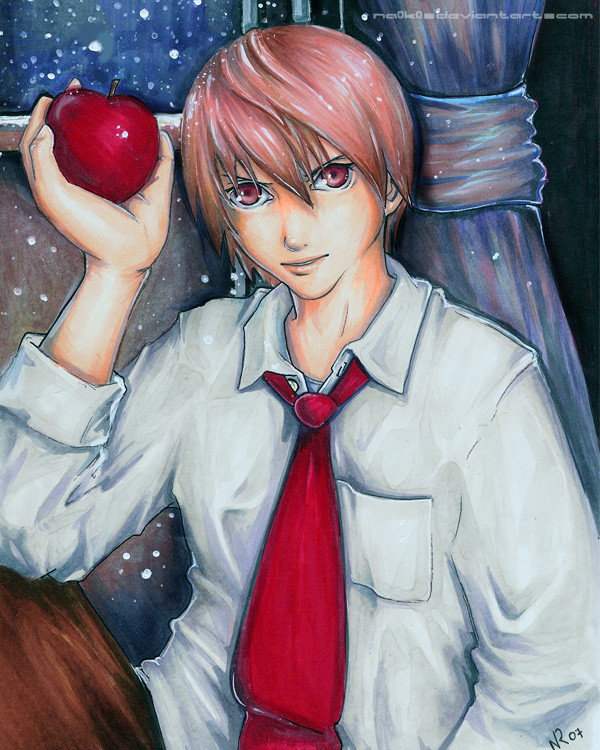
 NA0K0 — DeathNote: Light
Published: 2007-01-24 06:42:54 +0000 UTC; Views: 1059; Favourites: 43; Downloads: 16
Redirect to original
Description
Mm. Raito.Prisma & Copic
Related content


Comments: 16


Wow! This artwork looks really awesome! The colors here are amazing!
👍: 0 ⏩: 0

When did you do this?!?!?!?!?!?!?!?!?!?!
Very nice.
👍: 0 ⏩: 0


Overall, I like this. The hand holding the apple looks too big for the arm. It looks like a realistic portrait. This is colored and shaded well, and I like how the folds in his outfit and how that apple is done.
👍: 0 ⏩: 1

Gah, I know! His right hand is like twice the size of his head. Freakish little thing. I always seem to misjudge my proportions when I'm doing lineart. I don't notice them until I start to color/shade, but then, of course, it's blindlingly obvious. ;___;
Thanks for the comment!
👍: 0 ⏩: 1

oooh! You got the perfect mixture of evil and innocence - just gorgeous!
👍: 0 ⏩: 0

I will never get over how sexy you make the hair look. ")
👍: 0 ⏩: 0

wow, neat colouring (I'm in awe of those folds)  (Smile)")
👍: 0 ⏩: 0

I LOVE how you draw him. He looks so devious, but kind of nice as well, like he actually is -- part angel, part devil.
And you have a tremendous command over copics. Wow.
👍: 0 ⏩: 0

i think you should maybe make the background a little darker so Light will stand out more

👍: 0 ⏩: 0

