HOME | DD
 Namelessblob — Research Purposes: PLEASE VIEW
Published: 2009-12-01 01:04:10 +0000 UTC; Views: 636; Favourites: 6; Downloads: 12
Redirect to original
Description
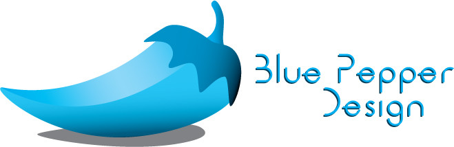
PLEASE READ THIS!!!Alright, I’m planning on starting to do freelance stuff soon, and I came up with the idea of marketing myself as a ‘company’ of sorts. I figure it might give me some more credibility, present myself professionally and give me the opportunity to do some branding.
So this is the logo I came up with. First I’d like you to comment with what you think of it; what it reminds you of, if it’s good/crappy, how the colors affect you, what the title reminds you of, anything. I’m trying to get some in-depth feedback on this from all sorts of people with all sorts of backgrounds to make this the most effective logo/branding I could do. PLEASE COMMENT FIRST BEFORE READING ON!
Secondly I have written below what I was trying to achieve in this logo.
Objectives I was going for:
Personal
Professional
Thorough
Friendly
Potential to work with other people/expansion
Name does not confine to one medium (web design,print…
 (Wink)") )
)Memorable/stands out
I’m specifically unsure about the text, so comments on that would be appreciated. Also, by some chance you want to favorite it, please wait. I will be making a ‘commercial’ DA account for this to use as an online portfolio of sorts, a link to which I will post in a journal on this DA account as soon as I finalize the logo.
Please tell me what you think! Anything is GREATLY appreciated.
Related content


Comments: 14

Hi! I came back for more
well I can't comment on the color... because I can't really see colors too well... But for me when people say pepper I picture more of a bell pepper (maybe that's just a northeast thing?)
and for me I think that it would be more interesting and fun if the words were somehow combinded with the pepper... it being separate kinda gives me more of an industrial feel more than friendly
To comment on the font itself... I had no problem reading it and I think it's cool
<3
 (Smile) - :)")
👍: 0 ⏩: 1

Awesome! Thanks for stopping by and looking at my other stuff.
Also, I REALLY appreciate you taking the time to comment on this; you can see that there weren't a whole bunch of people who gave me the in depth responses I was looking for. So thank you for that.
I hold nothing against you for not being able to see color.
In lieu of that, if you check out my latest journal you'll find a link to the new DA account I was talking about with a vastly updated pepper logo. Check it out if you like, and feel free to comment there too!
Thanks for you time friend!
👍: 0 ⏩: 0


The white/blue combo is too sterile. Too clean. I want to see your talents flowing, with all sorts of zazzy colors and designs, or maybe a single bold image with good background.
The pepper itself looks almost amateur. Though I personally know that you decided to create this as is, I do not believe it a potential client will appreciate this, and instead will take you for just that, an amateur.
As for the words, I'm 50/50 on the font. Taking off the front of the words was neat, though sort of hurts it's legibility. The most important letters in a word are the first and last. Maybe tone it down. Once again, the color bothers me.
Overall, if you're shooting to show off straightforward business graphic design as a service, you may have achieved that. But to anyone looking for a bigger package, as in some creative savvy, you aren't portraying it, and I KNOW you have that to offer. I'd either go more cartoony, with cell shading and such, or go more detailed, like a high rez 3D render, etc. Your logo will in essence be the first part of your portfolio that a client sees (unless they discover you from seeing a project you've already done). Don't ruin the first impression.
👍: 0 ⏩: 0

the text and image could be integrated together better.
the pepper as a logo by itself makes me think of chili's, and the text just sits there and does nothing, so it doesnt really fit. Its interesting but just doesnt fit with the design. its really plain and boring to behonest, nice looking, but is rather stagnate.
Also, since the text is your original design, which is fine, make more space between the tail of the e and the crossbar on it. if you minimize it it will dissappear on you and thus will no longer look like 'e' but like a cirlcle with a line in it.
the blue is a nice calming color, but its just kinda there, it doesnt say 'hey come and get me' like i'm sure you'd like it to.
try experimenting with different colors or color schemes to see which draws the most people mmkay. ^__^
good luck noah~! [i hope this is helpful]
👍: 0 ⏩: 1
For sure. Thanks a whole lot for the suggestions! It means a lot to me that you actually went to the lengths to read the thing and then post a thought out response. Good stuff. Thanks!
👍: 0 ⏩: 1
ofcourse, you wanted that kind of info so you got it [not to mention taking the same class right now and being told that stuff two days a week, its good to share the wealth.]
also the logo doesnt really fit you personally... like.. why did you choose a pepper to represent you? Are you spicy? Hot Stuff? ...etc? -doesnt really see the connection-
think about that stuff too. ^__^

👍: 0 ⏩: 1
I am currently re-working the style of the logo; making it more 'fun' and 'creative' looking (kinda a drawing/cartoon feel).
As for the origins of the pepper: it goes waaaay back to freshman year in robotics. My first real shot at 3DS was making a similar pepper. I rendered it and put it in a MS paint file, slapped a title on it and BOOM! Essentially my first computer based graphics work. It has significant history, and I think the pepper (along with the abstract color) is creative/fun and does what I want.
Again, THANKS for the feedback.
👍: 0 ⏩: 1
aahhh I see.
interesting, interesting~~
just be sure to make it different from the chili's pepper -nod nod- dont wanna have a mix up and someone thinking you stole their logo or something >__o;;;
maybe try stylizing it a bit, liiiike instead of a whole pepper like a more... calagraphic looking one [just a suggestion, its your logo you can do what you want of course ^__^]
good luck~!!
👍: 0 ⏩: 0

I like it....But the text is very distracting and takes away from the work. Also what font are you using?
👍: 0 ⏩: 2
I love the blue pepper! Its fun.
👍: 0 ⏩: 0
It's a custom font I created from scratch. Yeah, I'm not sure what to do about the text, but I think that the title needs to be in the official logo...
👍: 0 ⏩: 1
Try Helvetica for the text. It seems to go with every thing.
👍: 0 ⏩: 1
Ha ha. Helvetica is probably the coolest font ever created, but unfortuantly it's been over-abused because of that. I try to use it somewhat sparingly when I can.
👍: 0 ⏩: 0