HOME | DD

nanokostudio — The Desert Arch

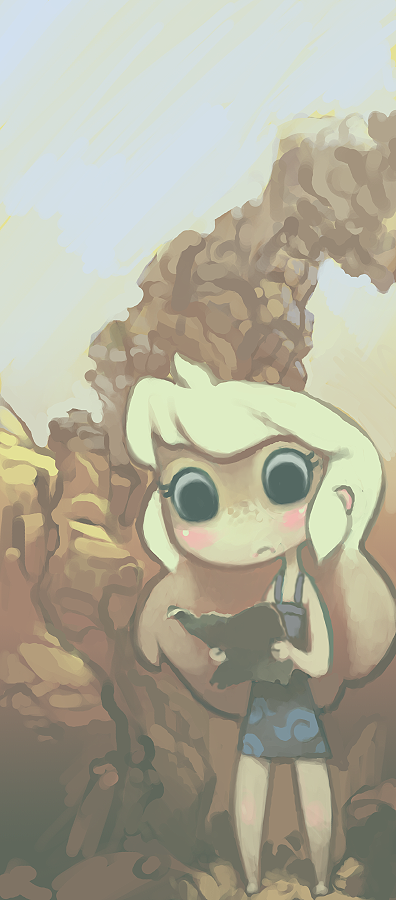
Published: 2008-06-11 07:37:56 +0000 UTC; Views: 5099; Favourites: 155; Downloads: 115
Redirect to original
Description guh im rusty havent done illustration in a while.
sorry everyone ill be posting more and improving.. just rusty.
Related content
Comments: 50

flipskip [2009-12-29 02:47:38 +0000 UTC]

I like this a lot. If I could paint like this while rusty, I'd be very happy.

👍: 0 ⏩: 0

ReiNoKage [2008-06-16 18:41:59 +0000 UTC]

Is this a character of yours?

👍: 0 ⏩: 0

Catiris [2008-06-15 22:07:23 +0000 UTC]

your style is getting better & better
Love the deep, musty shading...

👍: 0 ⏩: 0

FargalEX [2008-06-12 12:01:40 +0000 UTC]

Yessssss, the colours are perfect again. Good to see you're back. Beautiful work.

👍: 0 ⏩: 1

nanokostudio In reply to FargalEX [2008-06-12 18:57:14 +0000 UTC]

aww thank you! <3

👍: 0 ⏩: 0

RadioactiveZombeh [2008-06-12 06:18:30 +0000 UTC]

I love the soft, smooth style it has. Makes it feel more comforting, and children story like.

👍: 0 ⏩: 0

Dagwin [2008-06-12 03:59:08 +0000 UTC]

Hooray! I missed your art

👍: 0 ⏩: 1

nanokostudio In reply to Dagwin [2008-06-12 06:21:48 +0000 UTC]

<3s im back

👍: 0 ⏩: 0

meatsucks [2008-06-11 19:57:48 +0000 UTC]

ah I love the soft colors you used.

👍: 0 ⏩: 1

nanokostudio In reply to meatsucks [2008-06-12 06:26:50 +0000 UTC]

Im very glad you like them! <:
Thank you very much!!

👍: 0 ⏩: 0

Thiefoworld [2008-06-11 19:52:21 +0000 UTC]

I love the soft colors

👍: 0 ⏩: 1

nanokostudio In reply to Thiefoworld [2008-06-12 06:26:33 +0000 UTC]

Thank you very much!!!

👍: 0 ⏩: 0

AxelVIIII [2008-06-11 18:25:22 +0000 UTC]

I like the colors. They really work.

👍: 0 ⏩: 1

nanokostudio In reply to AxelVIIII [2008-06-12 06:26:24 +0000 UTC]

Im very happy you think so!! <:

👍: 0 ⏩: 0

faroresama [2008-06-11 17:09:07 +0000 UTC]

man i have no idea how you get such paintbrushy strokes and color blending in photoshop. especially on those rocks...so pretty! ;_;

👍: 0 ⏩: 1

nanokostudio In reply to faroresama [2008-06-12 06:26:04 +0000 UTC]

Use a brush with fixed size and hard edges, it helps alot : D
also map Transparency to your pressure sensitivity.


Thank you very much!!!

👍: 0 ⏩: 1

faroresama In reply to nanokostudio [2008-06-13 04:04:20 +0000 UTC]

cool thanks for replying!

👍: 0 ⏩: 0

Tonikop [2008-06-11 16:23:52 +0000 UTC]

I feel like doing an illustration based on this now

👍: 0 ⏩: 1

nanokostudio In reply to Tonikop [2008-06-12 06:24:42 +0000 UTC]

please do!!!!!!

👍: 0 ⏩: 1

nanokostudio In reply to nanokostudio [2008-06-12 06:24:50 +0000 UTC]

I'd love that!

👍: 0 ⏩: 0

elithespork [2008-06-11 16:23:50 +0000 UTC]

I love the painting style; it's sketchy, yet nicely drawn.

👍: 0 ⏩: 1

nanokostudio In reply to elithespork [2008-06-12 06:24:36 +0000 UTC]

Yeah i was kind of rushing near the end, but im very glad you like it!

👍: 0 ⏩: 1

elithespork In reply to nanokostudio [2008-06-12 11:14:23 +0000 UTC]

It doesn't look rushed, it looks purdy like that. :3

👍: 0 ⏩: 0

ZEBES [2008-06-11 16:08:38 +0000 UTC]

damn your pics are so cool!!!

👍: 0 ⏩: 1

nanokostudio In reply to ZEBES [2008-06-12 06:24:13 +0000 UTC]

Im glad you like them!

👍: 0 ⏩: 0

Light-Archangel [2008-06-11 15:18:02 +0000 UTC]

aww! sweet sweet! I love her expression! a beautful job!

👍: 0 ⏩: 1

nanokostudio In reply to Light-Archangel [2008-06-12 06:24:05 +0000 UTC]

Aww thank you very much! It is very much appreciated!

👍: 0 ⏩: 1

Light-Archangel In reply to nanokostudio [2008-06-24 16:07:49 +0000 UTC]

You're welcome very well deserved please keep on!

👍: 0 ⏩: 0

adoublesea [2008-06-11 14:53:28 +0000 UTC]

Your style + your colors =

👍: 0 ⏩: 1

nanokostudio In reply to adoublesea [2008-06-12 06:23:25 +0000 UTC]

Thanks so much!!

👍: 0 ⏩: 0

sircrust [2008-06-11 14:39:54 +0000 UTC]

Your style is so unique!

👍: 0 ⏩: 1

nanokostudio In reply to sircrust [2008-06-12 06:23:12 +0000 UTC]

Aww thank you!

👍: 0 ⏩: 1

sircrust In reply to nanokostudio [2008-06-12 14:25:39 +0000 UTC]

👍: 0 ⏩: 0

SteveonSeeley [2008-06-11 12:55:52 +0000 UTC]

She's very cute! I love the pale color scheme.

👍: 0 ⏩: 1

nanokostudio In reply to SteveonSeeley [2008-06-12 06:23:05 +0000 UTC]

Im very glad you like it!
thanks!!

👍: 0 ⏩: 0

Mafer [2008-06-11 12:21:11 +0000 UTC]

aah i love it,nice choice of colors<3

👍: 0 ⏩: 1

nanokostudio In reply to Mafer [2008-06-12 06:22:50 +0000 UTC]

Thanks very much! It is appreciated!

👍: 0 ⏩: 0

glamacabre [2008-06-11 09:36:41 +0000 UTC]

This is beautiful!

👍: 0 ⏩: 1

nanokostudio In reply to glamacabre [2008-06-12 06:22:24 +0000 UTC]

Thank you very much! (:

👍: 0 ⏩: 0

mukkuru [2008-06-11 08:24:20 +0000 UTC]

This is adorable! I'm such a big fan of your style!

👍: 0 ⏩: 1

nanokostudio In reply to mukkuru [2008-06-12 06:22:16 +0000 UTC]

Thank you!!

👍: 0 ⏩: 0

CelestialValkyrie [2008-06-11 07:48:53 +0000 UTC]

this is beautiful<333 seeing your works me all giddy inside

👍: 0 ⏩: 1

nanokostudio In reply to CelestialValkyrie [2008-06-11 07:49:34 +0000 UTC]

awww thank you <3s!

👍: 0 ⏩: 1

CelestialValkyrie In reply to nanokostudio [2008-06-11 08:02:45 +0000 UTC]

X3

👍: 0 ⏩: 0

Dogidillo [2008-06-11 07:46:02 +0000 UTC]

Still sexy, mi amiga.
Only thing I see that's really as bad as you make it out to be is that the rocks could be simplified quite a bit.

👍: 0 ⏩: 1

nanokostudio In reply to Dogidillo [2008-06-11 07:48:31 +0000 UTC]

wait the rocks should be simpler?

i thought they were way to simple as they are now...

👍: 0 ⏩: 1

Dogidillo In reply to nanokostudio [2008-06-11 18:03:40 +0000 UTC]

Well, simpler in form, uh... like... here, lemme show you: [link] (hideous attempt)
But right now the shading on it is hard to read anywhere except on the right because of the details and um stuff.

👍: 0 ⏩: 1

nanokostudio In reply to Dogidillo [2008-06-11 21:14:34 +0000 UTC]

ah. yeah, the leser detaild parts are mostyl just because i was kind of rushing it.

👍: 0 ⏩: 0

L-nay [2008-06-11 07:39:16 +0000 UTC]

Cute! I like your style.

👍: 0 ⏩: 1

nanokostudio In reply to L-nay [2008-06-11 07:41:02 +0000 UTC]

thank you very much!!

👍: 0 ⏩: 0