HOME | DD
 Nanuka — Commission :: The Oracle

Published: 2009-05-02 01:11:37 +0000 UTC; Views: 431; Favourites: 17; Downloads: 3
Redirect to original
Description
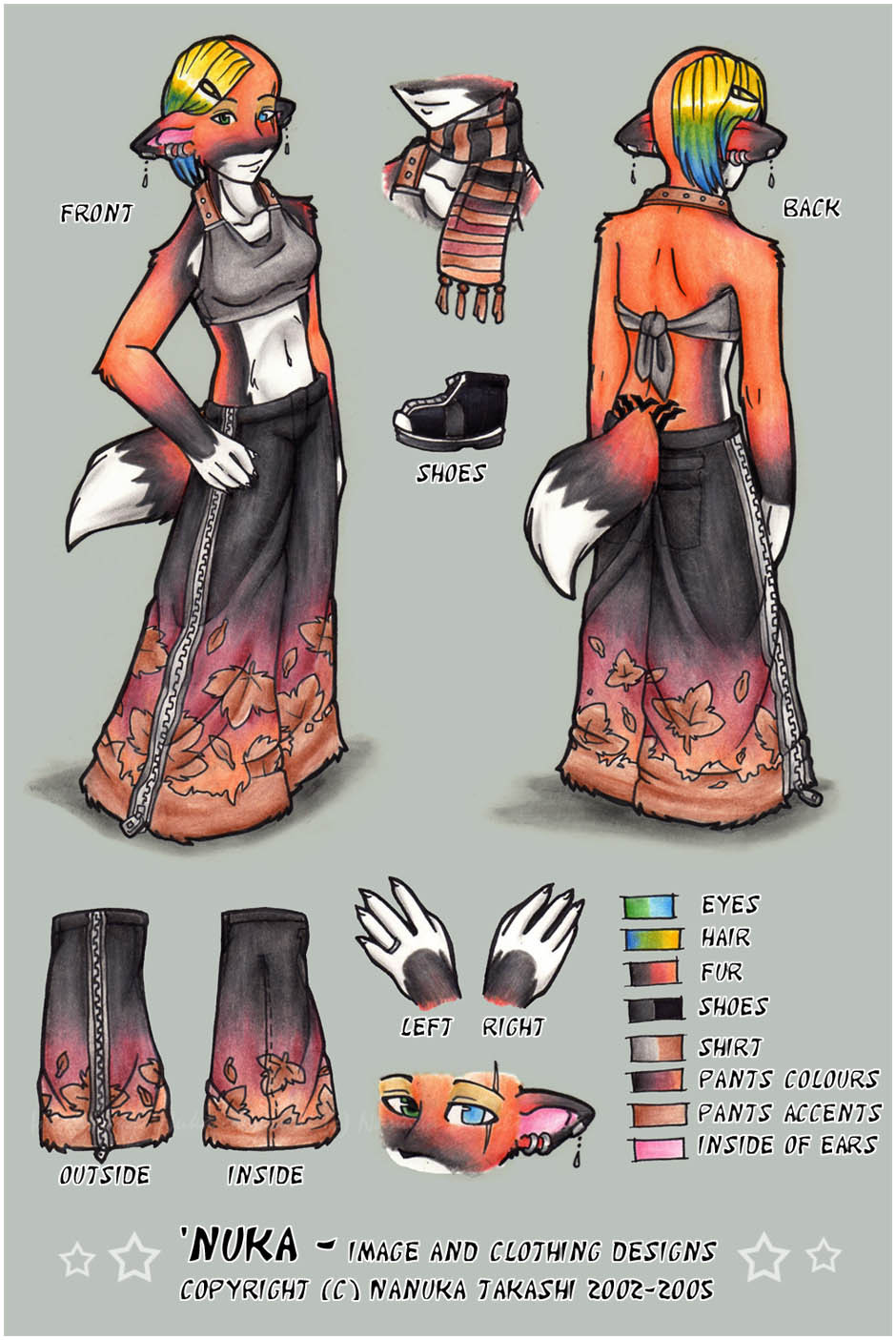
 (Smile)") Mixed-media piece for *TheOracleDragon !
Mixed-media piece for *TheOracleDragon !The original piece is just...gorgeous, which had me really happy - but once scanned I made a sad face. It really ate the yellows, hardcore. :/ They're not that IN YOUR FACE, more of a pastel feel & fade (used Cream and Deco Yellow for most of it). There are 4 wings to the side, but you have to look like an idiot and turn your head down and to the left to even see 'em. lmao.
Also, can't say I have experience in making 4 eyes look attractive. :c
• Images & artwork copyright © Nanuka Takashi - 2009
• Character(s) etc. copyright © Their respective owners.
• Please DO NOT alter, edit, copy, trace, redistribute!!
→ Like my art? I do commission work! [ Click For Info]
Related content


Comments: 5

Late comment, but I really like this piece. The yellows look good on both my monitors, very subtle and pretty. The whole thing looks very delicate. I love the composition with the wings on one side and the box on the other side. (Admittedly, it reminds me of swiss cheese, but REALLY AWESOME swiss cheese)
👍: 0 ⏩: 0

")

looks awesome nuka. and your right about the wings XD. My sister just looked at me funny cause I was turning my head to the side to make it look darker. Im sure it looks wonderful in RL >^^<
👍: 0 ⏩: 1


👍: 0 ⏩: 1
Yea I find that the photos I take of WIP look more like the original then when I scan it.
>^^<
👍: 0 ⏩: 0