HOME | DD
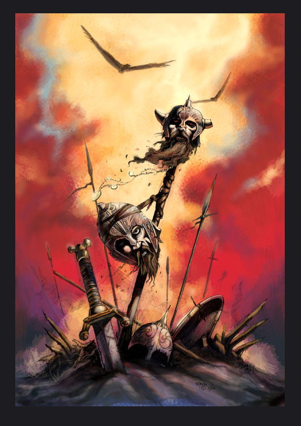
 NathanRosario — Vanquished-Colored
Published: 2006-05-24 02:01:28 +0000 UTC; Views: 4449; Favourites: 71; Downloads: 219
Redirect to original
Description
This started out as a sketch in my drawing pad. See [link] here.I then transfered the sketch onto drawing paper and fleshed out the picture.
Finally I brought it into Photoshop and added the colors.
The strokes on this are very loose, trying to hang on to that sketchy feel. Don't know if I pulled it off.
C+C is always welcomed.
Related content


Comments: 52

Great use of contrasting colors. It clashes, which makes this work look more chaotic and agressive. The red stands for the battle, and the blue for the silence after it. Great work.
👍: 0 ⏩: 1

Thank you very much!
👍: 0 ⏩: 0

amazing work ! You have a hell of an imagination !!
👍: 0 ⏩: 0


")

I think this is awesome...thoose details and colors are great.
👍: 0 ⏩: 1
Thank you, glad you liked it! It was a fun piece to paint.
👍: 0 ⏩: 0

wow dude this looks amazing!!!
not anly is the idia great but the colour o_O!!!
awsome man!
im starting to paint now but choosing the coulores is the worst part!
maybe u could chek it out when its finished
")

👍: 0 ⏩: 1
Sure, I'll be glad to check out whatever your coloring.
You know what I did for this one. I made a copy of the picture in PS, and shrank it. Then I added some fast colors on the small picture, without zooming in. When I like what I had I moved the colored layer to the original image and streched it to fit. I then painted the details and clean up over the new layer. Maybe something like that could work for you.
👍: 0 ⏩: 1
thanks for the advise man!
ill defenetly try it...
👍: 0 ⏩: 0

Great lines and amazing colour. That is really awesome... are those vikings though?

👍: 0 ⏩: 1
I wouldn't say they are Vikings. Just fantasy races.
👍: 0 ⏩: 0

No crits here. You did a bang up job, Nathan. Has a really solid feel to it.
-chris
👍: 0 ⏩: 1

")
By sketch I mean that it was just a rough small drawing. There was no real planning just putting down a rough idea. Done fairly fast with a pen so that I stay loose, since with a pen I can't correct the picture. I have drawing pads full of them, most are not very good, but for me is a great way to visualize on paper what might be in my head.
👍: 0 ⏩: 0

Dios!!!! Esta aun mejor. Pinta todos tus trabajos, hermano
👍: 0 ⏩: 1


Excellent work, really like hoiw everything is in the center of the picture. Taht awesome kind off light-smoke... beautiful! Nice feeling and nice textures as well!
👍: 0 ⏩: 1

Whoa, cool. I love the composition here, all the various angles fit together perfectly, right down to the two birds in the sky. Great work.
👍: 0 ⏩: 1
Thank you very much for the kind words!
👍: 0 ⏩: 0

Very cool! I have a different view on the background than many of the others who commented. I think it's looks dirty because of the dust and ashes form the battle. Being close to the heads, we see them clearly but it's a very dusty and dense battleground. So the image looks fine by me.
👍: 0 ⏩: 1
Thank you! It's funny how people interpret what they see differently from others.
👍: 0 ⏩: 1
Yes, I was surprised to see negative comments about the separation between the foreground and background, because I thought it was completely appropriate for the scene.
👍: 0 ⏩: 0

nicely done 
👍: 0 ⏩: 1
I wouldn't say that it was intentional. I did want a loose feel to the picture. But I am not sure if that was the best approach.
Thanks Chief!
👍: 0 ⏩: 0

Hey man nice piece, colors are nice and morbid as the should be seeing there are some chopped off heads. It does have a weird structural thing, the background is loose and the heads and other tidbits seem focused, almosty comicy if i might say so. Did you do this to avoid compition between the parts of the image? Anhow its a great picyure i mean who am i to judge? good stuff man, as always.
👍: 0 ⏩: 1
Thanks for the comments budd!
I wanted a loose feel to some extend because I wanted to capture the look of the sketch. But I'm not so sure that I pulled of what I wanted.
What I did manage to get out of this was that I used that technique from the guy that painted the wilder beast in that DVD you gave me. I painted the image first as a thumbnail and then blew it up. Overall I am happy with the color choice and the feel of the sky. Just don't quite feel it's there yet...
👍: 0 ⏩: 1
Youll get it, you always do!
👍: 0 ⏩: 1
anytime, so how many watches have you given the training video.
👍: 0 ⏩: 1
Watched it twice. It was good. If you have any more like that I wouldn't mind seeing them...
👍: 0 ⏩: 1
I don't think i have any more vids like that yet, i will keep you updated on anything that i find.
Hey, i just uploaded the professor to deviantart heres a link if you want to check it out.
[link]
👍: 0 ⏩: 0


I think it is definitely a great composition and sad to see Vikings decapitated. It's still kind of sketchy, but you probably could have been even a little more loose with it. Regardless it's pretty awesome.
👍: 0 ⏩: 1


it looks cool, though it doesnt look... um.. unido? its like the background its very sketchy, ok, but the lineart is very detailed... so the combination of both, i dunno... looks kind of weird... it looks cool, but weird at the same time.. hehe :/
👍: 0 ⏩: 1
The word you're looking for is "united" and I think that you have a strong point. I think that the background and foreground don't quite mesh together because of what you said and possibly because the lighting on the heads and gear does not properly reflect the ambiance light.
Thanks for the observation!!
👍: 0 ⏩: 1
hehe, yeah, you understood me correctly

👍: 0 ⏩: 0


| Next =>