HOME | DD
 neodesktop — AP_2
by-nc-nd
neodesktop — AP_2
by-nc-nd

Published: 2008-09-30 16:27:00 +0000 UTC; Views: 16511; Favourites: 17; Downloads: 2882
Redirect to original
Description
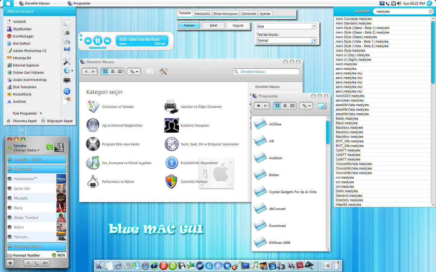
Only preview, release soon, enjoy.please write your comments..
Related content


Comments: 32

 (Smile)")


I like it, but the start button...
but the windows, taskbar....awesome!
Keep it up!
👍: 0 ⏩: 0

Very Much looking forward to the release of this skin!
👍: 0 ⏩: 0

in my opinion,
good:
low gloss taskbar
overall smoothness
shellstyle
bad:
start button
gloss on the sides of the windows
gloss on windowbuttons
white line around windowbuttons
light blue line around windows
there you go.
👍: 0 ⏩: 0

I look forward to your next visual style and for those icons. Finally an elegant looking visual style for Vista. I really hope you release this soon because frankly other visual styles i've seen are fine but don't compare to this.
👍: 0 ⏩: 0

i don't like the startbutton and the taskbar
they were better in the older screenshots
but everything else is just PERFECT
👍: 0 ⏩: 0

I really dislike the start button, it looks completely different from theme.
Text shadow improves readability, i'd live a slight one in (just my two cents...).
👍: 0 ⏩: 0


")


Make it thinner a thin substyle and make a start button with a grey circle beside it so it matches the whole theme.
👍: 0 ⏩: 0


IMO the original AP2 taskbar and start button was better.
👍: 0 ⏩: 0

i cant wait. this is shaping up to be a great theme. i hope u will release the browseui.dll mod
👍: 0 ⏩: 0

Looks Cool, nice and clean, will definetely go for this one
👍: 0 ⏩: 0

sol menü biraz daha farklı olabilir sanki. kesik kesik çizgiler pek hoş gelmedi gözüme. bi önceki çalışmanda da o bölüm biraz rahatsız etti
👍: 0 ⏩: 1

Mac mı abi bu, nerden koyayım çizgiyi, bastım tireyi işte, kısayol onlar sonuçta bişey ifade etmiyoki.
👍: 0 ⏩: 1
o tireli olan şeyi ben bölümler arası ayraç zannettim şimdi daha dikkatli baktım değilmiş doğru muyum ?
👍: 0 ⏩: 0

looks great, once again. Will there be a release with the new start button and the start orb from your previous release?
👍: 0 ⏩: 0


 (Wink)")


only back/ff buttons browseui mods.
👍: 0 ⏩: 1

myup, they are nice, and the fav links too, but i think i'll use the original shell not the gray one
👍: 0 ⏩: 0