HOME | DD

Nikeos — HardcoreDesigners.com by-nc-nd

Published: 2007-01-05 05:04:35 +0000 UTC; Views: 23397; Favourites: 205; Downloads: 852
Redirect to original
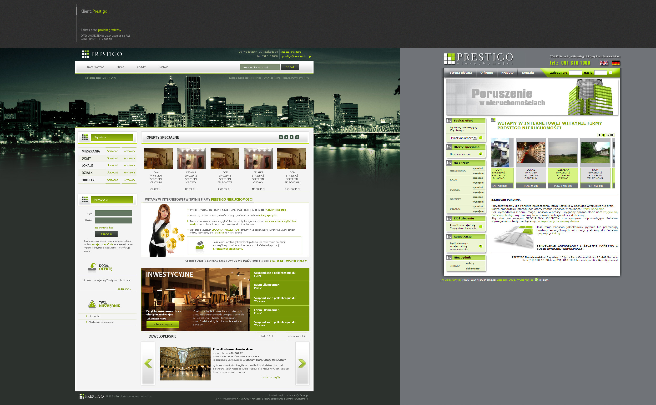
Description -


This is like DA for webdesigners... i'm aiming this


to a client\friend... and the logo will be added tomorrow...

see ya and please comment
Nikeos

Famine Creativity by Kwaku
eyes full of autumn sky by murrrzilka
Lonely by ninazdesign
Morko by Kakkr
Kashmir Project by Rasice
AOTM project by Kakkr
Related content
Comments: 52

BishanR [2008-02-27 10:54:14 +0000 UTC]

nice

👍: 0 ⏩: 0

mirisento [2008-02-14 13:39:17 +0000 UTC]

This is such a hot design !!

👍: 0 ⏩: 0

divineHeero [2008-02-09 21:18:51 +0000 UTC]

That's a fucking copy...
[link]
so if you haven't got imagination just stop designing and stop keep others ideas....

Heero

👍: 0 ⏩: 1

divineHeero In reply to divineHeero [2008-02-09 21:24:41 +0000 UTC]

Mmhhh maybe i've just speaked to fast.. maybe it's the other way and it's m-flash that copy your design... so ..

Heero

👍: 0 ⏩: 1

Nikeos In reply to divineHeero [2008-02-11 11:35:21 +0000 UTC]

yeah.. thanks for letting me know about this site...
they copied, not me

👍: 0 ⏩: 0

diverse08 [2008-01-29 21:59:02 +0000 UTC]

very nice ;]

👍: 0 ⏩: 0

zilwit [2007-09-09 18:09:23 +0000 UTC]

nice

👍: 0 ⏩: 0

osec [2007-08-17 00:24:01 +0000 UTC]

reminds me of my old AOTM design, but hey looks nice tho

👍: 0 ⏩: 0

jumomo [2007-06-17 21:36:27 +0000 UTC]

Where can I find it? URL not yet registered? Would I annoy you if I do?

👍: 0 ⏩: 0

prosp3ct [2007-05-30 07:05:14 +0000 UTC]

i love it

👍: 0 ⏩: 0

halfatoast [2007-04-22 17:46:38 +0000 UTC]

Nice one something that will come alive soon? Rly nice color scheme, 10 ++ and

👍: 0 ⏩: 0

Zidaantje [2007-03-18 14:24:02 +0000 UTC]

Nice, dark and cool. It's a bit crowded do.

I like the color scheme used.

👍: 0 ⏩: 0

cam07boy [2007-02-06 18:58:51 +0000 UTC]

i like

👍: 0 ⏩: 0

NDroid [2007-02-02 17:36:50 +0000 UTC]

awesome work.

👍: 0 ⏩: 0

Trippin13 [2007-01-24 02:13:29 +0000 UTC]

nice work !

👍: 0 ⏩: 0

Pazdan [2007-01-19 15:43:55 +0000 UTC]

yeah beautifull job

👍: 0 ⏩: 0

arbitrarynonsense [2007-01-19 04:26:18 +0000 UTC]

It is a bit busy and I had to search high and low for the login. I like it nonetheless, good work.

👍: 0 ⏩: 0

TwoDecks [2007-01-18 20:24:45 +0000 UTC]

Hmm. Tasty.
I like everything about it!

👍: 0 ⏩: 0

Fabi-FR [2007-01-18 18:50:50 +0000 UTC]

yeaahh it's amazing!

👍: 0 ⏩: 0

ElrondMcStyle [2007-01-17 15:53:34 +0000 UTC]

very good design!

I like it!

Elrond

👍: 0 ⏩: 0

cos [2007-01-17 05:30:20 +0000 UTC]

Great design! nice job on the colors and outer glows! Very Attractive!

👍: 0 ⏩: 0

tul [2007-01-06 17:54:14 +0000 UTC]

Nice work

👍: 0 ⏩: 1

Nikeos In reply to tul [2007-01-17 15:55:12 +0000 UTC]

i'm happy you like it

👍: 0 ⏩: 0

ShADowPr0ph3t [2007-01-06 03:23:54 +0000 UTC]

Love the colors. Great design.

👍: 0 ⏩: 0

fanzi [2007-01-06 02:29:21 +0000 UTC]

me encanta mucho lol its friggin awesome

👍: 0 ⏩: 1

Nikeos In reply to fanzi [2007-01-17 15:54:55 +0000 UTC]

I understand the frigging awasome part so 10x

👍: 0 ⏩: 0

Hyb9 [2007-01-05 21:48:12 +0000 UTC]

Inspiration is not necessarily a bad thing. It's a very nice design. But, I think what they are talking about is the feel of the site. And those small boxes that look like little lights.

Regardless it is original and very nice. Good job!

👍: 0 ⏩: 0

ZevuArt [2007-01-05 20:44:54 +0000 UTC]

Not so original, inspired by kakkr, but nice work.

👍: 0 ⏩: 1

Nikeos In reply to ZevuArt [2007-01-05 21:16:44 +0000 UTC]

If you think the interface is inspired by kakkr's, say you think it is, but don't say it like it's a fact.

Further more, I did the orange and light-blue like his AOTM, but nothing else...the structure is nothing like his, and everything else actually is my own style.

If you want you can enter my gallery and see everything is original and new... it's actually my interface-moto .

👍: 0 ⏩: 0

TazounsBones [2007-01-05 19:56:51 +0000 UTC]

Goodlookin' design.

Mind the width of the design though.
Not everyone has a 19" or 20" screen and text on a 17" at a higher resolution than 1024x768 can become less than readable. Resizing the text on the users end could mess up the design all together.

You could try making parts of this design collapsable.

👍: 0 ⏩: 0

Nikeos [2007-01-05 17:43:14 +0000 UTC]

thank you

👍: 0 ⏩: 0

osec [2007-01-05 17:29:34 +0000 UTC]

its ok.

👍: 0 ⏩: 0

setos [2007-01-05 16:46:45 +0000 UTC]

nice design

👍: 0 ⏩: 0

mD-06 [2007-01-05 15:57:52 +0000 UTC]

very nice love it

👍: 0 ⏩: 0

Nikeos [2007-01-05 15:55:56 +0000 UTC]

10x all... you are inspiring

👍: 0 ⏩: 0

Zionxxx [2007-01-05 15:17:06 +0000 UTC]

0o0o, i liike, looks inspired by kakkr

👍: 0 ⏩: 0

elusive [2007-01-05 15:09:24 +0000 UTC]

Similar to the project i'm going to launch. Great design

👍: 0 ⏩: 0

maxy-pl [2007-01-05 15:06:38 +0000 UTC]

before full size, i added it to favourites!!!!!! awesome work man!

👍: 0 ⏩: 0

3R-BizZ [2007-01-05 14:08:47 +0000 UTC]

nice work!

i like the colors and the contrast
+

👍: 0 ⏩: 0

richmtp [2007-01-05 13:34:33 +0000 UTC]

awesome!

just make the login boxes clearer, they are difficult to find!

👍: 0 ⏩: 0

Ironicph8 [2007-01-05 13:23:23 +0000 UTC]

were you going for "porsonal" just wondering?

👍: 0 ⏩: 1

Nikeos In reply to Ironicph8 [2007-01-05 15:57:10 +0000 UTC]

It's like your deviant page at DA...

👍: 0 ⏩: 1

Xelix In reply to Nikeos [2007-01-05 21:03:06 +0000 UTC]

I think he means to tell you that it looks as though it should say "personal".

👍: 0 ⏩: 1

Nikeos In reply to Xelix [2007-01-05 23:39:31 +0000 UTC]

ohhh.. LOL

👍: 0 ⏩: 1

Ironicph8 In reply to Nikeos [2007-01-06 01:47:23 +0000 UTC]

yes that is what she was going for thanks for the asshole comment though

👍: 0 ⏩: 0

shark-graphic [2007-01-05 13:06:40 +0000 UTC]

bravo !!

👍: 0 ⏩: 0

William-b [2007-01-05 12:56:49 +0000 UTC]

wow! very nice work

👍: 0 ⏩: 0

Mikekuul [2007-01-05 12:48:17 +0000 UTC]

You should make the login boxes a little easier to differentiate, but other than that nice work.

👍: 0 ⏩: 0

krazytim [2007-01-05 11:04:24 +0000 UTC]

Freakin' hot!

Excellent work.

👍: 0 ⏩: 0

ftstudio [2007-01-05 11:00:14 +0000 UTC]

nice job mr nikeos, i like the contrast between the black background and the red details i only think its a litle bit large, i use 1024x768, i think thats because you probably use a larger resolution, but its an awesome layout as aways

👍: 0 ⏩: 0


| Next =>