HOME | DD
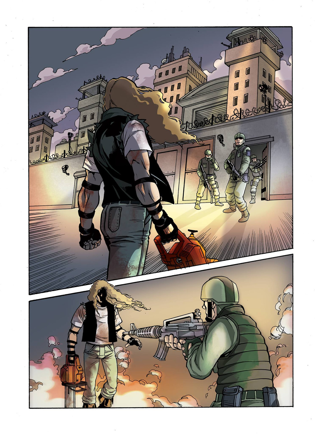
 Nippy13 — Color Test
#american #color #comic #dc #marvel #walkingdead #zombie
Published: 2016-03-16 20:12:35 +0000 UTC; Views: 2899; Favourites: 46; Downloads: 0
Redirect to original
Description
This is a color test i did for a comic...the lines are not mine...only the colors!Related content


Comments: 10

Overall


Vision
Originality
Technique
Impact
Looks all right. e.deviantart.net/emoticons/s/s… " width="15" height="15" alt="
 (Smile)")
My main critique is that the searchlight should be a lot brighter; the lens itself should have a white specular and I think the light beam could be placed over the line art. If you're using Photoshop I recommend setting the light to Overlay or Color Dodge and set it to low opacity / or feather out the beam as it leaves the searchlight. Obviously, you don't want the light to drown out the characters but it should go over some of the bg lines to really create that sense of depth in the scene.
Another cool trick you could consider is creating a faint fog between the characters, especially in the second panel to really separate the soldier from chainsaw dude. This would go over the line art as well, but would require a little finesse (I recommend using Layer Mask to control where the fog covers the arm but not the M-16 rifle) Again, it's another neat way to create depth in the scene.
Hope that helps. e.deviantart.net/emoticons/s/s… " width="15" height="15" alt="
👍: 0 ⏩: 0

Well, it a nice comic illustration, but the searchlights should have sort of lens flare, to give sort of dramatic feel. Still, a well done artwork.
👍: 0 ⏩: 1

")

Looks excellent! My only critique would be that if you're going to put the characters face in so much shadow that you may have wanted to continue that intense shadow to the entire character. His face looks very intentionally hidden.
👍: 0 ⏩: 0

Dang. I thought it was a scene from "Kingdom Hearts" you did.
👍: 0 ⏩: 0

