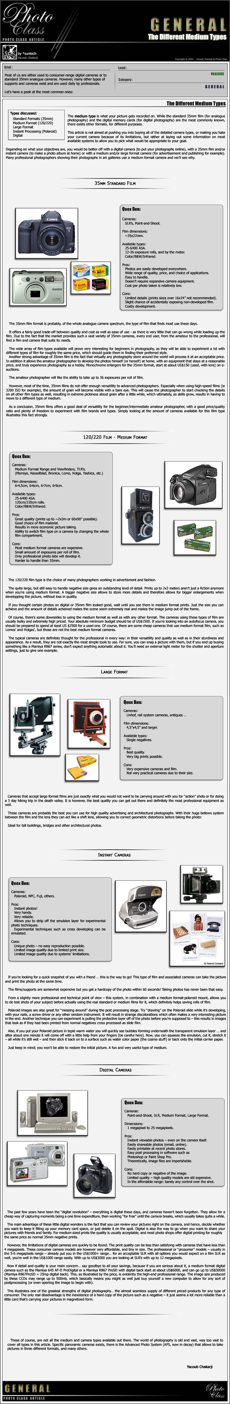
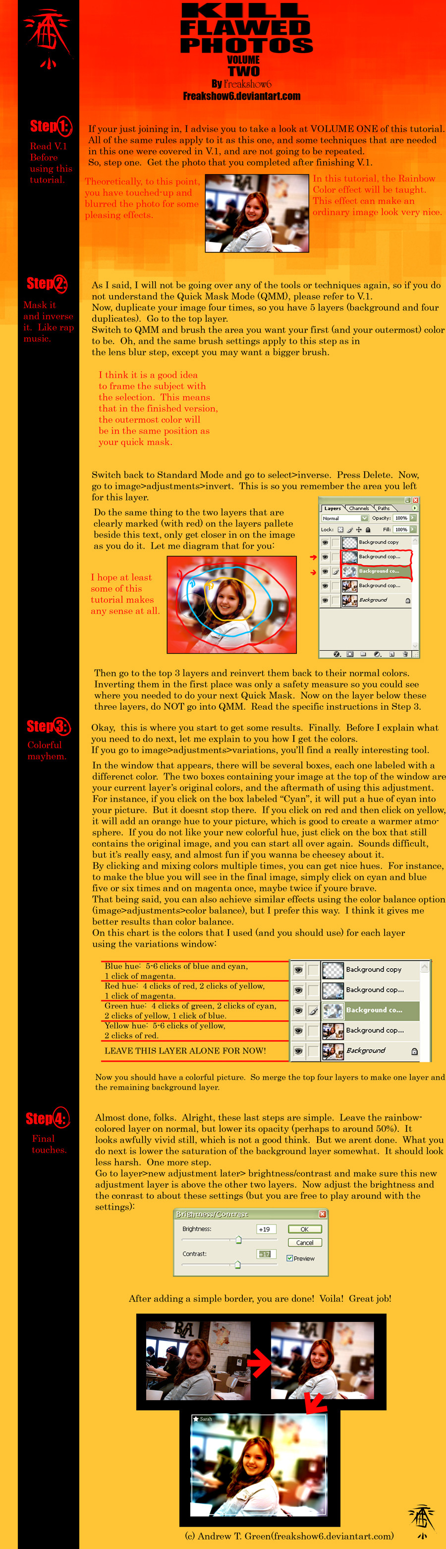
HOME | DD
 nobstutorials — 'PlaceScrolls' Site Design

Published: 2007-12-28 15:02:27 +0000 UTC; Views: 2911; Favourites: 14; Downloads: 145
Redirect to original
Description
Another practice design... Nevermind the quality of photos plus I was too lazy to finish the right (third) content block, mainly aiming to establish a balanced layout...I think it came out nicely, what do you say?
Related content


Comments: 24


Thanks for nice feedback my friend, I surely will
👍: 0 ⏩: 0

 (Wink)")
Thanks ")
👍: 0 ⏩: 0


Thanks a lot for your nice words
👍: 0 ⏩: 0

Did you make that all in Photoshop? If so, would you be willing to make a tutorial on how to make web stuff like that? I would love to learn how to.
👍: 0 ⏩: 1
It's all done in photoshop, yeah - and this design is in fact quite simplistic.
I actually had plans to make a lot of tutorials on layouts and such but I'm taking a little pause in my tutorials/weblog project, sorry... I'm planning to return to intensive blogging / tutorial writing by the end of January '08, so stay tuned and I promise you will not be disappointed
👍: 0 ⏩: 1
Cool. Are there any tutorials that you know of that I could use to improve? I can't wait for the tuts.
👍: 0 ⏩: 1
Well, did you check psdtuts.com? They have very nice tuts, not exactly web-design centered, but very cool, must see... Also, I like tutorials from webdesignerwall.com, very good stuff too...
👍: 0 ⏩: 0

This is a really nice design. There is only one thing: you used some lines that are barely seen on the three columns, they are nice, but used that kind of border around the pictures? I think those borders around the images may be look better if they were darker a bit. Becasue now they are like as they wouldn't be there. Maybe on the net in real they would look different.
👍: 0 ⏩: 1
I have downloaded the picture, the borders are okay there, sorry about it.
👍: 0 ⏩: 1
Thanks for your kind words, I appreciate that
The thing with the borders was that this design was scaled down a bit, it's 999 px wide and I've set 'Display 900px wide' while submitting to dA. So, when scaled down all the thin lines become lighter than they really are, that's why you could barely see them...
I was kinda hoping to prevent ripping of the design by scaling it down (well, I'm not too much worried about ripping, but anyways
Once again thanks for your feedback

👍: 0 ⏩: 1
I have realised, that the image was scaled down, so I fast downloaded it. But I have already sent my comment that time.  (Smile)")
Happy New Year! And thank you for answering me!
👍: 0 ⏩: 0


Thanks a lot for your comment
👍: 0 ⏩: 0