HOME | DD
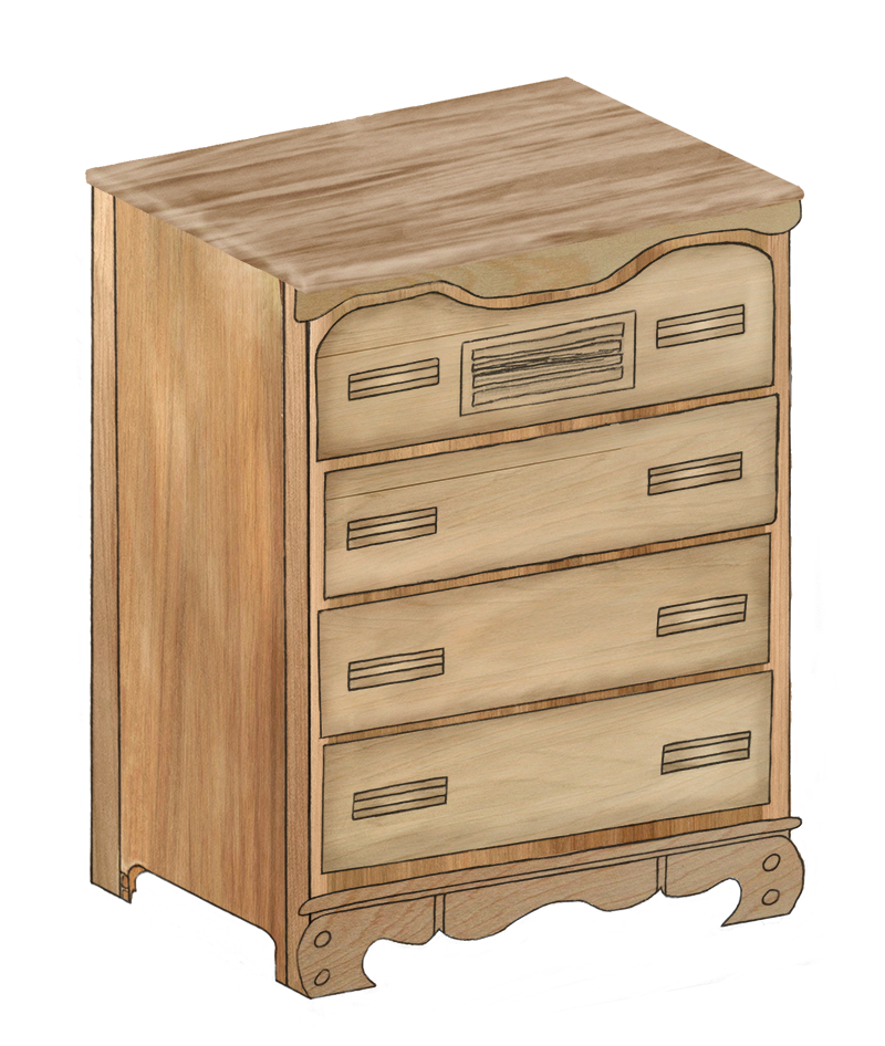
 ogiGamedev — '3D' Dresser
Published: 2007-02-16 22:12:58 +0000 UTC; Views: 554; Favourites: 0; Downloads: 0
Redirect to original
Description
Nowhere near the quality of my 3D book") .
.This was done in Photoshop after scanning in lines done by hand. The stock textures used are the following:
45 Wood Textures by ~Jammurch
Wood Texture 1 by Me
Side Note:
Now that I see it in the submission preview, it does look good as a small image
 (Smile)") .
.Edit:
I tinted and darkened the top of the dresser a bit. It could still use some work but at least now it stands out less.
Related content


Comments: 8

")

The only thing I see really wrong with it is the fact that the perspective is wrong. If you look at the bottom of the dresser and the lines there. Considering the frame is basically a box the top lines should be completely parallel to them. I wish I could show you what I was talking about. But beyond that I love the cartoony aspect of the picture. I don't know if that was what you were going for or not ^^. If you were going for a realistic picture I would have suggested staying very very far away from the perfect black that you used to outline it. and stuck with a dark brown to suggest depth and shading. There is no perfect black in the real world. except for man made fabrics and paint. and they aren't exactly perfect black
👍: 0 ⏩: 1

The perspective problem comes from how I put everything together. With the exception of the top part, everything was made flat (two separate images) and then rotated and skewed into place. That's the same way I did my book earlier. That's also the biggest reason for lack of depth in both images.
The line advice I can use though
👍: 0 ⏩: 0

It does look better small. Up close you notice that it lacks the sense of depth. Linework on the handles and drawers are too simplistic, but no one becomes a master engineer all at once. Also, you might want to touch up the top in photoshop. The lighter tone seems to make it clash with the rest of the image. Now you just need to make it fully-destructable for in-game environments, bwaha haha ha ha ha!
In a photoshop contest between the two of us, you'd definately blow me out of the water, so take my criticism with a grain of salt. You've definately made progress in realizing your goal.
👍: 0 ⏩: 1
If I don't forget I'll see what I can do about the top of the dresser tomorrow (it's on my lappy). The rest I'll have to just accept as a limitation in my skills for now.
Thanks for stopping by
👍: 0 ⏩: 1
Finished. It isn't great but it's better
👍: 0 ⏩: 0