HOME | DD
 overfiend0a — yet more practise
Published: 2005-05-31 10:32:44 +0000 UTC; Views: 30; Favourites: 0; Downloads: 5
Redirect to original
Description
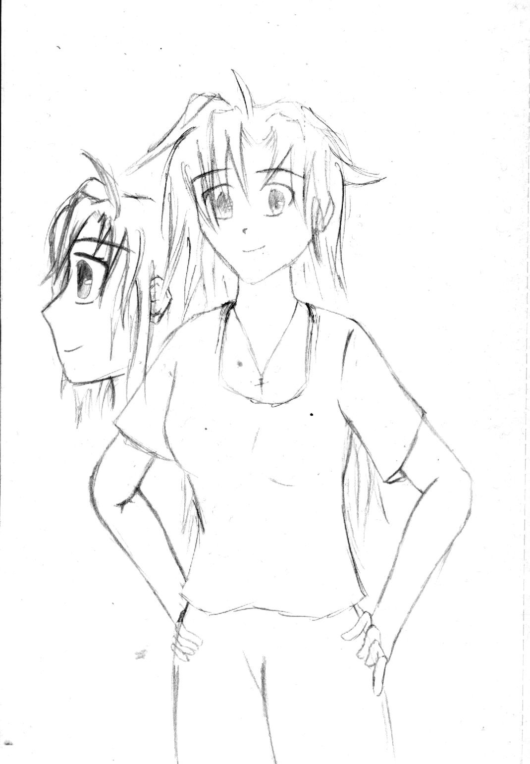
need feecdback. Sorry bout the low quality and the sketchiness but it is only practise. God i gotta clean my scanner. The arms are terrible in thisRelated content


Comments: 8

The face looks fine, eye/mouth/nose placement is nice and even. You may want to lower the cheekbone on the left side, to match more with the location of the right side, even from this perspective, it looks a bit too high. The left bend in the arm could use some work,( the lines don't seem to fit the position from the angle you're showing it in) and both hands could use slightly better positioning. Finger placement on the right hand is a bit off, it seems like you should be able to see more of the right hand showing too. The left hand is also too hidden by the curve of the hips. You did a pretty good job on the hips btw! Might want to work on er.. umm..*cough*groin*cough* area. It looks too far left in relation with the way the torso & hips are positioned. It's not bad for a sketch at all,and the care you put into the lines of the torso and sholders shows. ^_^
👍: 0 ⏩: 0

That looks really good! ^_^ The thing that bugs me though is the hand to the left. It looks a bit squished, but other than that, this is really good!
")
👍: 0 ⏩: 1

hm... I dno, the upper arm looks fine to me.. I'm trying to look at my own arm and I think it goes down that far. Just dont make the crease so big from upper arm to lower arm, she's not a balloon!
As for sideways head, try a new anime style. It's hard to describe while typing, but try and make the lips stick out a bit.... um... if you go to my Seraph Sephiroth pic you should see what I'm talking about.
Kinda like:
<
<
but.... less... ARG!
👍: 0 ⏩: 1

<
c
is the way i usually do it hehehe
👍: 0 ⏩: 1

To be frank, the only area where it looks right is the head. Technically, the left eye should be just a little smaller than the right, seeing as you've positioned her from the right.
The neckline is wonky.
The upper arm is too long, and the fingers are like....too unreal. What would real fingers be positioned if they're resting on a smooth slightly curved surface? It makes her hips look paper thin.
The bosom...either you need more shading to accentuate the right breast, or the left breast is like waaay out of proportion...I'd suggest you just shift the whole left hand side more to the right-and then it'd look better, OR now that I look more closely, the left breast is just out of shape-and as mentioned before too much to the left.
The face also shouldn't be so angular, seeing as the subject matter is female (I'm just saying it from a general anime point of view).
But damn, I love the hair! I can never draw hair properly -envies-
The side view? Looks perfect, except for the mouth. The outline of the mouth 'should' slightly show the upper and lower lip where as you've just got it flat.
Keep up the good work! You'll be an awesome anime artist in no time
(go to [link] for more info on anime drawing...it's a good site ^^)
👍: 0 ⏩: 1
thanks for the detail ^^ all helps me improve. I know I'm not very good at all at drawing women but I do plan to improve. Thanks for the link too ^^ Im gonna run through the tutorials. and I know the arms and hands were rubbish ")
👍: 0 ⏩: 0