HOME | DD
 p-o-c-k-e-t — My Pet Angel Cover Alternate
Published: 2007-06-14 03:14:52 +0000 UTC; Views: 592; Favourites: 17; Downloads: 14
Redirect to original
Description
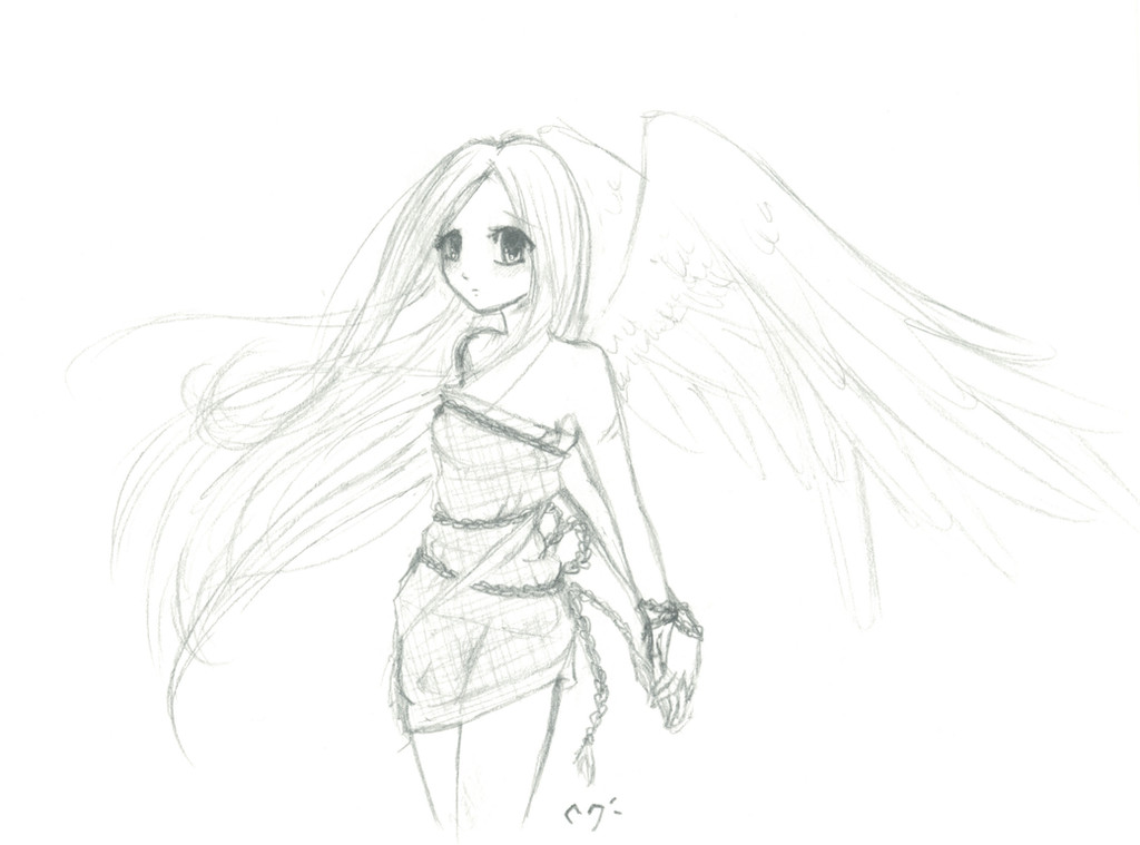
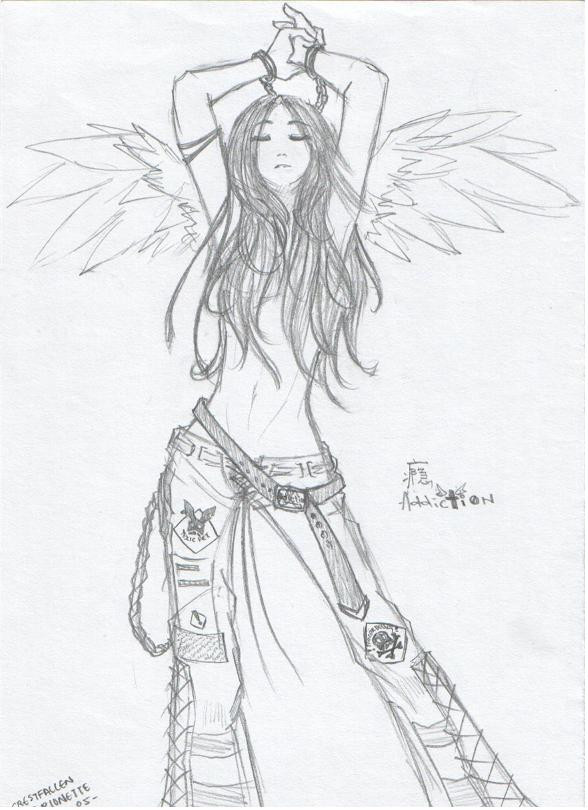
This is an alternate sketch for the cover of My Pet Angel. I found the first to kinda mis-inform the reader of what the manga would be aboout so please tell me which one you like better!First one:
[link]
PLEASE! Don't tell me to color it! It's just a sketch!
Related content


Comments: 43


Such a lovely sketch! This might be a better idea.
👍: 0 ⏩: 1

Thank you ^^ I'm glad you like it! Thanks for your help!
👍: 0 ⏩: 1

Thank you! ^^ Your input really helps!
👍: 0 ⏩: 1

Yeah, it's okay, but I think the other one was waaaaaaay better and awesome and such. Let's be going with the first i think.
👍: 0 ⏩: 2
hmm It looks like it meets up to me.. I'll examine closer ^^ Thanks for your input!
👍: 0 ⏩: 0
Also, just noticed... her left arm doesn't quite meet up with the shoulder. Like the top meets up with the bottom of the shoulder, see?
👍: 0 ⏩: 0

even if i pitcture this colored i like the other one better personally...but its still very good!!! maybe volume 2?? lol
👍: 0 ⏩: 1
^^ Thank you most people seem to like this one best though, I may use the other one for a chapter cover, rather than a volume cover
👍: 0 ⏩: 1
")

I think I like this one better.... It seems more calm... or somethig. I think this would send a betterr message than the other colver.... It seemed more... I dunno.... but after thinking on it, it seemed more like a hentai or a torture-like thing... or something... even if it is cute.... I dunno how to explain it exactly... I'm sorry. -.-
👍: 0 ⏩: 1
Thank you ^^ That's why I made this one, I don't want people to get the wrong idea
👍: 0 ⏩: 1
np.
I think the other one could've worked as well if you had colored it differently. but I digress....
👍: 0 ⏩: 0


aww its very cute =3 i liek this one a lot too
hmm what did they think it was of?
👍: 0 ⏩: 1
Thank you ^^
They didn't really think anything yet but I think because it had blood and she wasn't clothed, people may think it was either some gothic, morbid story or a hentai of some sort, or even a mixture of both
👍: 0 ⏩: 3
I'll probably use this one, and use the other for a chapter cover, since the first chapter is kinda morbid-ish ^^
👍: 0 ⏩: 0
oh lol thats silly i mean you dont draw stuff like that ")
👍: 0 ⏩: 0
oh lol thats silly i mean you dont draw stuff like that
👍: 0 ⏩: 0

yeah I like this one better, the chains don't make any sense though
I love the hair, it's so pretty
👍: 0 ⏩: 1
the chain is symbolic to how she has no freedom ^^
👍: 0 ⏩: 1
of course it is...silly Amber, but it's still all random...
👍: 0 ⏩: 1
yeah I know, the picture's random all in all
👍: 0 ⏩: 0

i like it better
honestly the first one made it look like hentai
👍: 0 ⏩: 1
haha it did kinda, and I don't want people to get the wrong idea, thanks for the input ^^
👍: 0 ⏩: 1

Oh, I like this one better, too. >> Another fave from me!
👍: 0 ⏩: 1
Thank you ^^ Your help is appreciated!
👍: 0 ⏩: 1

I like this one better. I dunno why, I just do...

👍: 0 ⏩: 1
Thank you ^^ Your opinion is very helpful!
👍: 0 ⏩: 1
You're very welcome! I'm glad I was helpful for something!

👍: 0 ⏩: 0

Even though the other one looks better because it's colored, I think this one is much better drawn. It looks so smooth and light. Very very nice. Beautiful, in fact.
👍: 0 ⏩: 1
Color is a killer indeed ^^ It sways peoples judgement ^^ The sketch of the colored one had nice lines too though
👍: 0 ⏩: 2
Me too ^^ Thank you a lot for your input!
👍: 0 ⏩: 0
I know, I just think this one is prettier. :3
👍: 0 ⏩: 0

thats really pretty love! good job!
check out my gallery plz
👍: 0 ⏩: 1
Thank you ^^ I'll take a look at yours
👍: 0 ⏩: 0