HOME | DD
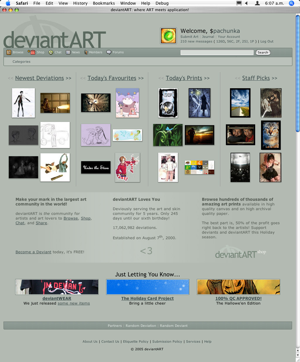
 pachunka — DA Homepage Work in Progress
Published: 2005-12-06 07:11:38 +0000 UTC; Views: 16115; Favourites: 21; Downloads: 10280
Redirect to original
Description
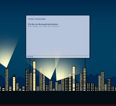
Mainly looking to exhibit the layout here folks, so don't pay too much attention to the slightly off font-sizes and spacing of some elements.


 It certainly isn't finished.
What would you change?
Deviation: [link]
Members: [link]
Related content
Comments: 519

I agree no staff pics more all around favs. how do we know what you guys are faving is what we think should be so. -sorry to make it sound mean but our oppinion should be first instead of staff
👍: 0 ⏩: 0

All due respect, but... is that it? You just changed around what, 50 lines of code to spit that out? It doesn't seem like that much.
Unless there's something I'm missing?
👍: 0 ⏩: 0

It looks good.
Changes? I'd move the Log Out up, next to "Your Account". Otherwise it won't sit in one place.
👍: 0 ⏩: 0

Not bad. Although I would rather see more new deviations than staff picks...
👍: 0 ⏩: 0

Well, the sheer amount of deviations in the top portion lead to horrible lines as far as the eye can tell, and it's a bit too cluttered. I feel very claustraphobic and daunted by imagery when I look at it, whereas the front page now can be broken down into three rows of nicely laid out instances. I would say that the design concept of doing one thing well is very good, though, but i think instead of daunting the user with a thousand different "previews" of different sections, perhaps have the user customize which section they'd like to be referenced to, or have a tabbed interface so that the front page can *really* specialize and focus on a particular section for each layout, or tab, rather than 4-5 per page. This way, you could focus on each section individually as well as keeping it clean, and neat.
--Rajin
👍: 0 ⏩: 0

It has improved, at least, with the dimension of the tables. It looks more sleek.
However, the display of thumbnails looks awfully jumbled, due to the inconsistancy of deviation size.
👍: 0 ⏩: 0

Honestly, I'd expect this from a dull Microsoft site that is ONLY interested in appealing to those people that have no sense of direction when it comes to art and design.
Seeing as DA is, in my opinion, the pinacle of all this in design, I expected more, but hey.
Seems like the April Fools' version would have taken more work..
Sorry to put a dampener on things... ;-(
👍: 0 ⏩: 0

this is so much better better, its cleaner and looks more appropriate. well done, good job guys
👍: 0 ⏩: 0

Not for the front page but i think the submitting should be easier for people who do alot of the same gallery instead of clicking a bunch of time DA should save the top 5 most used categories per artist, sort of like what ebay does
I definately do love the new start page.. would take some getting used to but i do love it
👍: 0 ⏩: 0

I like it but will any other pages change and also I"m not to thrilled about the <3 at the bottem it doesn't seem professional and Channel Cat pokeing fun at the shop icon well it looks worse now
👍: 0 ⏩: 0

I prefer the original version rather than this.
Seriously, why does everything have to change?
👍: 0 ⏩: 0

I like it because it shows an easier format, and good navigation qualities. It'd be nice if it still had the counter that said how many deviations and a link to a section showing all the galleries people can choose from to make it even easier to navigate while still showing the new layout but all of what deviantART has to offer. But I do like the existing layout with the banner down the side highlighting such things as DDs, Hot Topics, Notices, and the deviousness award of the month. - Is there a way to put that in somehow?
Otherwise great work. Keep it up.
👍: 0 ⏩: 0

I've always loved the counter that shows how many deviations have been submitted... Just watching it go up and up is really something... It would be great if that was still there somewhere...
👍: 0 ⏩: 1

It'll be back. Just haven't figured out exactly where to put it yet.
👍: 0 ⏩: 1

Fair enough, well its looking great so far
👍: 0 ⏩: 0

A really nice design for the front page, however I like the list of news articles that is on the current front page and think that it should remain.
👍: 0 ⏩: 0

What if, instead of << >> you put .:: ::. in the titles? (as in, instead of < 👍: 0 ⏩: 0

I am -definitly- looking forwards to the new layout. It looks like major improvement, good luck!
👍: 0 ⏩: 0

don't like it because it restricts the fast accessibility to the content. We don't need those gigantic favourite thumbnails. Six pictures can never reflect the whole site. This only leads to more superficiality. Instead, the title page should allow to dig ddep into the site. Additionaly the "staff pics" are absolutely superflous. No offense, but I don't care what the stuff thinks is great, i don't care more about the opinion of the staff members than of any other deviant. The staff should work in the background, and push the community in the right direction. Those "staff picks" are obstrusive. The title page is the main entry to the site and that concept is a mousehole. A big community needs space.
👍: 0 ⏩: 0

I'm looking forward to a new skin but I feel that the headings and columns look really basic. DA is a community for artists and when we browse we want to be hit by some nice eye candy so when I looked at this, I cringed due to the overpowering n00b feel to it.
Hope it develops further!
-Sabrehagen
👍: 0 ⏩: 0

i like it, its simple but eye catching, nice work
👍: 0 ⏩: 0

I like how you simplified it but it's much easier to read a horizontal format than a vertical one.
👍: 0 ⏩: 0

Don't hate me for saying this but it looks like Web 2.0. I like the clean look though
👍: 0 ⏩: 0

I really am glad you guys have simplified the front page more. There's getting to be too much going on it lately.
One that I might have done differently, is make use of the site ID more. When newcomers come to dA for the first time, most will say "what is this?" At least that what people ask me when I show them this site, at least. I would include one of our many site mottos, or even a new one to tell them immediately A) What kind of a site they have reached, and B) Why this one is better than others. Something original but obvious like "The Online Art network". I hope this is valueble to you.
👍: 0 ⏩: 0

Pros:
Personally I like the section displaying the number of deviations/journal/comments.
Like the use of gradients.
Cons:
I'm not too sure of the vertical format for the deviations on the front page, too radical of a change I think, but thats just me.
The section under front page deviations is way too big, to me its not really important info. We know you love us
I kinda liked the news on the front page, it's in your face kinda thing, no need for loading another page.
Others:
I'm guessing staff picks is the new name for daily deviation.
Perhaps you could give us a screenshot of the new category chooser?
Wheres the shoutbox/opinion poll?
Will those firefox greasemonkey scripts still work?
What exactly is the members page, I've seen the screen shot but still don't quite get it, something similar the the Today's page on v4 I'm guessing?
How would the deviation page look with the picture zoomed in, especially those huge pictures, now that the add to fav and zoom in buttons are on the left?
👍: 0 ⏩: 1

I think news having its own page will be good... it means there'll be more of it and it'll be better presented. :j
Shoutbox similarly is moving to the chat area.
I'm not sure what's happening with the giant poll...
Greasemonkey scripts & skins probably won't work at first, but I'm sure their respective authors will be on the case.
When zoomed in, just the icons themselves appear to the left. So there is a small push to the right that wasn't there before, but it's quite minimal.
👍: 0 ⏩: 0

Hmm, I like the one we have right now much better. This new one looks too confusing and hard to navigate in.
👍: 0 ⏩: 1

Cluttered and random as well, now that I look at it again.
👍: 0 ⏩: 0

Will this next layout be less buggy in browsers like Mac OS X Safari and KDE Konqueror?
I use Firefox almost all of the time, the site looks perfect in Gecko.
👍: 0 ⏩: 1

Provided it's kept up to date, it should be fine. I browse using Safari most of the time; I don't know of any particular problems.
👍: 0 ⏩: 1

I spend about 92% of my time browsing in Firefox (8% for school, they force MSIE and Safari upon us.) I spend about 3% of my time in Safari, and 5% of my time in MSIE6. Of those three browsers, the only one that has any problems is Safari. The only time I use Safari is on the art computers at school, because they use Macs exclusively for art stuff. Half of them are running OS X 10.3 (Panther), and half are running OS X 10.4 (Tiger), but all of them have problems with rendering pages in Safari. I'm pretty sure all of the Macs in the school are given the recommended updates from Apple with the ingrained update tool once every five weeks. There are very few sites that Safari screws up, but dA is one of them. Konqueror (in Linux) has the same problems with the same sites, only worse, and I suspect this is because they use the same basic layout engine (except Safari's has many fixes and improvements coded by Apple. Konqueror's engine is called KHTML, and Safari's derivative engine is called WebCore).
I never have problems in Firefox. I use Firefox in GNU/Linux about 65% of my total browsing time, and about 27% of the time in Windows XP SP2. The only difference between the two is the fonts used to render the pages. I prefer the fonts I have on my GNU/Linux computer much more than the ones on my Windows computer.
Anyway... I'm babbling. I think there was a reason I was writing all of that, but seemed to have forgotten it in a mess of pointless semantics and ADD (absent minded computer scientist). Next time I go to dA on Safari, I will try to remember to take a screenshot for you. I'm currently in Firefox on Linux, and everything is a-ok.
👍: 0 ⏩: 1

I dont like it. I like having an overveiw of the sections on the front page, and I like the horizontal arrangment better. mch easier on the eyes and provieds more information.
👍: 0 ⏩: 0

I LIKE IT!!! much cleaner and easier to nav than currently. one thing I'd add (if possible) is a "what to search" checkbox at the top under the current search bar. ie: daily dev, prints, help, ppl, etc... so you click the check box & type the search string.
ex: if you are trying to search for all prints from "devbob" ..... Just a thought . .
👍: 0 ⏩: 1

The way it'll probably work is something like: if you're in the news section, the search does news... same for forum, chat etc. But for specific things like 'prints from captainbob' we'll have some kind of advanced search options... right now you can do some operations like that using commands... they're all listed here: [link]
👍: 0 ⏩: 0

It looks too random. The vertical grouping is just terrible. It's much more natural to have objects arranged in a horizontal format because the eyes are placed horizontally on the face.
The use of the empty space in the header is nice, but I really don't think that the avatar needs to be included.
Also, having the four columns for the art, and then having the three the rest of the way down, it doesn't align right. I think this is also what helps make it seem to random.
Plus, with the images being so many different sizes, it just doesn't work well. Maybe if dA implemented a thumbnail requirement, with them being all the same size and such, then this might work. But still not so much with 4 columns, then three.
👍: 0 ⏩: 2

The thumbnail sizs were a big problem in trying to get it to look right, and as you pointed out, it still doesn't. We're not going to introduce an awkward stand size or start cropping artwork, but we've come up with a few good ways to present them since then. This layout wasn't received terribly well, and it's been more or less redone backstage. Shoud be another preview soon.
👍: 0 ⏩: 1

Are the columns going to be fixed? Four on top of three on top of three really doesn't look good.
👍: 0 ⏩: 0

Good to know some people might.
👍: 0 ⏩: 1

Well the horizontal layout makes it appear squashed and cluttered, and the top "forum", "chat", "submit" etc,. buttons i think need more emphasis, maybe a box around them like current layout. Otherwise good job
👍: 0 ⏩: 0

I dont like it, I dont like it at all, the whole vertical thing is going to go to the shitter. It doesnt look that great and i've seen how the vertical things on this website have turned out in the past, its all going to go spastic and screw up...
👍: 0 ⏩: 0

i'm not able to see DD or is it Staff Picks? and front page link list is not available in here i think... it looks a bit different. we should try... lets design this page and give it's link seperately, we can use that style and give critic to admins, so normal users do not have any problem...
👍: 0 ⏩: 0

It definitely looks more organised and I guess it'd be a lot easier to find what you're looking for. However, regarding specific galleries such as stock galleries and photography galleries - where would they be situated, because it is actually very helpful to have them on the front page. By having them under the link of Categories... well. I do prefer the current layout in that respect because it's very fast and very accessible.
👍: 0 ⏩: 0

I really like the top part where the current user shows.
but the rest... mmm... I’d prefer it flashier... at least the navigation bar.
Make the buttons shiny!!!
👍: 0 ⏩: 1

shiny like the "search" button...
👍: 0 ⏩: 0
| Next =>


