HOME | DD
 pascalblanche — Blackstyle_01
Published: 2014-09-14 03:14:52 +0000 UTC; Views: 12012; Favourites: 574; Downloads: 4
Redirect to original
Description
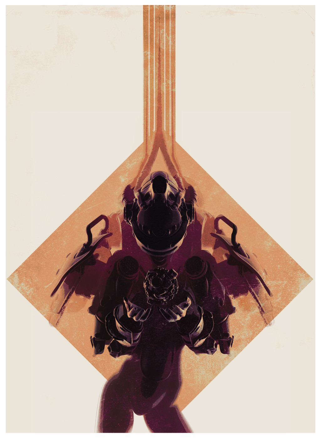
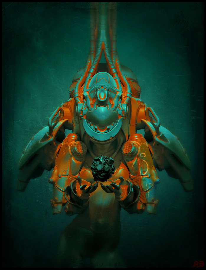
Trying something new, poster style... let me know if you guys like it and would want it as print? basically, do you think that this more radical approach would work better for posters?update: brought back some more details. And thanks for your opinions, ill certainly investigate more in that direction as I now have even more things I want to explore, more to come soon
 (Wink)")
edit: poster now available here!: society6.com/pascalblanche/bac…
also for Iphone/galaxy
 (Smile)") : society6.com/pascalblanche/bac…
: society6.com/pascalblanche/bac…
Related content


Comments: 50


Every single one of the ones in this range are excellent. You've really hit it out of the ballpark.
👍: 0 ⏩: 0

superbe ça ferait une belle couverture de magazine de SF
👍: 0 ⏩: 0


this'd be an excellent poster! it's positioned just right and attracts attention right away. SO goood! <3
👍: 0 ⏩: 0


Oh and as for working 'better' for posters, I'm not too sure I'd say that, no... I'd say it simply works. It's not better, just different. I think it really depends on what you feel posters are trying to accomplish/cater to? Hmm...
👍: 0 ⏩: 0
Personally, I really love the look of this!
I think that a few minor tweaks to improve clarity would help (adding some separation between the hands and torso (perhaps a subtle gradient between the two planes), and perhaps a little more light on the face, etc.); just little things to add a tad bit more readability. Otherwise I very much adore it

👍: 0 ⏩: 1

changed things a bit thanks for your feedbacks !
👍: 0 ⏩: 1
Glad to help! Omg, that's definitely way clearer; gorgeous!
👍: 0 ⏩: 0

I don't understand why some say it's too sketchy for a poster. I think it's perfectly fine, it's just a different style. But I'd say both this and your usual style would make nice posters
👍: 0 ⏩: 0


interesting new direction Pascal, these would make for striking book covers too - I would contrast the colours and differentiate them a little, an opposite to burgundy red somewhere
👍: 0 ⏩: 0

i like the composition, but i also don't really understand what it is.
it/she seems to be looking at something in her hands - but i had to work for that information.
of course your stuff is always worth a little work, but this particular render leaves too much to the imagination.
print available...
geez i thought this was just a sketch.
but don't get me wrong - i dig the style.
just don't really see anything but a vague silhouette.
hey, you asked.
👍: 0 ⏩: 1
no worries, I am gathering intel
👍: 0 ⏩: 0


You like homestuck?!?!?! AWESOME!!!!!
Gamzee (he's my favorite!!! 
👍: 0 ⏩: 1

That is my "patron troll" and it is good you said "liked" cause I am at act 4 part 2 so far and I would exactly say I am a homestucker. So far I like Eridan he reminds me of Megamind.
👍: 0 ⏩: 1
Really???? That's cool!!!!!! What's your opinion on tavros????
👍: 0 ⏩: 1
Tavros has the least over the top personality. Like you could actually meet some one like him.
👍: 0 ⏩: 1
Yeah. I've always liked him for some reason
👍: 0 ⏩: 1
Your profile description is cleaver and brought me a few chuckles.
👍: 0 ⏩: 1
I dunno... Wut was we talking about???
👍: 0 ⏩: 1
Man, i forgot a long time ago.
👍: 0 ⏩: 1


I'd say no.
Problem with this is one doesn't know what he/she is looking at.
its obviously an alien. appears to look female, but not much else.....
problem maybe with the depiction of the head.
👍: 0 ⏩: 1
so... too abstract to you taste? ^^
👍: 0 ⏩: 1
yeah, prolly too abstract. in some ways, the extra lines at the top make it too busy.
I take that the brown things are pincers or antennas or both.
👍: 0 ⏩: 1
got it thanks true it is a tad too much on abstract side, but has a general style direction, what do you think?
👍: 0 ⏩: 1
I think the direction you're going with the style seems fine.
👍: 0 ⏩: 0