HOME | DD
 PaulaEdith — Elsa fanart
#elsa #fanart #nieve #snow #reinadelhielo #digitalpainting #disney #disneyprincess #frozen #snowqueen #elsafrozen #frozendisney #elsasnowqueen #frozenfanart
Published: 2018-02-02 16:32:24 +0000 UTC; Views: 569; Favourites: 36; Downloads: 0
Redirect to original
Description
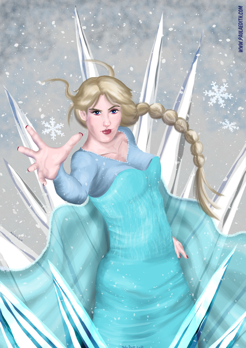
Digital painting A4 300DPI made with Clip Studio Ex.Related content


Comments: 21
I´m from
Although I personally do not like Frozen, I must say that I really like this Fan-Art
It has a thousand and one details and finishes, a range of cold and tiled colors, a perfect proportion, the character plays well with the background full of sharp crystals and snow ...
But I also like the natural appearance of the character Elsa: Despite having a disturbing and anatomically incorrect face, his hair, dress and hands have an amazing finish and design that really makes you stay a few moments to contemplate the work itself and get all the "juice" literally.
If this work is great and improving the small flaws, it would be totally more impeccable than it is. Great job
")
👍: 0 ⏩: 1

"disturbing and anatomically incorrect face"
Ok, that hurts x`D
I did a new version with a corrected face, hope it's better now!
👍: 0 ⏩: 0

Heyo! I am here from Project Comment , and I hope this critique can help you.
To start off with the good, the ice shards, snow, and the aesthetic of the dress all improve that icy look you were going for. The minimalistic and blurred background allow for more focus on the foreground. I also really like the pose. The way she's standing and the way her hair and dress are blowing capture the actual effect of wind, and quite realistically.
Now, here comes the things can you can improve upon. The ice spikes in front are transparent, and as we can see through them, we see that Elsa's dress is not at all refracted by the ice. Next, there is the lighting. At first, the lighting seems alright, but as I look at the piece more, I can see that some of the lightings of objects such as the ice and on the dress contradict each other slightly. The hand on the right seems to cast little of a visible shadow, and on the top strands of hair blowing upwards, the top right of it is shaded, even though it seems as if the light source were coming from above.
All of these were actually minor things. The major aspect you can improve on is the facial anatomy. Here are some things that you could have improved. If you want the hair to be a little more realistic, then try adding individual strands of hair flying outward, as in real life, your hair wouldn't just clump together if the wind was blowing. Try to also add a little more detail and shine to it. Then, there is the face. The lips are a little too large, and the lighting on the eyes is a little unrealistic. When looking at a real eye, the lighting wouldn't just be a dot. You would see a reflection of light that takes the shape of the eye, as it has a curved surface. Apart from that, there are only a few minor changes that you should make, such as some less exaggerated eyebrows, a little more details on the face, a slightly slimmer body, and a little more texture on the clothes.
I hope this helped you, and overall, this is a decent piece. Just keep practicing, and you'll improve very quickly!
👍: 0 ⏩: 1
Thank you for the critique! I'll keep it in mind for the next one ^.^
👍: 0 ⏩: 1

Hello! from ProjectComment Here!
It's not everyday you see Disney fanart here on deviantart and I absolutely love this piece! but correct me if I'm wrong but it seems like you used Black to shade Elsa. If that's the case I recommend using warm colors for the skin (Red, Orange, Gold, Etc) and Dark blue for her dress, though the color you used for her hair seems to fit in. since this piece is supposed to look more realistic (That's me saying your style is more on realism) I don't think elsa's mouth should be that way, the opening to her mouth seems more longer on the right than on the left. you could try and even out things.
The collarbone seems really out of place, make it look more natural rather than random two lines beside her neck.
Next Anatomy, I'm not an anatomy expert myself but I do think Elsa's hand needs work. In the movie she was a little more slim and try making her breast a little rounder (or smaller). bits of her hair are going left (Our perspective) but her braid is going right, And in my opinion the piece would be fine even without the bits of hair flying around randomly like that.
The sparks (DId I use the word correctly?) or I guess chunks of Ice in front of elsa are really good, nice color choices! though I don't see why don't you do the same with the chunks of ice at the back of her. Perhaps to give an effect of the ice chunks being way behind elsa but maybe make it a faded color of blue to make the work more colorful, And snowflakes and snow in general looks nice, and here's one more suggestion..
I don't see why Elsa is doing that pose, yeah that sounds like a very dumb thing to say but when making a character doing a pose it has to fit it, For example if you were to draw a park full of people but then one person is doing a pose as if they were flying in space. Maybe try making it so that it looks like she is actually using her powers in the photo.
I've seen the rest of your gallery, and I think it's really good that your doing a realistic style, but of course everyone needs to improve so good luck with that!
👍: 0 ⏩: 1
The idea was to make her like a superhero.
👍: 0 ⏩: 0

Hello, I am here from ")
I will start this by saying I love the art as a whole. My first critique is that
are the ice spikes. They seem to be out of place meaning that they don't seem to match Elsa's art style. My second critique is that Elsa's face is differs to the rest of the body. This is because you didn't put any dark outlines until the face where you put darker outlines on the mouth and eyes. I hope this helps even if I have some grammar errors.
👍: 0 ⏩: 1
Not sure what do you mean but thanks for comment :b
👍: 0 ⏩: 1
I'm am very sorry for not being clear. Next time i will try my best to be more clear.
👍: 0 ⏩: 2
Now, it's funny but your critique was more useful than the one of the girl who wrote the long comment xD
I'll try difuminating the lines of the face.
Edit: done, but it's only noticeable from close. Probably I should use a softer brush next time.
Thanks!
👍: 0 ⏩: 0

Pretty :3
I really like the ice and the corners and the pose
The desaturated hair is a very nice touch
Good job
👍: 0 ⏩: 1
 (Smile)")

hooo nice one
I love the colors you used here, it keeps true to her tho
nice movement of the hair, it looks really natural
great work
👍: 0 ⏩: 1


This is a pretty cool take on elsa here.
Looks more like a Comic hero then a cartoon damsel.
👍: 0 ⏩: 1