HOME | DD
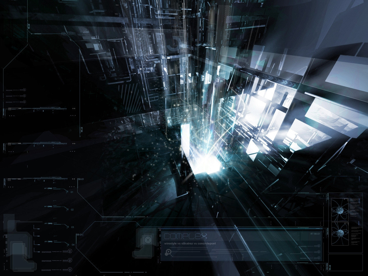
 pete-aeiko — Complex_
Published: 2004-04-03 18:57:59 +0000 UTC; Views: 44435; Favourites: 395; Downloads: 45776
Redirect to original
Description
*wirestyle vs ~silvatrez vs * concretepoetserving overflow - [link]
Related content


Comments: 253


Tasty. All there is to say  (Smile)")
👍: 0 ⏩: 0

That is pretty damn superb, I seriously wish I was this good.
")
👍: 0 ⏩: 0

Excellent composition with top notch 3D and brushwork. I'd critique it but I like it the way it is.
👍: 0 ⏩: 0

")


Your pieces are so stunning, so beautiful.
I just wish I knew how to do some form of this artwork. You are very talented.
👍: 0 ⏩: 0

Excellent work out there Wirestyle. I would appreciate it if you give me permission to port this to a bootskin. If you don't know what that is, check out my gallery [link]
Please send an email to me Jos3phs@bigpond.net.au with a Permission.txt Inside of it if you would
👍: 0 ⏩: 0

So sick!
I use Windowblinds alot, and this skin matches Mike Bryant's 'StealthOS' so well! [link]

👍: 0 ⏩: 0

I love this wallpaper, really love the whole blend of different elements.
👍: 0 ⏩: 0

what program do you use to draw the 2D lines around the sides?
👍: 0 ⏩: 0


Exellent work with the model or photo, cant really see the difference  (Wink)")
👍: 0 ⏩: 0


holy crap, been looking through your stuff this is def my fav, +devwtched
👍: 0 ⏩: 0

wow, great collab. i love everything about this piece, great great job
👍: 0 ⏩: 0


The sparkles are little to blurry imo.
But the overall look of the piece is verry nice.
Well done.
👍: 0 ⏩: 0


HOLY SH!T. thats the coolest thing ive seen in a while. DEF :fav: i love the color. i love the 3d the 2d, it looks amazing.
👍: 0 ⏩: 0


wow, excellent collab, very complex and dark look, a lot of elements and good 2d shaping. I like it a lot
memod
👍: 0 ⏩: 0


the render is awesome, it got good depth and perspective, but theres too much 2d ... but thats my opinion, else its great job ! awesome
👍: 0 ⏩: 0

really awesome work guys...lots of detail and thats what i love
👍: 0 ⏩: 0


so why did it come up in my new dev art thing?
👍: 0 ⏩: 1

cos when you edit the desc / submit a print / try to do something to it...it resubmits in ppls watch.
👍: 0 ⏩: 1
ahh sry bro didnt know? so......what did you change?
👍: 0 ⏩: 1
I was gonna submit a print, but it got rejected..
probably cos i blew it up (we never made this piece print size anyway) but i thought it was worth a shot.
some reason even if a print is rejected it still shows up in ppl watch.
👍: 0 ⏩: 1
ahh i c lol thx for the info...it explains a lot
👍: 0 ⏩: 0


It should be a 'month deviation' - at least! - Great style, that You are keeping on. +fav
👍: 0 ⏩: 1
I dont understand the month thing..?
👍: 0 ⏩: 1
I said that, Bcause i think if even complex was the daily deviantion, it should be more rewarded... & be 'monthly deviantion' - i think thais feature should be started on DA...
👍: 0 ⏩: 1


| Next =>