HOME | DD
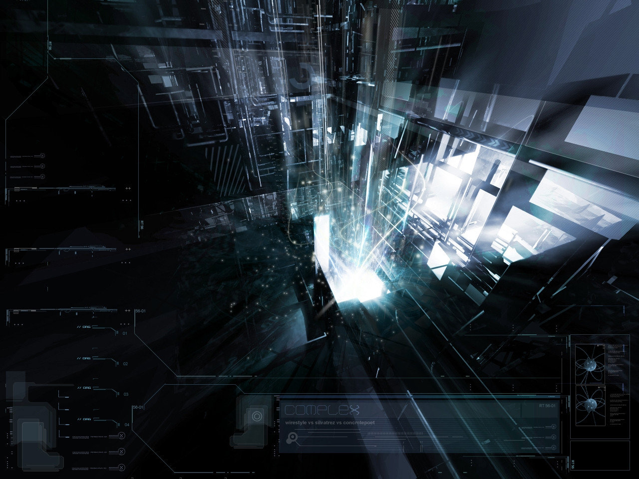
 pete-aeiko — Complex_
Published: 2004-04-03 18:57:59 +0000 UTC; Views: 44444; Favourites: 395; Downloads: 45776
Redirect to original
Description
*wirestyle vs ~silvatrez vs * concretepoetserving overflow - [link]
Related content


Comments: 253


awesome piece and amazing site, one of the best I've been too, great work!
👍: 0 ⏩: 0

the second i saw the tenticals i knew it was silva
sweet work you to,keep it up
 (Smile)")
👍: 0 ⏩: 0

..oh...very nice..lol....hey..ITS GREAT !!!!!!!!!!!!!!!! 
")
👍: 0 ⏩: 0


I'm loving that typo... tres sekesh. ")

👍: 0 ⏩: 0


oh man its got 3d/perspective line art that shit rules, awsome as always
👍: 0 ⏩: 0


The render and model were done in 3DS Max and the post work with Photoshop. I assume 2D was also done in PS.
👍: 0 ⏩: 0


not bad guys, esp the 3d and typo. lights could use some work IMO.
👍: 0 ⏩: 1

+fav // beautiful use of light and color escaping the opening.
👍: 0 ⏩: 0


sweet work guys.....great depth...and wonderful details
👍: 0 ⏩: 0


looks almost like a hyperstylized scene from the matrix

👍: 0 ⏩: 0


wow...all 3 artist that are my favs...
this pic looks great!
👍: 0 ⏩: 0


hmm actually i don't like the renders too much, but i rEALLY love that 2d in the piece.
good job alll1
👍: 0 ⏩: 0


Cool.
I don't really think that I could critique this very well...doesn't feel like a lot is messed with it...
Reminds me a lot of Alphakx's stuff...except the lighting. Especially the name.
👍: 0 ⏩: 0


great job you guys
who did what?
or did you all just put in random amounts of work?
fav. definately
👍: 0 ⏩: 0


I love it. It reminds me of Pandora's Box, except more futuristic and bright instead of evil. xD
👍: 0 ⏩: 0

nice, but it looks like its really compressed? kinda low quality?
I like all the perspective tech n stuff, looks cool. but the brushing I'm not into.. the glowy particles n stuff. seems a bit crude or something..
maybe needed to be at higher res to see details better.
also something about the typo goin down the left side of the pic looks a bit straight or something compared to the rest..
but still, nevertheless, it is a good picture
👍: 0 ⏩: 0

awesome work you 3, everything fits together very nicely. cool, clean, and of course, quite complex!
👍: 0 ⏩: 0

wow, this piece is so cool! i wouldn't even know where to begin to make something like this. simply awesome!
👍: 0 ⏩: 0

Really lovin it. This piece turned out insane!
Thanks to both of you for having me involved in this.
👍: 0 ⏩: 0


Excellent work! The darkness mixed in withthe architectual layout makes this an amazing piece. Great job!
👍: 0 ⏩: 0

cute. the angle is unusual, which gives it a much better feeling of peeking in instead of a static image. the lightning is excellent as well. Very good, very very good.
👍: 0 ⏩: 0

Brilliant abstract work...
beautiful

👍: 0 ⏩: 0


<= Prev | | Next =>