HOME | DD
 pete-aeiko — Substance.

Published: 2003-12-15 15:51:38 +0000 UTC; Views: 26715; Favourites: 562; Downloads: 15618
Redirect to original
Description
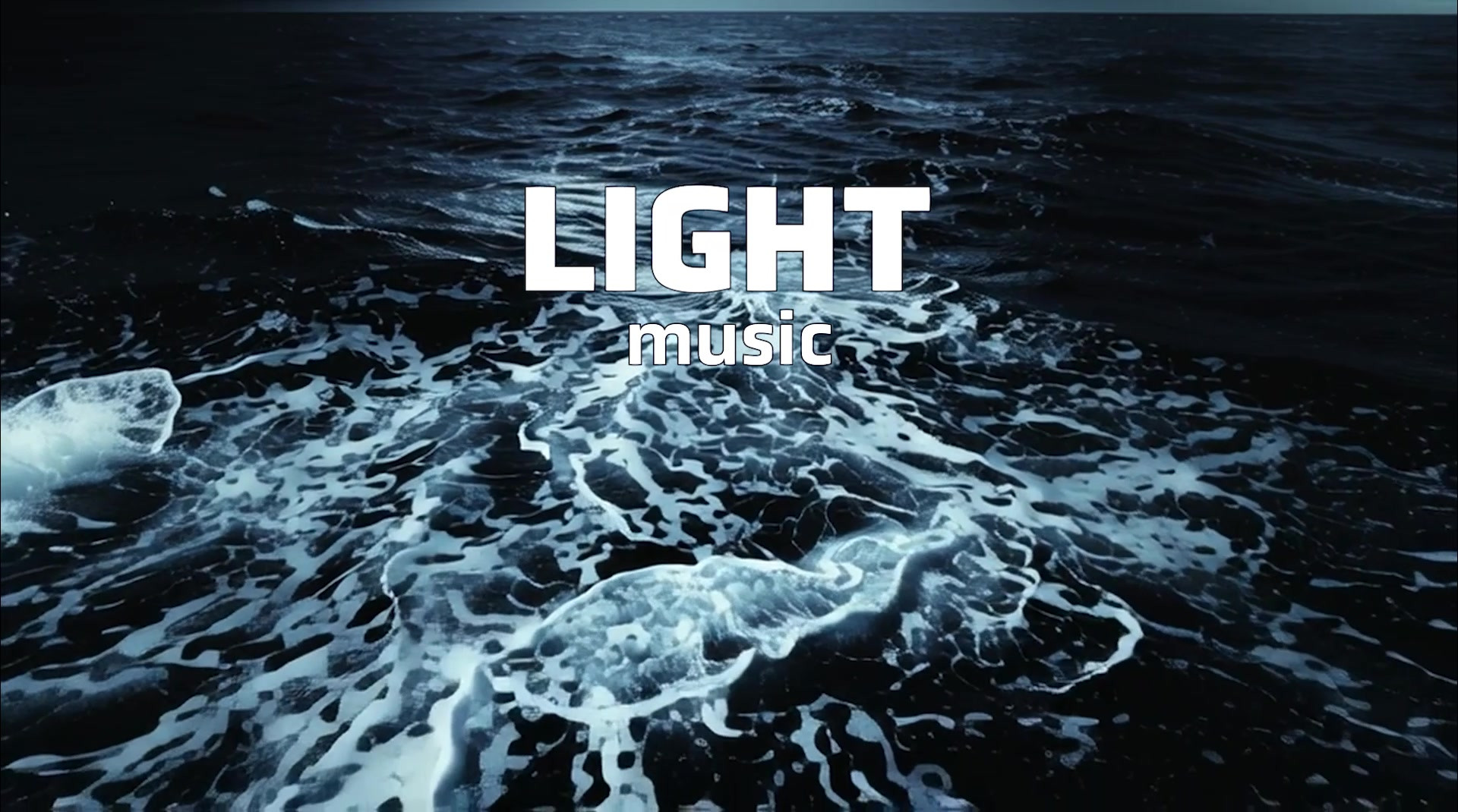
vs~dangta3 - original render
*wirestyle - typo
I wanted to improve my typo and got some tips off some friends
 (Wink)") and they seem to like it, so I hope you like it too
and they seem to like it, so I hope you like it too 
Props to dan for the original render..
Oh and print is also available, and looks really nice ^__~
Related content


Comments: 256


")


 (Smile)")

not bad, you did well on the typo, escpecially on the right side..nice work you two
")
👍: 0 ⏩: 0

awsome typo, and a sweet render, what more could you ask for?!
good job guys.
👍: 0 ⏩: 0

what shall i say....another great collab !!!! nice colortheme and great typo !!!

👍: 0 ⏩: 0


hmm... i cant tell when the render starts and the 2D ends.... but it's a nice and clean design for u 2... i luv it
👍: 0 ⏩: 0


hmm pretty nice redner and 2d..
some parts of the 2d are a bit too bulky for my liking, but its not bad
i actually really like the colours
good job both
👍: 0 ⏩: 0


That's very impressive!
I'm amazed, How'd you do it?
Tell your secrets?
👍: 0 ⏩: 1

I love the fragmented glass look 
👍: 0 ⏩: 0

too fresh to handle man, awsome design'n skills going on here, you guys are owning my love!
👍: 0 ⏩: 0


look at the detail. u are impressive. great job on the typo.
👍: 0 ⏩: 0


YA BABY!!!! WOOOOOT!!! This is sooooo sweet!
Maybe a wall of it?!?!?!?
👍: 0 ⏩: 1

hehe good idea bro...
ill have a look into that later
thanks for your fav too
👍: 0 ⏩: 0

trendy, and why is is a VS?
why are the VS' So damn tredny it's a collaboration guys..
👍: 0 ⏩: 0


That is some pure excellent work! 
👍: 0 ⏩: 0

Pretty good. Still better than anything I could make. But I'm sure that where design is concerned, any input is helpful.
The piece is good overall, and will be getting a +fav. Yet there are places where I find room for even more little touches and additions. I guess what I'm saying is that there's a fair bit of empty space that can easily be filled with that really nifty schematic, (heh still love that word, SCHEMATIC) blueprint-ish elements that I like so much. Especially on the right side. There's this block that would make for a good foundation of some random text, line-art, grids, etc. and this pulls my attention away from the center of the piece.
Another thing that you could try out with this piece is to work with the background a lot more, and create some subtle flowing elements (soft beams of light eminating from the center, for example) to help maintain my focus onto the central structure.
The underside detailing on the structures "arm" (coming from the center to the bottom left) seems to be at an akward angle, too. It just doesn't seem consistent with the flow and angle of the other details on it. Perhaps if they were tilted at a more extreme angle, that could help the structural realism of that arm.
Lastly, there are some bits that could be casting shadows on the lower structure. That would really add some killer depth to the piece. For instance, just to the bottom left of the structure's central joint (if ya know what I mean) there's this bar that is floating there. It's a nice touch, but considering the light sourcing, I think that it should be casting a soft shadow on the structure below it.
These are just my mere observations though. You did an utterly fabulous, allow me to emphasize, FA-BYOO-LUS photoshopper here. Also a great joint execution. +fav all the way.
👍: 0 ⏩: 0

The render could be better. The 2d looks great bud. Digging it.
👍: 0 ⏩: 0


Very impressive composition. I like the style and typo in this one.
Nice color choice too.
👍: 0 ⏩: 0

wow, your work seems never end. Great jobs, I love it, FAV+++
👍: 0 ⏩: 0

I love it ! completely amazing!ill put it in my wishlist!
👍: 0 ⏩: 0


wow.... very very nice work you two!!! looks great!
👍: 0 ⏩: 0

i've seen tons of those tech-type structures alredy... yet this one has some impressive detail...
/me likes

👍: 0 ⏩: 0

visually stunning in its seemingly simplicity, yet beautifully intricate. excellence, pure and simple!
👍: 0 ⏩: 0


woooow, I'm really excited that someone with work like this likes mine and added me to their watch
very nice typo. +ekud recently sent me a render of his so I can practice my own 2D off of it; it's proven very difficult for me...I'll get it done someday
👍: 0 ⏩: 0


hey wirestyle !! nice sharp rigid background kudos to the design. I found this to be an alluring work of art. Not to over done and layered out just right to give the perfect balance. good on you for doing this collab
👍: 0 ⏩: 0

dangta3 - Very nice render there, may i ask what proggie/method did you use? And I really like the 'icy' texture on the darker blue parts, is that the render or wirestyle's work?
wirestyle - Wish i could do these stuff like you... The 2d is really well-implemented into the render. FIts the perspective perfectly! Oh yeah, you have a great eye for detail, something that I don't have
Keep up the good work guys!!!
")

👍: 0 ⏩: 0


<= Prev | | Next =>