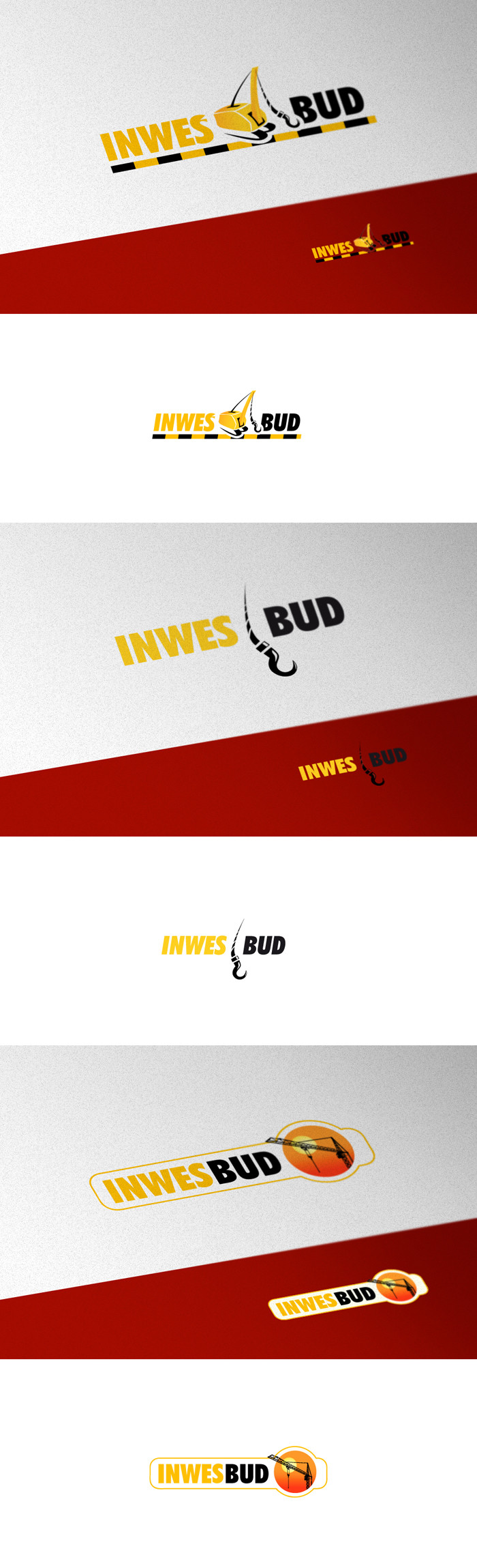
HOME | DD

pho3nix-bf β€” Inwesbud Logotype

Published: 2008-03-18 14:26:17 +0000 UTC; Views: 15639; Favourites: 103; Downloads: 430
Redirect to original
Description Rly old one. Logotype for a company wich offers cranes for leasing. Or sth liek that. The last one was made on their special request and also was the choosen one - however I dont like it

For: Agencji Reklamowa ESKAL
Related content
Comments: 25

Chopelina [2017-10-04 12:28:40 +0000 UTC]

Love the first one! Beautiful work

πŸ‘: 0 ⏩: 0

cpenree [2009-01-14 15:54:01 +0000 UTC]

The second or first for sure.

πŸ‘: 0 ⏩: 0

wilsoninc [2008-11-19 17:15:10 +0000 UTC]

i prefer 1 or 2

πŸ‘: 0 ⏩: 0

moapz [2008-09-26 01:27:22 +0000 UTC]

third version is good

πŸ‘: 0 ⏩: 0

digitalAM [2008-04-22 13:45:40 +0000 UTC]

i like second one

πŸ‘: 0 ⏩: 0

m-A-s [2008-04-03 11:00:59 +0000 UTC]

Good good and good!!!

πŸ‘: 0 ⏩: 1

m-A-s In reply to m-A-s [2008-04-03 11:01:32 +0000 UTC]

...i prefer the second version

πŸ‘: 0 ⏩: 0

mikomi26 [2008-03-21 06:59:04 +0000 UTC]

imo the first version is by far the best, but if the client wants a more simple, the second is a wonderfull one too. I dont realy like the third.

awsome logo's !! (1+2)
cheers ^^

πŸ‘: 0 ⏩: 0

pofezional [2008-03-19 19:47:40 +0000 UTC]

I like the first version. Good work. You are amazing!

πŸ‘: 0 ⏩: 0

cooh-pl [2008-03-19 16:55:13 +0000 UTC]

looz, man

πŸ‘: 0 ⏩: 0

cooh-pl [2008-03-19 14:28:07 +0000 UTC]

p.s. nie podoba mi siΔ™ czwerwieΕ„ w prezestacji.

πŸ‘: 0 ⏩: 1

pho3nix-bf In reply to cooh-pl [2008-03-19 15:30:30 +0000 UTC]

sek w tym ze materialy mieli na czerwonym w sporej czesci wiec trzeba bylo pokazac jak pi razy oko bedzie wygladac po podmianie loga

πŸ‘: 0 ⏩: 0

cooh-pl [2008-03-19 14:27:00 +0000 UTC]

no tak.. nie chcem sie na ten temat wypowiadac + fav

πŸ‘: 0 ⏩: 0

lumberpack [2008-03-18 17:24:38 +0000 UTC]

wszystkie bardzo fajne, ale nr 1 the best

πŸ‘: 0 ⏩: 0

neilan [2008-03-18 17:23:02 +0000 UTC]

numer 1. oj tak.

πŸ‘: 0 ⏩: 0

Burger92 [2008-03-18 17:08:19 +0000 UTC]

wg mnie super, najlepsza wersja 1

πŸ‘: 0 ⏩: 0

Torsten85 [2008-03-18 16:29:55 +0000 UTC]

the 2nd one is the best....really nice!!

πŸ‘: 0 ⏩: 0

zottel89 [2008-03-18 15:44:23 +0000 UTC]

very nice ... my favourite is the first one ...

πŸ‘: 0 ⏩: 0

smitu [2008-03-18 15:28:52 +0000 UTC]

pierwsza wersja moim zdaniem jest total kozak, inne zbyt malo kojarzace sie z tematem w moim odczuciu

πŸ‘: 0 ⏩: 1

pho3nix-bf In reply to smitu [2008-03-18 15:31:49 +0000 UTC]

nie no - ostatnia tez jest oczywista - ale nie trawie takich "dokladnych" rysuneczkow w logach :/ wieje zeszlym wiekiem Co do srodkowej ... a takie tam ... tete fete

πŸ‘: 0 ⏩: 0

Swayze05 [2008-03-18 15:04:05 +0000 UTC]

brak sΕ‚ow ; )

πŸ‘: 0 ⏩: 0

frose [2008-03-18 14:54:24 +0000 UTC]

I really like the first version : )

πŸ‘: 0 ⏩: 0

shftfrm [2008-03-18 14:50:52 +0000 UTC]

I think the first one is the best here. I don't know why they choosen the last.

πŸ‘: 0 ⏩: 0

EnzuDes1gn [2008-03-18 14:39:10 +0000 UTC]

very good, love the bottom versions best

πŸ‘: 0 ⏩: 0

amandhingra [2008-03-18 14:30:13 +0000 UTC]

nice

πŸ‘: 0 ⏩: 0