HOME | DD
 Pinefrick — Finally on the Surface (AT)
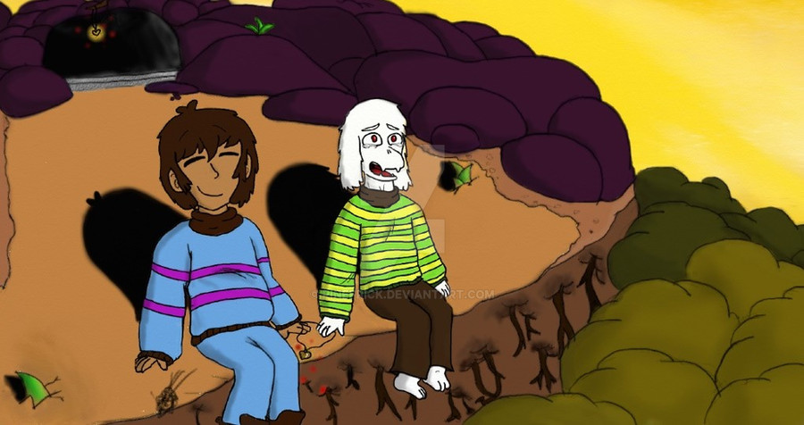
#heart_locket #artrangelite #digitalart #frisk #locket #surface #undertale_game #asriel_dreemurr #undertalefanart #frisk_undertale #asriel_undertale
Published: 2017-01-04 18:44:06 +0000 UTC; Views: 693; Favourites: 22; Downloads: 0
Redirect to original
Description
There we go! I have finished my part of my Art Trade with BlizzardBrick !It's a digital art this time because I wanted to practice and I thought this would look so much cooler colored than anything I could do traditionally.
I'm so happy with how this came out! I'm still kind of new to the program but I really like what I made!
I hope you all like this, I know I do!!
Undertale (Frisk, Asriel) - Toby Fox
Art Trade done w/ BlizzardBrick
All art by me
Related content


Comments: 10

Hello from project comment.
Warning
I'm going to be honest with you about this drawing and I'm not going to sugarcoat it either, because I don't give bullshit.
Honestly, I like the concept of having frisk and asriel sitting beside eachother on a cliff while the sun is setting, especially when they finally reach to the surface after being underground for so long. I think that's a heartwarming moment. I also think you got your perspective pretty down pat.
However, the rest of the drawing honestly sucks and I'll explain why it sucks.
1. Colour theory.
Some of the colours in this drawing look too saturated, especially with the greens, blue, purple and brown. The yellow on asriels shirt and the sky are way too bright. Also the green on asriels shirt is too bright as well and it's distracting.
My advice would be to learn colour theory.
Here's some youtube videos that will help you:
www.youtube.com/watch?v=9kQllL…
www.youtube.com/watch?v=g2fZdG…
2. The Anatomy.
Ehh, it's okay. Frisks head looks oddly shaped and both characters look very stiff. Most people don't sit with their legs tightly shut like that, especially with guys. (If you know what I mean) I can see that other people in the comments have already provided you with anatomy references so I don't think that I have to provide you with any more, unless you want me to, then I will.
3. The Shading.
I can see that you've shaded with some colour, except for the shadows of frisk and asriel. Whatever you do, don't use black for shading. I've made this mistake with my own drawings and they look like dog shit because of that. So please please please, whatever you do, don't use black for shading. Use darker colours for shading.
4. Asriels face man.
He looks like he's seen some shit or something. Now I know it's supposed to look like he's crying for joy, but he looks more traumatized than happy. The way you drew his mouth, makes him look more traumatized than happy.
👍: 0 ⏩: 0

Hello from Project Comment!
I really love the overall concept for this piece, the way you incorporated the locket was quite clever and the angle that you tried to draw this in was quite ambitious, but I think there are a few things that could use some work. So the previous comment from project works already addressed proportions so I think I want to tackle color choice and your use of shading.
I love the colors you used for the background, the colors used for the trees and the mountainside are warm, and look like how you might see them at sunset, and the colors you used for Frisk and Asriel are quite accurate to their in-game appearance. However, that's where I find the first issue. This landscape is covered by sunset light, which is a sort of an orange color, both Frisk and Asriel should both be under some sort of light, their clothes, however, lack that warm coloration. In addition, you use alot of soft shadows which really complement the setting. However the shadows behind Asriel and Frisk are really extreme as if you they were under an intense light, I recommend lightening them to a softer shade, like how you shaded the rocks.
I also noticed in the foreground you have alot of trees surrounding the base of this mountain, 2/3 are made of a light olive color and 1/3 appears to be a jade green. I recommend that in the future perhaps you diversify the green spread it out, as it is now, it gives the appearance of shading, make every couple of trees a different variation of shades of the jade green, giving it a more natural sporadic appearance.
👍: 0 ⏩: 0

Great job! Maybe put more "strong" shadings because of the sunset.
👍: 0 ⏩: 0

Hello from Project Comment!
I think the concept for this drawing is well realized. You chose a great color palate, and I like how you incourperated the locket- that was a neat small detail. However, I feel there are a few things you can work on in order to evolve your art. First off, your proportions are a bit inconsistant and wanky. The legs are too short in comparison to the body and Frisk's head is a bit large in comparison to the rest of their body. Also, Asriel has what looks like tears in his eyes, but they are easily missed. If this is what you intended, I would sugest you excentuate them more. The lineart of the drawing is great, but I feel like you could add more shading and texture. For the rocks and trees, I think you could add more details like crevices and leaves or at least more color variation, and in total there is minimal shading- the inverted cliff should be darker as the sun is above and in frount, and the roots should cast long shadows downwards.
In whole, I think you show great promise as a growing artist and I wish you luck in the future. I hope I was able to help!
Tutorial on body proportions:
m.youtube.com/watch?v=laWSSkcn…
👍: 0 ⏩: 1

Thank you so much for your well thought out comment!
I agree I have work to do in proportions, I will definitely check out that video, thank you for it in advance.
I'm still kind of new to digital art so I think that's really why Asriel's tears look strange, I'll admit it. I was trying to go for a "shiny, but clear" effect, but I think that's a little too advanced for me at the moment.
Thank you for the tips on shading, I agree it should be much darker in some areas, I think while drawing this I was really focused on the cave where they all left the Underground, the shading still looks off there, but I think I was so focused on it I pretty much forgot how much darker some areas would be. I'll be sure to work on my shading more in the future!
Also, I'm so glad you noticed the locket, it makes me happy that you did!
Thank you once again for your comment!
👍: 0 ⏩: 0

Nice! I like Concept and all, But The actual Image itself Has its problems.
For me, the style doesn't fit the Cartoony Nature of Undertale's Characters, and I see this problem a lot with some artists.
For example, Asriel Doesn't look very...Marshmellow lovable Butterscotch goat?
Idk, It's just Asriel Has A Very Soft Peachy and Fluffy Aesthetic To him, And In this Drawing, He Kinda Looks A Bit off character.
For Frisk, She Just....Doesn't Look normal, She Looks fairly Happy, While Asriel Looks Like He's Been through the 7th Level of hell!
Overall the Image has a Very Unsettling vibe for An Undertale Image that features Two very light-hearted characters.
I recommend Trying to put yourself in the Characters shoes and Try linking what their Expressing, Then Drawing them In the Style they both emote while leaving the Background In your own Style.
👍: 0 ⏩: 1
Thank you for your comment, it always makes me happy to know that someone had posted a comment on my work.
I understand that my style for Frisk and Asriel is kinda different from the canon universe, but I try to go off canon, get inspiration from other artists, and put my own style to them. Frisk has especially changed a lot (you should see all their previous designs, holy cow XD) but I'm quite happy with how they came out, Asriel too. Every artist has a different style for characters, and I think that really comes down to a matter of opinion.
As for expressions, I agree I have a bit of work to do on them to make faces easier to read. In this picture I tried to make it seem as Frisk is content, happy even, they finally got Asriel on the Surface. As for Asriel I tried to make him in disbelief happiness, he can't believe he's finally on the Surface again, he's also crying because I feel like he would be so happy to see the sun, to be free. (Also he cries in the True Pacifist ending when he remembers Chara, and imagine seeing the Surface for a happy reason, I imagine that'd make him cry)
You said it was unsettling though? I don't mean to be rude, I'm just confused. Unsettling usually is used to talk about things that are creepy or disturbing, could you elaborate on that? I want my pieces to be enjoyable, some will be unsettling on purpose, but for a picture like this one, that's not the overall feeling I want, so could you explain more on how this is unsettling?
Thank you for your time.
👍: 0 ⏩: 1
It's Unsettling in the Fact that their expressions Are off.
Sorry that I didn't make that Clear.
👍: 0 ⏩: 0

Ahh this looks awesome! ;o;
I love the color of the sky, even though that might be a smaller detail, it just gives the picture more depth than a blue sky would!
Thank you so much for trading with me! ;w;
👍: 0 ⏩: 1
I'm so glad you like it!
I wanted to try and do the sunset (or rise) that you get in the Pacifist Ending, so I'm glad it turned out well!
And this Art Trade was lots of fun, so it's no problem! ^^
👍: 0 ⏩: 0