HOME | DD
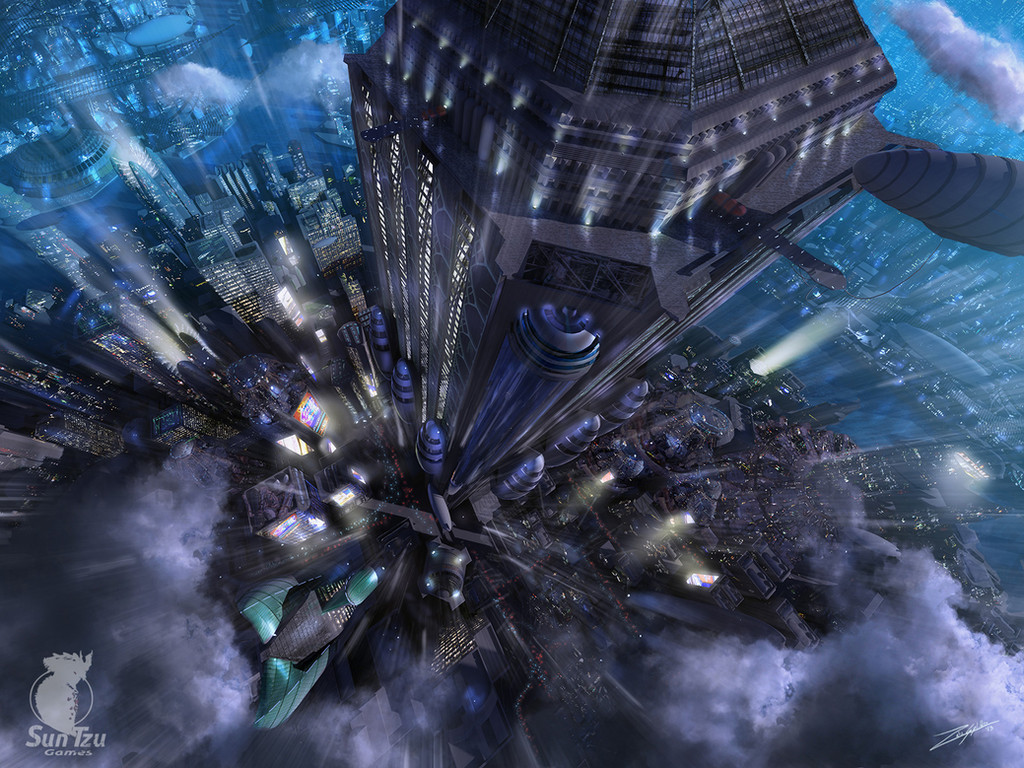
 PlasmaX7 — Cityscape

Published: 2007-12-06 16:10:53 +0000 UTC; Views: 20949; Favourites: 253; Downloads: 4775
Redirect to original
Description
Some matte painting practice, just for fun. Stocks from sxc.hu and *mjranum-stock .EDIT: Fixed some of the issues (sorry, not perspective
 ) that people mentioned, and revamped the image slightly. Thank you to everbody who commented helpfully! To see the changes, here's the old version: [link]
Related content


Comments: 38

I think I like the perspective being off. It makes it more interesting and, well, chaotic. ")
I really like this, I love the girl statue with the sword especially. In fact I like the whole thing. >.< Haha.
Brilliant.
👍: 0 ⏩: 0


so nice!
but I think I would be crazy
if I was in that traffic ")
👍: 0 ⏩: 0

Your amazing work has been feature here ---> [link]

👍: 0 ⏩: 0

SOOOOOOOOO SEXY!
Teach me to matte paint like you!
👍: 0 ⏩: 0

Wow cool, reminds me of Blade Runner a little bit.
👍: 0 ⏩: 0

it's been quite a while since i've added to favourites 3 of someone's works but some of yours are truly inspiring and really, i'd say, "stylish" (atmosphere&all that stuff)
👍: 0 ⏩: 0

Though very detailed and well done, it would be better without that strange formation with the giantess in the background
👍: 0 ⏩: 0


Nice one, just lovely enough to make me want to draw a nuclear mushroom over it
")
👍: 0 ⏩: 0


Excelletn! All the little details are wonderful, I wouldn't have patience for such a work
👍: 0 ⏩: 0

Excellent work! So detailed and painstakingly done. A well deserved

👍: 0 ⏩: 0

Nice one, but as already mentioned the perspective really is way off what kinda destroys the first impression as it is really obvious at some places. Some buildings look very much cut in and a little color variation would make a good difference. Keep at it
👍: 0 ⏩: 1

Thanks dude. It'll be a long time before I reach your level of cityscaping.  (Wink)")
👍: 0 ⏩: 0

the pollution fog is a nice touch..
I wish a little more color spoke out within the details of the different buildings
but wow wow wow thats incredible detail and work.
belongs in a Rp game or something.
👍: 0 ⏩: 0


Very cool, I think the messed up perspectives on the buildings add something to the image. I like very much.
👍: 0 ⏩: 0


")

Great work my friend, way to think outside the box!
👍: 0 ⏩: 0

yep, great, but as said before, perspective is a bit off.
👍: 0 ⏩: 0

Wow
normally i am too lazy to write something (even when i give sth a fav). But this time...
This is amazing Plasma[link]
Awestruck
👍: 0 ⏩: 0

The perspective is indeed a bit screwy in various different places..
But it's still pretty awesome
👍: 0 ⏩: 0


The sky colour is very dramatic, and the structure in the middle would be a cool sight to see !
👍: 0 ⏩: 0


You're so good at Mattes, how did you learn?
👍: 0 ⏩: 0

Very nice work, the perspective is a bit odd in some places, but in general i really liked it, but i would probably take the girl out of there, doesn't fit very well IMO
Keep it up
👍: 0 ⏩: 0

your perspective is a bit screwed  (Smile)")
👍: 0 ⏩: 0

Heya...
Awesome idea it looks really interesting. I cant help but feel that the '
👍: 0 ⏩: 0

There's a problem with perspective like =Akajork already said.
I'm fighting with the same problem
👍: 0 ⏩: 0


Love it. The far back sand dune/mountain type area seems a bit bland compared, but nothing major at all.
👍: 0 ⏩: 0

hmm some serious perspective and color issues.. watch out with the saturation on that big platform in the back.. it has more contrast than the buildings in front of it.. nice concept
👍: 0 ⏩: 0

