HOME | DD
 PochiPops — Ambition overload
by-nc-nd
PochiPops — Ambition overload
by-nc-nd

Published: 2007-06-10 22:46:44 +0000 UTC; Views: 2403; Favourites: 63; Downloads: 84
Redirect to original
Description
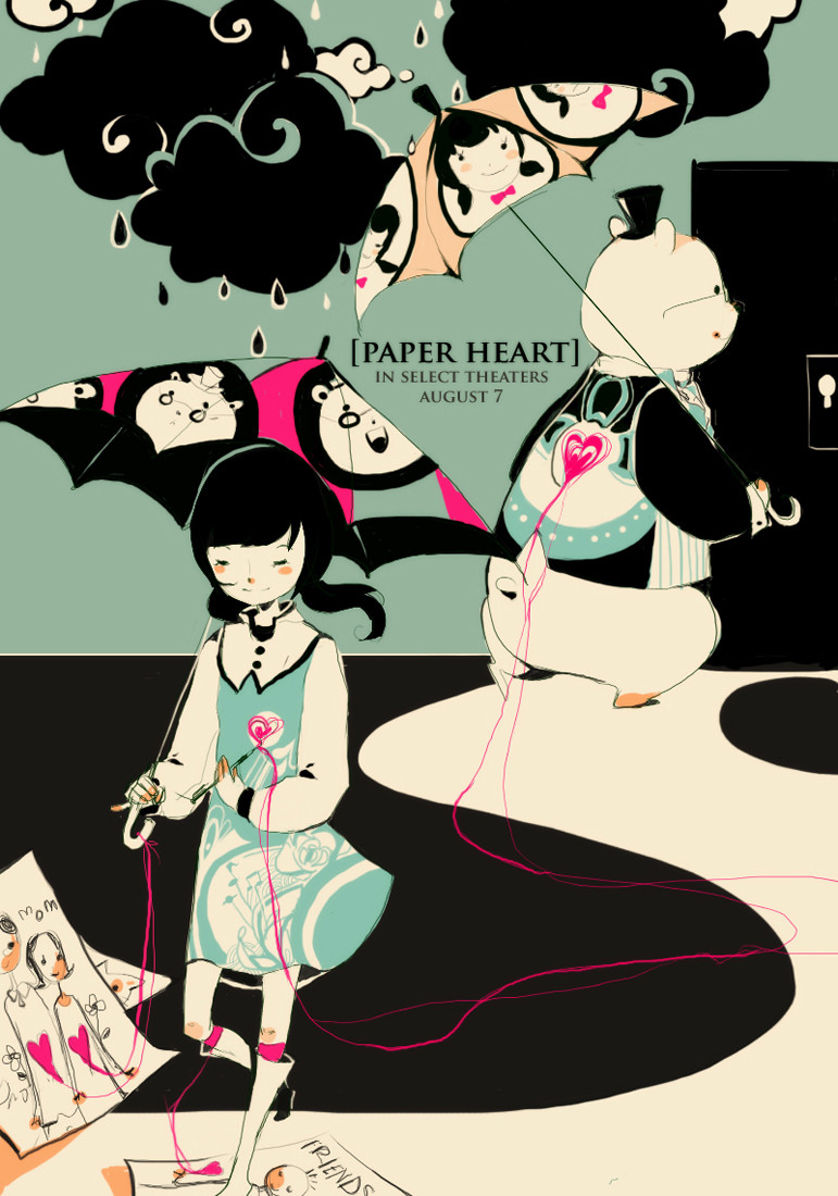
Haven't done a black-white-red piece for a while.Overly ambition people somewhat scare me. Ahaha I wish I had more ambition. But I think when you're ambitious disappointment hits you harder. Well, that's just an assumption, I really wouldn't know.
Holy crap I should watermark, will watermark later. >_>;
Related content


Comments: 32

Great composition, as usual XD
the concept was well illustarted though
👍: 0 ⏩: 0


pretty. black read and white go together
👍: 0 ⏩: 0

rofl i dont watermark things... i really should but w/e.
shit... you know how to work that tablet.
👍: 0 ⏩: 0

hello there emoegg~ this is martia from nnk forum =x
what sort of dream needs to take lives?
👍: 0 ⏩: 0

Deep and meaningfull... And wonderfully done. Bravo

👍: 0 ⏩: 0

The impression I'm getting is that the red is the ambition and the faces are the older generations that have failed. The red eyes shows that they are blinded by their overly extravagant dreams and they might not see that their goals are an impossibility.
I really like the line running down the right eye of the face to the right. As you said, the ambitious disappointments hit you harder. The transition of the red to grey tear line threw me off for a second but now I see it as sorta like the cold slap of reality.
I also just noticed the bit of red on the stars to the side. The price of success I assume?
As for the girl to the left. The string hanging off the flower on her head is a nice touch. I like how it sorta turns into some sorta liquid as it touches down on the ripples coming from the girl in the center. The ground splashing up of course was vital.
Last but not least, the shading of the red. I have seen the shade of red when fresh blood is whipped on white paper. This is exactly what it looks like. Job well done on that. My analysis maybe way off, but I can say for certain that the shade of red is perfect.
I don't believe that anything in this picture is done on accident so I try to analyze every part of it. Sorry if everything I just said was way off the mark, but this is the impression that I picked up  (Smile)")
👍: 0 ⏩: 0


I agree. More ambition = more disappointment. I learned that the hard way. >_>
👍: 0 ⏩: 0

that looks so cool!! i love your choice of colors ")
👍: 0 ⏩: 0

you hated colors DDDD: very lovely piece anyways
👍: 0 ⏩: 0


i really love your style...its both creepy peacful and cute at the same time and kinds sureall
you pack so much into your pics
👍: 0 ⏩: 0

This is AWESOME.
I'm just wondering, but how do you do your coloring? =o I've seen it and have tried to do it on photoshop, but I've never really been able to get my brushes to come out looking like that. o____o;
👍: 0 ⏩: 0

Your pictures always have depth and meaning to them.

👍: 0 ⏩: 0

That is so mad. I love the colours. What program do u use? 
👍: 0 ⏩: 1

Oh, I use photoshop CS2 there's no way I could do this with paint LOL I can't paint!
👍: 0 ⏩: 1
LOL! same here. i use the same program but u are so pro..
👍: 0 ⏩: 0


Beautiful words & concept. The color scheme is sheer genius. : D
A powerful piece
fav+

👍: 0 ⏩: 1
Thank you. XD I used to work with black and white a lot since I hated colours.
👍: 0 ⏩: 1
ahaha, that's adorable : D
but it really works. It kind of makes the viewer concentrate on the meaning and small details more instead of the colors. But the subtle add of red is a nice touch 
Very artistic of you!
I realy like the sketched out feel of this. It makes it... i don't know... special. :'DD
👍: 0 ⏩: 0


Ahaha thanks. I really like using this brush but it makes everything look really messy.
👍: 0 ⏩: 0
