HOME | DD
 princepal — TV.com Community GUI-Homepage
by-nc-nd
princepal — TV.com Community GUI-Homepage
by-nc-nd
Published: 2010-12-15 12:05:58 +0000 UTC; Views: 11707; Favourites: 41; Downloads: 512
Redirect to original
Description
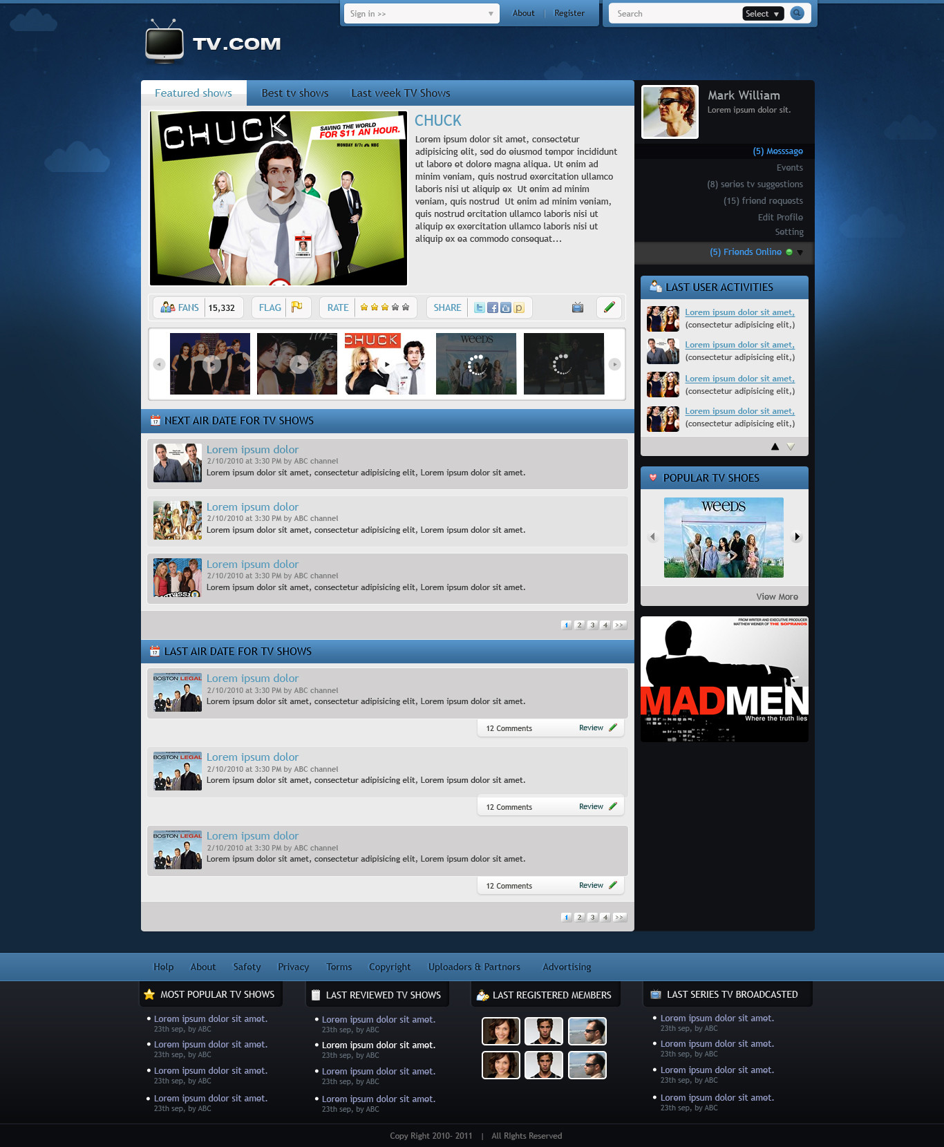
Before Comment Please Check Full View Of The Interface - [link]I designed this interface for tv community website. Client want clean, web 2.0 and easy to use for user
 (Smile)")
In this deviation i shown inner pages like TV show profile and User profile pages.
Please check innerpages of the TV.com community here -
Also check my previous community related web interfaces -
Follow Me @ Facebook - [link] || Twitter - [link] || DesignersCouch - [link]
Related content


Comments: 12

love the search bar, color wise could be better but overall its good
👍: 0 ⏩: 1

Very nice! I just wouldn't add the clouds in the background, they don't fit in with the rest of the layout in my opinion
👍: 0 ⏩: 1


Ok
👍: 0 ⏩: 1

its a real design which is in underdevelopment.. i mentioned in my comment client want clean/light and easy to use
👍: 0 ⏩: 0
