HOME | DD
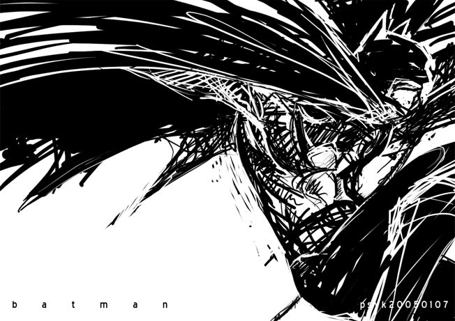
 PsychedelicMind — Batman
Published: 2005-01-07 09:23:29 +0000 UTC; Views: 16642; Favourites: 213; Downloads: 883
Redirect to original
Description
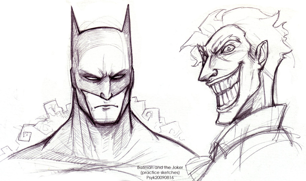
who are you chasing?Scrap or not?
Photoshop
approx 1/2 hour
------
Batman (c) DC
Related content


Comments: 50


May I ask how do u create such pics in Photoshop please? I really want 2 know.....
--
|\|Ei|_
👍: 0 ⏩: 1

hello~ if you have a graphic tablet, that would help. I just use the normal photoshop hard brush and play around with it. (opacity, flow, other effects). The varying brush size comes from the graphic tablet's pressure sensitivity.
👍: 0 ⏩: 0

Best Batman ever. Love the way you did this! looks like you paint white over black!
👍: 0 ⏩: 1
woo... that's actually a good idea.... will go try that next time >D
👍: 0 ⏩: 0

THIS. IS. SO... WAWSOME(woah and awesome)!!!!!!!!!!!!!!!!!!!!!!!!!! BATMAN RULES!!!!!!
👍: 0 ⏩: 0

I love messiness, and this is the gorgeous type of scrawliness that I adore. Lovely job.
👍: 0 ⏩: 0

Definitely not scrap. This kind of art suit very well in batman black and white kind of book. Cool.
👍: 0 ⏩: 0


NO SCRAP! but LatentLeviathan is right, the jaw should be a little more square.
other than that, it's %$!@'n amazing.
👍: 0 ⏩: 0


Am a big batman fan and I love this! it's got such a great feel of urgency
👍: 0 ⏩: 0

Great job, it looks awesome. It perfectly captures what Batman is really like: dark, mysterious, and kinda scary.
👍: 0 ⏩: 0


this is freakin awsome man!!! (I finally used freakin in a comment...)
B&W, use of line quality giving a sense of motion and framing...sublime!
definately going in my faves...
:3
👍: 0 ⏩: 1
\(^.^)/ Happy u like it dude! Woo! thanks for the thots man~ :3 shuld develop this style more nya....
👍: 0 ⏩: 0

reeeely cool! no scrap! ")
batman is the only superhero i like (awww ok...i like spiderman too...childhood leftover heh)
i think u should check (if u already haven't) "Batman Black & White" vol 1 + 2

👍: 0 ⏩: 1
hehehehe~ thanks man! i already have B& W1. :3 might go get B&W2 soon X3
👍: 0 ⏩: 1
tehehhh i thought you would!
katsuhiro otomo's story rulz! ain't it? (he made me buy it 
👍: 0 ⏩: 0


wow thats awesome o_______o
nice job on it! I dun think it should be a scrap o________o
👍: 0 ⏩: 0

I looooove it!
Oh batman. I think, my favourite hero. ;]
👍: 0 ⏩: 0

he belongs to DC, but then DC is owned by Warner Brothers, which is owned by Time, which is owned by AOL, so yeah there are a lot of people.
👍: 0 ⏩: 0

Whoa. Good work man. I just saw in my message you have a few others too...Can't wait to see them, this is by no means scrap. However, I am curious, how did you do this, did you draw it, or is this a minipulation, or...is that not for me to know? I mean, no matter what the answer, tis a stunning peice, I really really like it. It could use a higher res. but the fact that it isn't as crisp as I like, doesn't hurt the over all presentation....and once again. Whoa!
👍: 0 ⏩: 0

very nice! that style of drawing is really great!
👍: 0 ⏩: 0

Wow, I love the sense of movement in this. Very cool.
👍: 0 ⏩: 0

Yeah don't scrap this, this is possibly the best Batman fanart I've seen on DA.
👍: 0 ⏩: 0

damn..cinder was right....i saw batman....and instantly favd it....this pic rox psyc....almost looks like frank miller...sin city stuff...definately..not scrap!!
👍: 0 ⏩: 0

=3 i'm happy to see some batman fanart, this reminds me a lot of the Dark Knight book i bought.. greatest batman story ever done.
^^ awesome drawing style, goes well with the theme though i think the lineart should've been grey or some dark color with a black backround or something along those lines.
👍: 0 ⏩: 0

Nice pic of mr wayne! looks like it'd make an awesome wallpaper!
👍: 0 ⏩: 0


Don't make it as a scrap, it's PERFECT! You've captured the tone and the energy of Batman. It looks perfect enough for the Batman Anthology book Black and White.
👍: 0 ⏩: 0


oh man I know my brother is gonna fav this! damn you are awesome psych...but of course you know that...batman is the shizznite!!
Do not scrap this!!
👍: 0 ⏩: 0

Finally! Dynamic action pose! Been waiting for you to draw this kind of stuff since forever...!
Yes, the neck is too long (head too far from shoulders).
👍: 0 ⏩: 0

Aww i love it you use this style! Likin this a lot and i'm gonna support the idea that his heads a little too far away from his shoulder, but not so much that it makes the image look wrong. ^_^
👍: 0 ⏩: 0

Maybe the neck's too long?? But it's awesome anyways! I love the sketchy, raw look!

👍: 0 ⏩: 0


Hmm... I don't think it needs to be scrap at all, I love it... but his face looks a little... wrong... I don't know how... but it does... maybe it's just me, though... I think it points down a bit too much... that might be it...
👍: 0 ⏩: 1
maybe too far away from the shoulder? +thinks+
👍: 0 ⏩: 1
Hmm... maybe...
*Also thinks...*
👍: 0 ⏩: 0