HOME | DD
 pycckuucommi — Lets start the show.:
Published: 2004-06-21 23:35:59 +0000 UTC; Views: 246; Favourites: 3; Downloads: 70
Redirect to original
Description
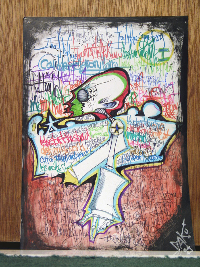
Terrible Photo, I know. I'll scan this eventaully, that way the colours would be RIGHT. These colours look awful in the photo, makes my eyes snort coke.Anywho, I felt as if I needed to upload something. Enjoy coke.
Btw, this is inspired by Deep's earlier work.
 (Smile)") If he wants, he can take all the credit
If he wants, he can take all the creditEDIT: You should full view this, but full view doesnt work now cuz DA is fucked.
Related content


Comments: 15

i love your art. .........stuff like this is rare. everything now is so generic. anyone who can draw anime eyes is considered an artist, but you're a REAL artist. i really admire your work
👍: 0 ⏩: 0

Ilike it cuz I always enjoy your works..but then there is something about it I don't like as well....I think it just is kinda busy...as far as colours....I am not use to seeing that from you...you usually keep ur drawings intricate and ur colours simple...
👍: 0 ⏩: 0


dude,,awsome pic (as usual..)..and i DO think this is one of the first few times you've actually used green,,as someone said,,i think,,,haha
👍: 0 ⏩: 0

Long time no see! If you're gonna scan it, I'll hold some of my comment till next time. I see you proped it next to a door. I got those doors too. Looks like something that'll found graffieted on a wall.
👍: 0 ⏩: 0

your letters are tight man.keep on writing .that shit looks like the walls with years of overlaping.
thx 4tha mention. made my buzz even better...how is big is it?.........

👍: 0 ⏩: 1

I dunno, not too big. maybe 10 x 16. Its bigger than computer paper, but not that much.
👍: 0 ⏩: 0


THis is amazing........can't believe it......ur so talented.....great job......love the colors!
👍: 0 ⏩: 0

um... not really much to say but.. i think this is the first time u used green that bright on ur drawins
👍: 0 ⏩: 1
I repeat, the colours are fucked in this photo. Its not really that bright.
👍: 0 ⏩: 1
")
👍: 0 ⏩: 0
