HOME | DD
 Pyrexea — Marlow-PosterDesign
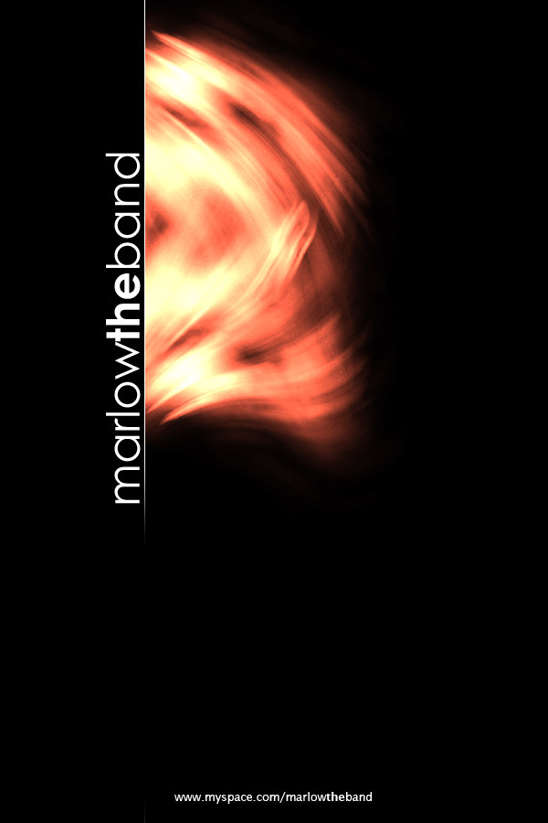
Published: 2006-05-07 21:42:38 +0000 UTC; Views: 155; Favourites: 0; Downloads: 20
Redirect to original
Description
I know that this will never be used for them. So here it is. Yes, i know its crappy with too much negative space and the fonts are all worng sizes. I just like this one somehow.")
Related content


Comments: 3

Yeah thanks, i spose it is a little cold. They kinda want something simple and minimal. Its hard to get a lotta love in something minimal.
As for the kerning, It was good untill I bolded the "the" to make it stand out and look like different words. I might go back to the spaces or just fiddle.
Wish i could od it now, stupid uni
👍: 0 ⏩: 0

Oooh ")

 (Smile)")
Wait no theres one more complaint! I was about to say I like the typography and noted the W at the end of Marlow and the T for the needs a little kerning alteration. Pretty common complaint with lower case T's and I's, usually necessary to custom alter the kerning by eye...
👍: 0 ⏩: 1