HOME | DD
 QTZephyr — Sailor SilverHare
Published: 2010-04-14 19:04:02 +0000 UTC; Views: 597; Favourites: 9; Downloads: 0
Redirect to original
Description
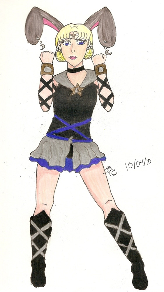
NEW STYLE
I was drawing this, and something changed.
I present to you, Sailor SilverHare. She's an AU version of Sailor Mene, if Sailor Mene's starseed had actually been claimed by Chaos and they decided to keep her around to work for them.
I like this design myself.
Sailor SilverHare/Sailor Mene is mine.
SM universe © Naoko Takeuchi
Done on Strathmore paper with Prismacolors
Pose ref:
Related content


Comments: 12


Sweet fuku, I had a feeling it was animamate-Mene I spotted at the livestream!
I agree about the facial features, and that aside this looks sweet! I dig the colouring, and she looks all srs bsns here!
")
👍: 0 ⏩: 1

Thanks. This version of Mene is a lot less silly and totally into kicking butt.
👍: 0 ⏩: 0

For a more realistic face, I usually try to put the eyes exactly in the middle of the head from top to bottom. The style of the eyes I like a lot!! I hope you keep going with it!
👍: 0 ⏩: 1
Thanks Sakky. I will try the next lineart with new eye positions.
👍: 0 ⏩: 0

erm...scary bunny ears are scary, Zephyr...D:
This doesn't mean that I don't like the picture -- I love it! I do like the path you're taking with the face, though I'll agree with the others in that it might look a big better if you position things lower on the face. I also like how you did her arms. ^^
But still...I don't really like seeing people wearing bunny ears. XP
👍: 0 ⏩: 1
But they aren't bunny ears, they are hare ears. Hares are sooo much cooler than bunnies.
Right: move facial features down.
THANKS!
👍: 0 ⏩: 1
Oh, oops. Still, they're SO BIG in comparison to her a it's kinda...odd.
THANK YOU, MY FRIEND!

👍: 0 ⏩: 0

Agreeing with Kuki about the face--it sort of feels like the facial features are just a little too high, which makes the forehead look too small. Bring them down a little next time and see how it works out?
I like this face style better than your other one--it goes well with how you draw the bodies.
👍: 0 ⏩: 1
I'll try your suggestion with the facial features. I took the cues for the facial placement right from the stock.
I think it goes better with the body too.
👍: 0 ⏩: 0

Her face looks a little bit odd, like it's out of place with the rest of the body... I can't quite place why, though. But aside from that, this is actually really good! I like it.
👍: 0 ⏩: 1
I am experimenting with this. I am leaning towards a more "realistic" anime style now. It may take a while to get the kinks out.
Thank you.
👍: 0 ⏩: 0