HOME | DD
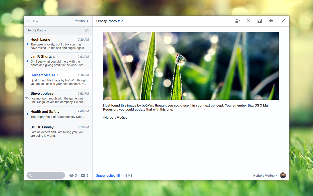
 r2ds — OS X Mail Redesign
by
r2ds — OS X Mail Redesign
by
Published: 2013-07-21 19:54:26 +0000 UTC; Views: 42355; Favourites: 69; Downloads: 93
Redirect to original
Description
Updated! I changed to the filled icons this time, you convinced me internet. I also fixed Hugh Laurie, which went unnoticed as Huge Laurie.
1514: Interface updated to a new design language I am experimenting with.
Images - bo0xvn.deviantart.com/
Related content


Comments: 39

")

Its a only a mock up, sorry.
👍: 0 ⏩: 0
")

This doesn't look anything like Chrome OS. This is like a mixture of Elementary OS, OSX and iOS 7.
👍: 0 ⏩: 1

The Chrome OS files app: gigaom2.files.wordpress.com/2013/04/chrome-os-files-dev.jpg Ok, the browser itself has a different window but a lot of the default Chrome OS apps have that style of border.
👍: 0 ⏩: 0

Looks really nice, inspired by iOS 7, but then not too dramatic a change.
Only thing would be that it doesn't look like an active window as it is too pale... Not too sure how you'd go about fixing that though.
👍: 0 ⏩: 1
To make it look like an active window the icons could be blue, like on the iOS Notes Redesign.
👍: 0 ⏩: 1
Yeah, guess so. Maybe also if it had a larger shadow?
👍: 0 ⏩: 0


Though I honestly hope they do not do this, your design is the most plausible and thought-through of all the mockups I've seen around. Great job.
👍: 0 ⏩: 1
I would have to agree, but I would like to see a slight change, just not this dramatic for OS X.
👍: 0 ⏩: 0

This looks great, and very Apple-like! Just not sure about the shadows in the actual window.
👍: 0 ⏩: 1
Thank you! Are you meaning the window drop-shadow?
👍: 0 ⏩: 0

this looks so like the ios7 update! on the iPhones , you should show this to apple

👍: 0 ⏩: 0

This is so much better and logical than the other "flat os x" concepts. I'd be more than excited to upgrade if this is how OS 10.10 looks like. Thanks for the GREAT UI mockup!
👍: 0 ⏩: 1
Thank you. I wasn't expecting Mavericks to be a new design, based on their team for mavericks where moved on the new design for iPhone. But hopefully the next update will look something like this.
👍: 0 ⏩: 0

The only thing I dislike is that the icons on the top seem too thin. I wish they were as thick as the arrow near the "Mailboxes" label. This is nothing against you though, it's just what I dislike about iOS 7's new design... but other than that, this is a really great concept! I would love using something like this. Very simple indeed.
👍: 0 ⏩: 0

I am just hoping that this is the way they are going.
👍: 0 ⏩: 1

absolutely!! i just hate skeuomorphism! and Apple really disappointed me with Lion and ML. and the iOS design was also really outdated.
👍: 0 ⏩: 0


")

This is so amazing and professional! It really is the design from iOS 7, and you made it suit OS X. I think the current aluminium look of OS X is beginning to look old, dull and boring, just like it did with iOS 6. I bet this is direction OS X is going to go.  (Smile)")
")
👍: 0 ⏩: 1
Thank you, I was going to uploaded a few more instances of this then start other applications. The full screen icon's ghostliness was a mistake; subconsciously due the the hours it took when designing an Elementary full screen icon to be pixel perfect.
👍: 0 ⏩: 1
Awesome, I am very interested in seeing more.
👍: 0 ⏩: 1
Just uploaded a new instance of it fav.me/d6g9n2w
Hope you like it!
👍: 0 ⏩: 0


I can totally see them going that route in near future. Not sure why many hate that transparency and blurry thing, looks very cool to me. And this is coming from a pure Windows fan
👍: 0 ⏩: 1
I think people do not like the blur for how it has been used in iOS 7, like the Control Center on top of the bright colorful icons doesn't work for me. However, it does work in the notifications.
www.etradesupply.com/blog/wp-c... " style="font-size: 9pt; -webkit-user-select: none;">
👍: 0 ⏩: 0

Thank you, it seemed that's where they would be going.
👍: 0 ⏩: 0