HOME | DD
 radicalthunder — Thor Test Trace
Published: 2010-05-17 16:55:27 +0000 UTC; Views: 2111; Favourites: 27; Downloads: 39
Redirect to original
Description
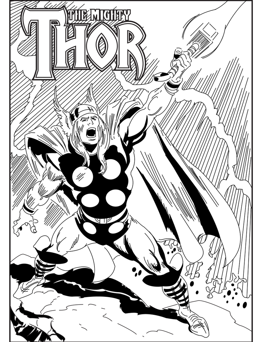
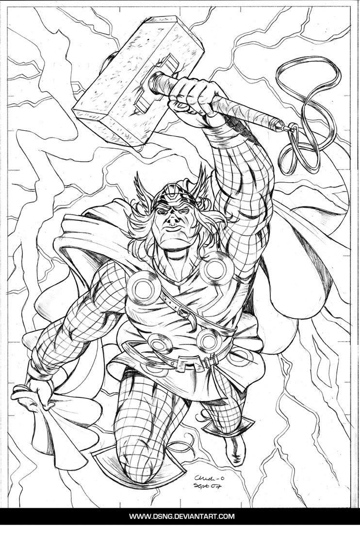
Recently, I obtained the book, "How To Draw Comics The Marvel Way" by Stan Lee and John Buscema. I was going through the pages and I found the artwork for Chapter 5, which was Thor. I liked the picture so much that I thought I'd try my hand at tracing it out in Illustrator. Personally, I'm stoked about this picture, I think it came out great for my first time tracing out someone ELSE'S pencils! Please tell me what you think!The following will take you to picture by John Buscema:
[link]
Pencils by John Buscema
Inks (term used lightly here) done by Kris "Skip" Johns
Related content


Comments: 12


That was truly an amazing drawing in that book. I also like The Namor in chapter 9 or something, cuz he shows his muscular mass on his back while he's stopped running. 10/10 for tracing Thor in clean ink!
👍: 0 ⏩: 1

Thank you very much! I really appreciate it! I'm always happy to hear from the people that truly appreciated the styles of the original drawers, though I really like where comics has come artistically, a lot of characters lost their individual qualities over the years. Namor is really good example of this, he basically lost his signature hairline and crazy eyebrows, and those are kind of why I like him, he was different, ya know?
👍: 0 ⏩: 1
I noticed the changes with Namor, yeah. I'm sure Namor will go back to his signature face someday, Namor's face is too boring right now. Who changes the most is Superman. I dunno why, but I prefer the older ones Dan Jurgens drew of Superman. Like Jim Lee's Superman....eh, boring. The way McQuiness drew Superman, krypto-steroid. Dan Jurgens' Superman...it's SUPERMAN!
👍: 0 ⏩: 1
I hear you. It's cool that there can be so many interpretations of the same character in the world, but it's not always a good thing. Style is everything and the phrase, "If it ain't broke, don't fix it" seems appropriate!
👍: 0 ⏩: 1
That's it! "If it ain't broke, don't fix it" is perfect.
👍: 0 ⏩: 0

Long while since I read it at the library. 10/10 for how you traced Thor.
👍: 0 ⏩: 1
Wow, thank you very much! Perfect scores are cherrished here! 
👍: 0 ⏩: 0

Pretty awesome for a trace! ")
👍: 0 ⏩: 1
Thanks! I REALLY pleased with him! It took 5 hours to get everything the way I want it, but I don't think that's too bad for a starting point. I would have liked to give him a greater strokeweight for his outline, but I was getting tired of working on it (I worked on it practically non-stop), and I wanted to hurry up and post it!
👍: 0 ⏩: 1
He really does look awesome.
👍: 0 ⏩: 0