HOME | DD
 radzad — portfolio 1
by-nc-nd
radzad — portfolio 1
by-nc-nd
Published: 2010-06-30 05:51:12 +0000 UTC; Views: 7120; Favourites: 38; Downloads: 136
Redirect to original
Description
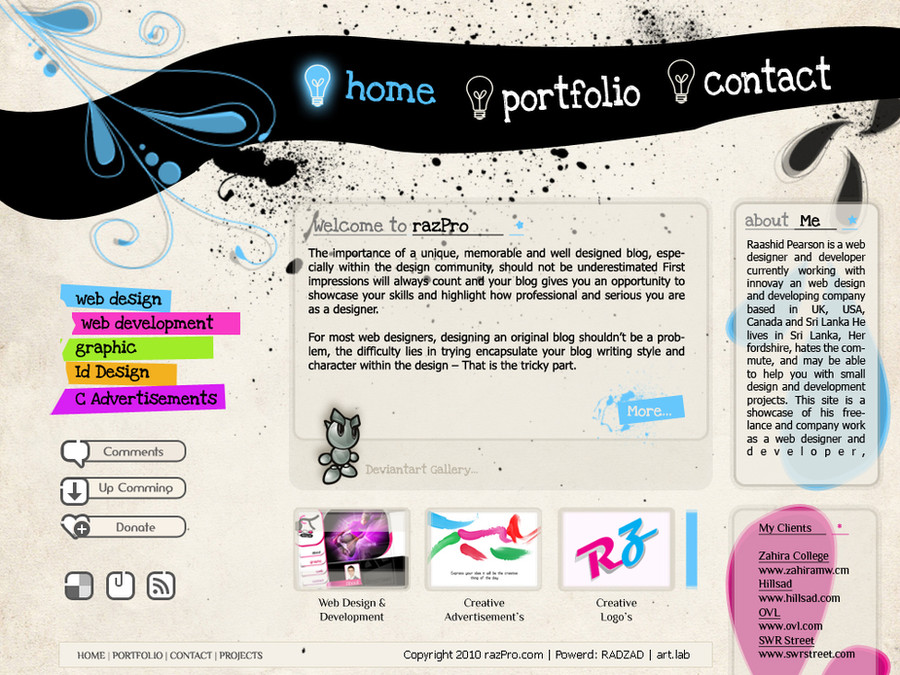
My second portfolio design")
")

Related content


Comments: 26

Regardless of that, many of the clients nowadays DO have a clue about webdesign. If they see poorly made typography and brushes allover you will have a hard time attracting business clients.
Like yourself I consider myself a beginner in the art of design. And taking pieces of advice from other designers always improved myself.
Constantly read smashingmagazine.com and the tutsplus.com network.
Aside from this I agree with manujg.
👍: 0 ⏩: 1

thanks a lot for you advice and support as a designer.. your welcome.
I got many point from this webpage design i think i want to be more and more creative..
👍: 0 ⏩: 0

original idea, but i claim such designs are very unpractical and won't attract many persons.
👍: 0 ⏩: 1
This page is a portfolio.. so its build fr my taste but i appreciate the comments and ideas of deviantart members
👍: 0 ⏩: 0

Good effort however, I don't think you will be attracting any clients with this. The header does not have any flow to it, there are random brush sprays. The typography is weak, and all the text is crammed up. The footer has different set of typography again, which throws it of sync. My clients is crammed into the footer, not practical. other than your menu, everything looks poorly presented. You have to make the design have a rhythm and be practical. I would suggest you revise your work again. Good luck.
👍: 0 ⏩: 1
hmm wel brother..
i think so..
i have got many idea's from deviantart frnds. so im going to modify this website.
so will get a replay for all request
Thank you.
👍: 0 ⏩: 1

 (Smile)")


")

good start but still needs a lot of minor details, you can remove the upper floral blue thing and use some other good effect there.
👍: 0 ⏩: 1
thnks brother...
i like this type of comments, i mean advices
i think so to make some change.. within 1week..
👍: 0 ⏩: 0