HOME | DD
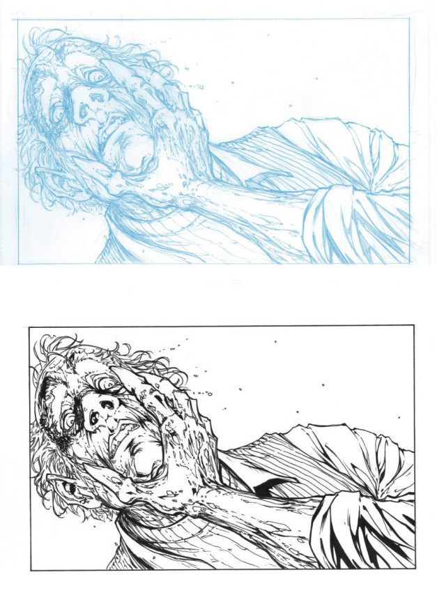
 ragelion — inking sample
Published: 2006-08-11 12:55:41 +0000 UTC; Views: 1658; Favourites: 15; Downloads: 12
Redirect to original
Description
Just an inking sampleI did this a couple of yrs ago. It was for a Topcow talent search thing I saw in Wizard magazine.
Never did submit it though. There was a couple of pages, I was too busy or something to finish them.
I always did like this panel though.
Inks by me. Pencils...not sure. Think Silvestri...I think.
Related content


Comments: 20


looks like dwayne turner's Curse of the spawn. Your inking lines are varied and wonderful!!!
👍: 0 ⏩: 0

that lines are from michael turner!!!! jejeej nice done!
👍: 0 ⏩: 0


I think I just messed my pants O_o.
Them be some mighty inks.
👍: 0 ⏩: 0


Looks good, I agree that the line weight should get thicker as it comes towards the reader. Also the line weight on the lines of the scabs (or dead skin, what ever it is) should be a very fine line compared to the others. You can see it in the blue line.. Just a point of view..
Peace
K
👍: 0 ⏩: 1

I know I know...excuse is this was done a couple of yrs ago.
 (Wink)")
👍: 0 ⏩: 1
Nutin but love baby.. nutin but love... good work all around though..
GONE
K
👍: 0 ⏩: 0

you got some really nice inks there.and the pencils are by michael turner.that was from a five page sample script from top cow.for the contest you were referring to.looks very nice.good job.and congrats on all the nice feedback you got at the con man.thats got to be a self esteem booster right there.
👍: 0 ⏩: 1
thank you. Yes it was a boost.
👍: 0 ⏩: 0

Nice job on the inking... you use traditional inking, or digital?
👍: 0 ⏩: 1
traditional inks. Dont know how to do it digitally.
👍: 0 ⏩: 1
Wow, then incredibly job, man!
👍: 0 ⏩: 0
NuclearConvoy [2006-08-11 13:14:27 +0000 UTC]
Nice inking. I'm used to seeing you ink more bold lines, this fine linework looks spiffy, man.
👍: 0 ⏩: 0

I really like these inks Jamie, You really add depth to thid pic. It just pops, Maybe a slightly thicker line weight on the arm as it get closer to the reader.
Really Nice work
")
👍: 0 ⏩: 1
I know I know...excuse is this was done a couple of yrs ago.
👍: 0 ⏩: 0
