HOME | DD
 raichmann — Prosthetics
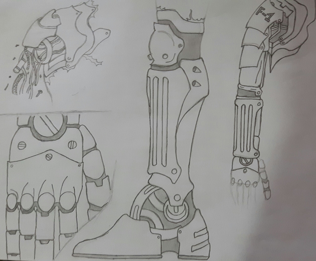
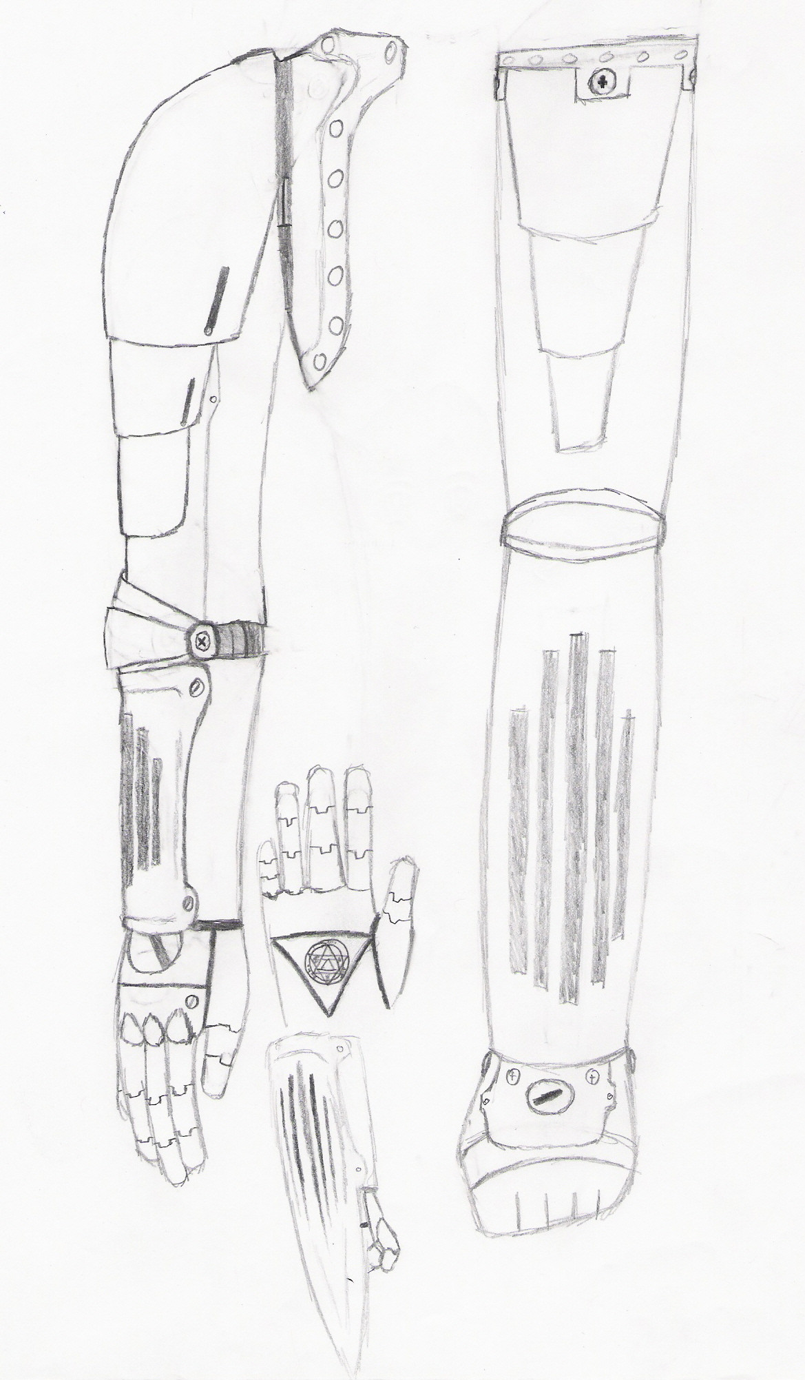
#legprothetics #fma #fullmetalalchemist #prosthetics
Published: 2016-09-20 17:50:31 +0000 UTC; Views: 409; Favourites: 22; Downloads: 1
Redirect to original
Description
I think i watched a little bit to much FMA.Related content


Comments: 24

Hello! I’m here from with some constructive criticism.
First of all, I like how much detail you put into each of the prosthetics. The soft gray shading around the joints, combined with the neat line-art, makes each part look smooth and polished. The leg and the shoulder in the upper left corner look especially realistic, like they’re actually capable of moving.
The shoulder and arm along the right edge look a little stiff in comparison. I think that’s due to the way you drew the arm hanging straight down. Instead, try giving the arm slight bends at the elbow and the wrist. The hand would look a lot more natural if we saw it from the side (with the thumb side nearer to us), as that would be a more typical resting position than keeping the back of the hand facing forward. Similarly, the fingers should also be bent ever-so-slightly instead of held rigidly straight.
The proportions look mostly good, although the kneecap and knuckles seem a little small in comparison to the surrounding parts. The knee should protrude more than any other part of the leg, while the knuckles should be slightly wider than the rest of the finger.
You could also benefit from paying more attention to how you position each drawing on the page. You clearly ran out of space for the hand in the bottom left corner, and everything pushes right up to the edges of the paper. Giving everything a border of white space would make the whole drawing look a lot more organized. The way you present your art can often be just as important to how the viewer perceives it as what you draw.
Speaking of presentation, I wish there was better contrast between the paper and the drawing. This is especially noticeable in the top left corner, where the paler line-art makes it difficult to see all the details in the shoulder clearly. One possible solution would be to edit the contrast using some kind of photo-editing software. If you’re not comfortable editing it digitally, you could alternatively trace over the pencil with a thin black marker or gel pen, although that would take a lot longer.
Overall, you did a good job with these prosthetics. It’s clear that you put a lot of time and effort into your art. Keep practicing the parts that give you trouble, and I’m sure you’ll improve quickly. In my experience, if you need help figuring out how a body part should look, it helps to look at your own as a reference. Try looking at it in various poses before you start to draw. I hope my critique was helpful. Let me know if you have any questions and keep up the excellent work!
👍: 0 ⏩: 1

Thanks for the great feedback!
Yeah i need to take a look on some softwares to help when i take pictures of my handmade work. I do belive i got better at positioning my drawings, but mostly of those were just going to be sketches, it just happen that i got a bit to exited with them!
 (Smile)")
👍: 0 ⏩: 1
")

Which one would that be ?
👍: 0 ⏩: 1
 (Wink)")
Shame that there aren't more here on DA.
I love prosthetics with a more mechanical style
👍: 0 ⏩: 0

Cool robot design hear.
Everything looks cool but the hand, it's a little off.
👍: 0 ⏩: 1
Thanks!
I'm really bad at hands, doesn't matter the type
👍: 0 ⏩: 1
Me too.
I used to be really good at heads two years ago,
because I did't want to be like all the other artists, so I worked on hands a lot.
But now my art as cot up with me.
👍: 0 ⏩: 1
I have this problem with drawing people, i've always liked drawing creatures and monsters now that i want to draw people it shows how little i've done it before
👍: 0 ⏩: 1
I used to only draw cats,
Now I mostly draw humans.
👍: 0 ⏩: 1
It's like changing styles, takes a while to adapt
👍: 0 ⏩: 1
I know what you mean.
👍: 0 ⏩: 0

Hi,
Some remark concerning the way you present traditionnal art on the net.
You surely utilised a white sheet of paper, yet on a screen it is grey. It doesn't look good and doesn't look like your drawing at all. If you scanned it, you may want to adjust your setting. If it is a photo, you have adjust it afterward with an editing software like gimp or photoshop. Try to adjust the color layer so that the white appear as a pure white onsreen and that your black are black as well.
Also try to let a margin around your drawing, otherside the eye can't naviguate fluidly between your drawing.
It may seem a pain but it would make the picture more appealing.
Anyway may you have a nice day ^^
👍: 0 ⏩: 1
Thanks!
I will try it out next time i post o photo!
👍: 0 ⏩: 0


Is that Nick Cage's face on the Mona Lisa
👍: 0 ⏩: 1