HOME | DD
 Ranoartwork —
Colors tutorial
Ranoartwork —
Colors tutorial
Published: 2011-03-28 17:16:30 +0000 UTC; Views: 46930; Favourites: 1739; Downloads: 2
Redirect to original
Description
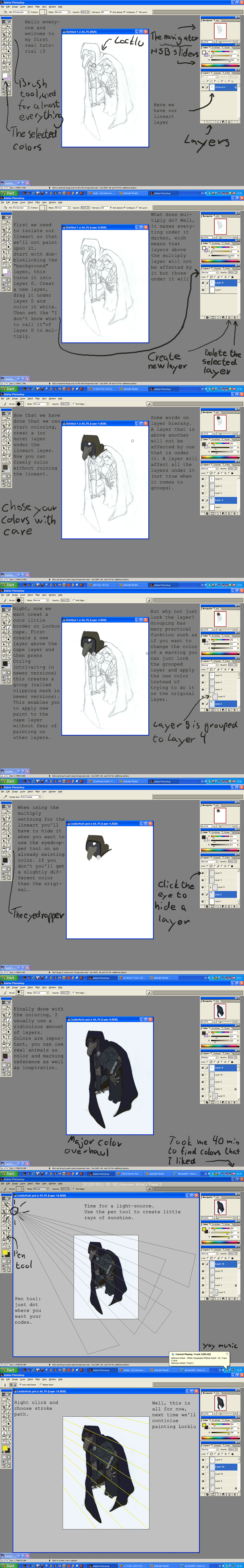
This a coloring tutorial. I've got some request about coloring technic so there it is !Related content


Comments: 104

Wow I did not know this technique. I'm so eager to try it. Thanks! And congrats on the DD.
👍: 0 ⏩: 0

Oh, that is just TOO good. Thanks!!
Calvin.
👍: 0 ⏩: 0


Nice. I didn't think anyone else colored like this. I used this a lot back when I was into doing flash art, especially for dressup games. Lovely tutorial and congrats on DD.
👍: 0 ⏩: 0


Will use this as the base for my next design project. This process is great! Very effective and gives a specific look that is... MOST pleasing ")
👍: 0 ⏩: 0


I've seen this method before in a few tutorials, but it always seemed too complicated to try myself. This makes it look so easy, and now I'll definitely try it out in my next drawing!
👍: 0 ⏩: 0


Nice work although its not blurring the eyes its like defocusing like in a camera.
👍: 0 ⏩: 0


You make it look so easy, I need to try it! Thanks for the great tutorial!
👍: 0 ⏩: 0


Good tutorial, nice & clean with lots of instructive images, but not with thousands of confusing micro-steps or huge intuitive leaps in the sequence.
👍: 0 ⏩: 0

I just tried to color one of my linearts this way and It looks better than all the others!
Thanks a lot, dude! I guess now I can make some nice artworks that really deserve to be uploaded^^
👍: 0 ⏩: 0


I definitely don't know enough techniques for color in photoshop, thank you so much for sharing
👍: 0 ⏩: 0

This is a good tutorial. What I was wondering though is how you go about picking out the good grey tone to define your painting? Do you pick a random colour while in grayscale mode or do you set up grey values from a 100% black?? Thanks!
👍: 0 ⏩: 1

pick the shade of grey that will work best for your image. a darker shade = darker colors.
👍: 0 ⏩: 1
np. also try doing a partially greyed color instead if that works better.
👍: 0 ⏩: 1
Thanks for your advice; I'll try that also.
👍: 0 ⏩: 1

I will have to give this a shot. Thanks, and congrats on the DD
👍: 0 ⏩: 0

Fantastic! This is extremely helpful, when I get a decent working tablet I will most definitely try this. Thank you for this and congrats on Daily Deviation!

👍: 0 ⏩: 0


En effet, ça fait un moment que j'entends parler de la technique de grisaille digitale (dérivée de la technique traditionnelle du même nom) sauf que jusqu'ici, ça n'a jamais marché pour moi. Peut être parce que ils conseillent de mettre le calque couleur en "color" et non "overlay". Jusqu'ici les couleurs étaient affreusement pas naturelles, je vais donc essayer ta méthode, car le résultat dans ta galerie est très bon. Et puis bravo pour le conseil du "flou", c'est une étape que l'on a tendance à oublier facilement quand on passe à l'illustration sur ordi, et qui est pourtant une étape essentielle pour l'équilibre de l'image.
Bref, encore bravo, un DD franchement mérité
👍: 0 ⏩: 0


what I find the most interesting is the little axis you have on you last three, that is a wonderful idea
👍: 0 ⏩: 0

i used the same technique for my last piece..
works..
good job.
👍: 0 ⏩: 0

Thanks for the advice and going to the trouble to create this wonderful tutorial. I've been experimenting with shading in grey tones first-- and this'll really help!
Thanks again!
👍: 0 ⏩: 0

This is amazing, so simple but yet works out fantastically!
Thanks for the amazing tutorial!
👍: 0 ⏩: 0

thanks for the tutorial, i'll definitely try it in the near future!
👍: 0 ⏩: 0


Really well laid out, this is a big help. Thanks for making it!
👍: 0 ⏩: 0

Wow! This is a fantastic tutorial! Thanks a bunch!
👍: 0 ⏩: 0

That way, the colours will come out pretty realistic, I suppose, but I feel there's something lacking. For example if you colour skin with this techniqe, it will look dead, as shadows on skin are not simply grey but usually more rosy/red-ish (as there's blood under the skin shining through). It's a quick and effective method I guess but I highly suggest shading with colours and not with greys.
👍: 0 ⏩: 0

One thing that annoys the heck out of me with the "just use grayscale derp"-method, is that the colors NEVER EVER turns out like in the tutorial. Srsly, it looks much more like the layer is set to multiply rather than overlay.
I did I quick test with this method by using one of your own grayscale sketches, I really hope you don't mind it.
To show you where I (and probably many others) get stuck: [link]
I'm used to color directly and thinking in terms of warm and cold light/shadows. I still haven't found a tutorial actually explaining in how you use values in painting, and I srsly spend a lot of time finding good tutorials. I hope you can provide some sort of logical answer, since this was a good tutorial. But the overlay-method never works out for me. The colors just turn out.... not what I wanted.
👍: 0 ⏩: 1

I'm not the artist, but I've found two methods for dealing with this - one is not to use a flat gray - most things have some kind of tone to their shadows (a blue, or a red, or an orange: what color is the light in your room?), and another/an additional one is to change the opacity. Things rarely work straight at 100% multiply or overlay. Also, you mention that the coat looks good but the skin doesn't...but I'm thinking that they should be colored separately; they probably need different amounts of adjustment.
Usually adjusting the curves or a light filter to your gray will help, though. I was surprised that this DD advocated a straight gray, but then I realized this wasn't a portrait.
So in essence, you're right, it's a simplistic version of the method. Opacity is your friend! So is color mixing. It's easiest for me to understand by thinking about theater lights - it's not quite like a paintbrush.
👍: 0 ⏩: 1

is right. This step is actually a real fast method to set up colors. But if you want to have more rich and tight colors, you have to add other coloring step. Cause the overlay or multiply mode (or other layer mode) is a photoshop thing. It's a computor code. So this is not really a "human" way to deal with colors
In your test, it's quite metallic (those things happens with this technic). So i suggest you to start from this base, and work your colors the way you want it to be
Try other layer mode, try other colors, merge the colors and add other layer mode colors, work with a new layer that is set on default layer mode,... Just try  (Smile)")
 (Wink)")
Hope that's help... ")
👍: 0 ⏩: 0

Hmmm
i never try coloring on photoshop that way..
Im gonna have to try it
👍: 0 ⏩: 1

That's a wonderful Tutorial!
I've trying to colorise this drawing from like a month. Now I have a line to follow.
Thanks for sharing, mate.
👍: 0 ⏩: 1
👍: 0 ⏩: 1

Ok so my first try is a shame so i wont post it... BUT ! Im already trying for a second time and my only problem is that i cant really get the fraking color i want lol i think its because my grayscale is too Strong too dark and too bright at some point. I guess ill show you the next one even if im not so satisfied so you can see maybe were i am wrong ;0) SO STAY TUNE !
and always thanks , without you ill be still searching the tutorial database and drawing chibi haha
👍: 0 ⏩: 0
THANKS MATE ! you really are a charm hehe
👍: 0 ⏩: 1
| Next =>